Apparently I’m a “need a deadline” type of person, which tracks in every aspect of my life (I mean, who doesn’t?). You may have seen in some of our holiday posts or gift guide content that it looks like the guest cottage is done. The beadboard is up, paint is finished, floor is stained, etc. It may seem like we skipped over so much of the design process, and in a way we did (it’s still coming – kinda), but instead of turning my family’s house into a holiday wonderland in early October, we literally painted half a room at a time to shoot what we needed to in front of it, rushing the process in the name of creating some new, exciting images in a new world. It’s been gloriously fun, and I can’t wait to show you it all (today you’ll get an iPhone sneak peek). Usually in October, I set up multiple holiday corners to shoot campaigns or big fun openers for our gift guides. As you can imagine, this creates a level of chaos in my house that can only be felt by my fam, not shown – IT’S WILD. Three months of holiday is an occupational reality, handled best by extreme holiday enthusiasts (me!). We have to work at least 6 weeks in advance to meet publishing deadlines, so this is our accepted reality (and I’m so grateful for the work). I know how atypical it is, and I’m not really going to address it much on social because it’s just so weird, but I wanted to give you loyal daily blog readers more context and transparency. We aren’t done with this house, I promise, but we did make progress in the name of hitting some deadlines, and it’s an extremely fun house to be in right now. I LOVE how it’s turning out, you guys. There are still a lot of unknowns, but here’s what we do know:

Here’s where we were in early October. Just so close to being done, but the floor needed to be stained, the lights needed to be installed, and the door/trim painted. I was super excited to shoot a holiday job in here with a big tree in the corner, so literally the weekend before, I chose a dark stain and then had the floor stained the next day.

But the floor was in ROUGH shape (this is after we rented a huge floor sander – it’s just very damaged). We knew it wasn’t going to be incredible or perfect, but we hoped it would be good enough for the purpose of the room, in this clearly older farmhouse. It has tons of dings, paint in grooves that will never come out and big oil stains everywhere that can’t be sanded clean. Now, I didn’t hire a professional refinisher, to be fair, so maybe it could be in better shape. So the options were to lay something on top of it (new flooring, new reclaimed flooring, or we even considered a dark wall-to-wall carpet to make it really cozy) or just stain it dark, and throw down a big rug and say it’s good enough. We opted for the latter for speed and cost.


So I tested out two different Bona sealants (based on Reddit recs) and like 8 Minwax colors. The wood must be some sort of redwood or doug fir, so all of them pulled really red (which is kinda fine because we clad the walls intentionally to match the OG walls and ceiling in the front room, which are kinda red). The lighter tones weren’t dark enough to cover the black marks underneath, but when I went darker, it showed so much of the leftover paint that is deep in the grooves. So I wasn’t sure which was worse: go light and show dark? Or go dark and show light? I ended up spending a couple more hours trying to hand sand (with my palm sander) as much white paint off as possible and then I had to sand all the stain samples out (which was MUCH harder than I thought it would be, and you can still see them through the new stain – whoops). I ended up sampling two more Minwax colors, Special Walnut and American Walnut, and then texted Gretch to see if her gut was the same as mine (and it was), so the next day we hired a friend who likes to do handy work to stain the whole floor.

This was after I had tried to sand up all the non-contenders (which kinda worked but not really; you can see them in the back), and the four darker spots you do see are the 2 finalists, in two parts of the room.


We ended up going with Special Walnut and felt great about it. Obviously, it didn’t come out perfect, but I was happy enough with it. So literally the next day, instead of sealing the floor or touching it up, I laid down the rug.


It actually turned out fine!!! Like, you don’t really notice it. There is so much dark, pretty wood in here that the flooring just looks like it’s always been there, which is GREAT. We only did one coat of the stain and didn’t have time to seal it before we had to populate the room to shoot.
So literally we went from that to THIS in a couple days:
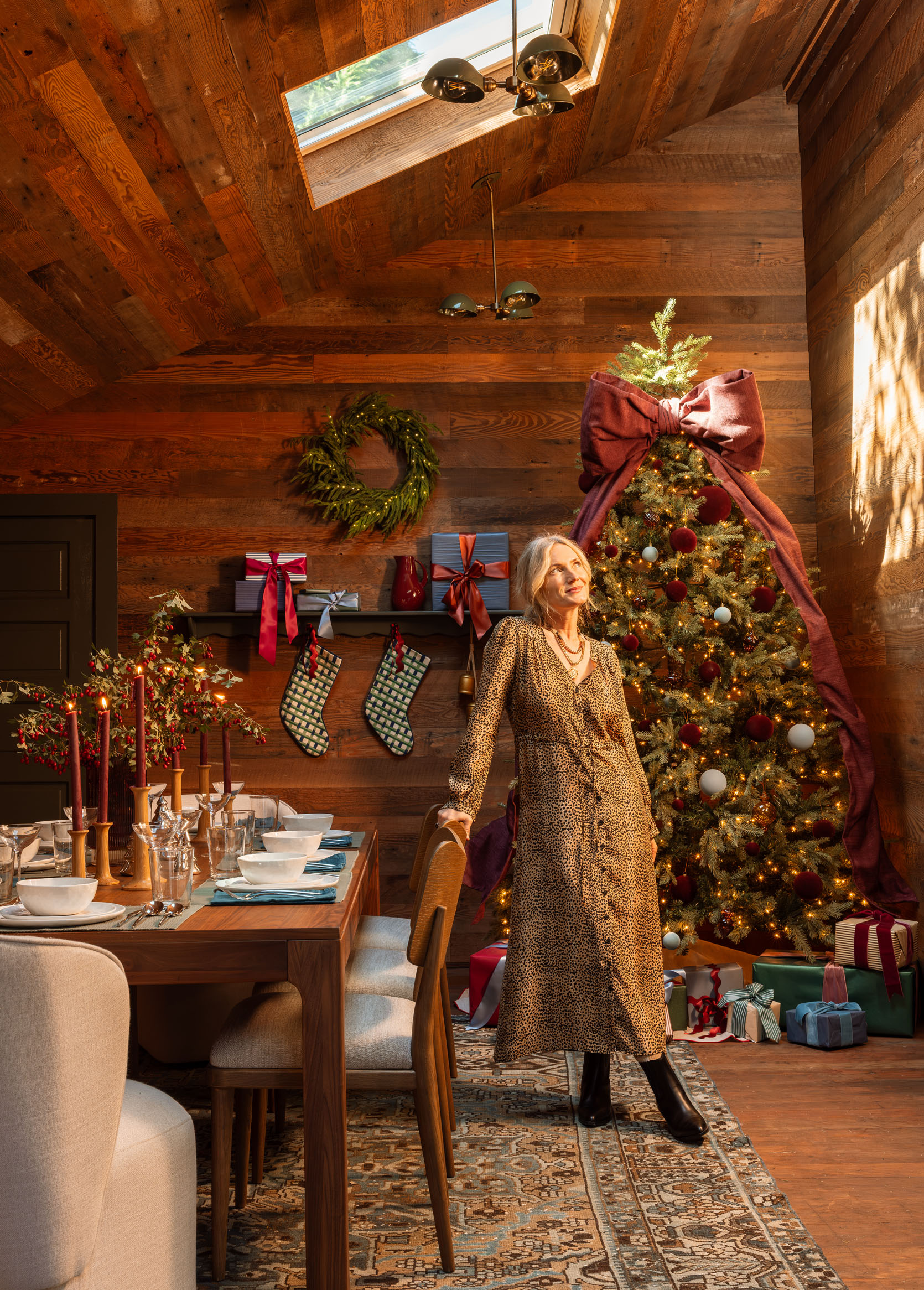
It looks pretty dang good if you ask me. You might notice we also painted the door to the bathroom the same color as the other door and window, SW Foxhall Green. We don’t even have process photos of that because we were all working so fast to get it done, but it sure helps not having spray-paint-covered doors anymore! A big shout-out to the skylights (Velux) for making that corner angelic. We also hung the Olde Brick Lighting pendants and sconces, and I LOVE them. If I could snap my fingers and have them be a bit bigger, I would, because this room is just so large, but the style, color, and function are perfect in here.
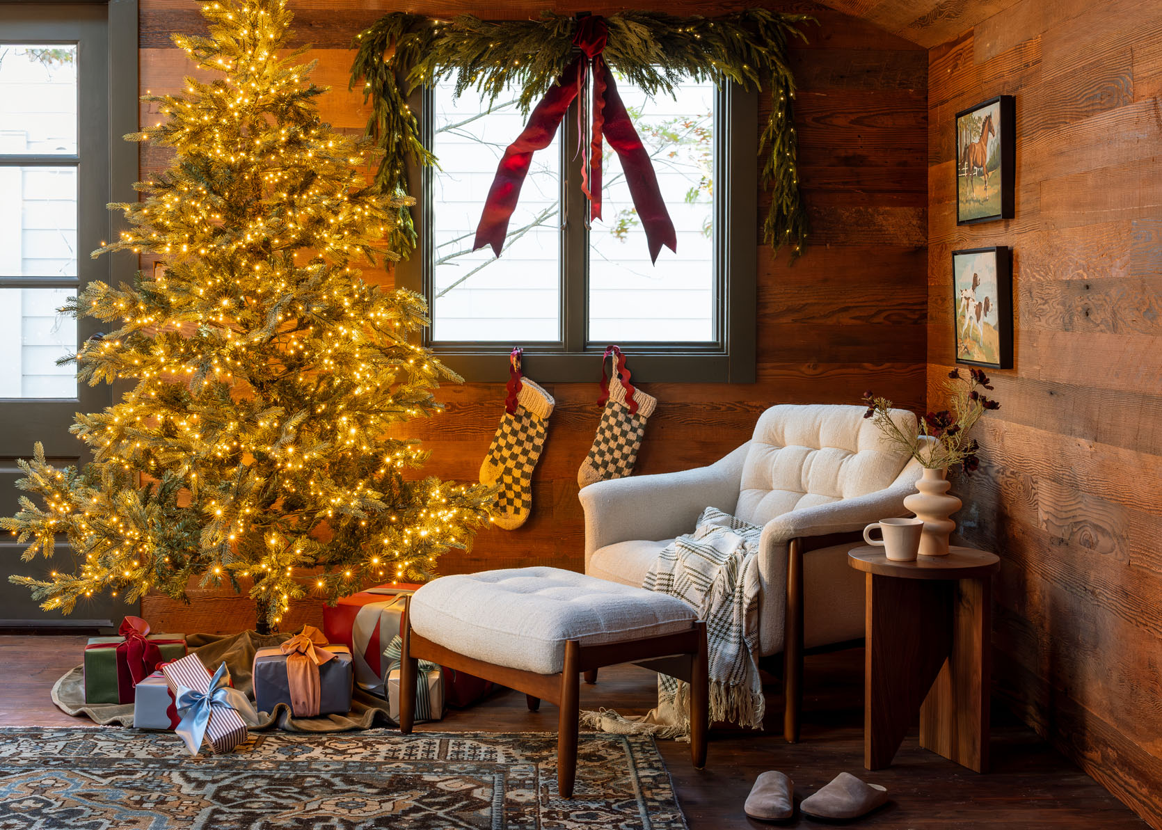
It paid off and was a great way to speed up our process and make our clients happy. Also, our shuffleboard came in, and I can’t wait to show you how good it looks!!


We had no intention of rushing in here just to shoot holiday posts. The beadboard was leaning against the wall for a long time. My team and I were in Arrowhead on our planning retreat, and when we came back, most of the beadboard was put up. So, of course, I got a bee in my bonnet and thought it would be so fun to have it ready for some upcoming shoots. We hired a friend of ours with Gretch, and myself (at times) to fill nail holes and paint over a few days as we were setting up the shots. We were literally working on top of each other, shooting in one corner of the guest cottage while painting in the other, with a lot of last-minute trim decisions (none I regret, which is always fun).
OH AND I WENT WITH GREEN!!!

I had 10 different green Samplize paint samples on the wall for months. Then one day I was like, “no… let’s do dark red,” which I blogged about in this post. Remember?


You all were very clear, voting GREEN, enthusiastically. And so I awoke from my temporary red fever dream and remembered that green was the right choice for this room. But I still hadn’t chosen the exact shade of green. And then the day before we painted, I just chose it, called it in, and picked it up. I had stared at them for so freaking long, and honestly, most of them could have looked good!!! But I was mostly drawn to Farrow and Ball’s Green Smoke (a color I had always wanted to use), and I just went for it (color matched by Sherwin-Williams).
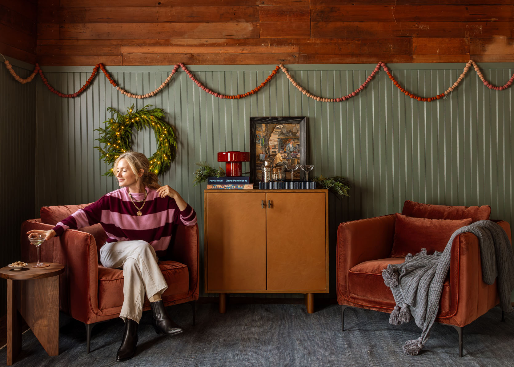
I’ve chosen 552,984 paint colors in my life, and I don’t always nail the color with zero regrets (obviously, lol), but y’all, this green is soooooo perfect. THANK THE PAINT GODS (or more like thank you Samplize for the ability to stare at so many at one time for months). It looks fantastic with the tone of the wood, the light, and with all the future blues and accent colors I want in this room. Where it’s dark, it looks moody and cool, and near the window it looks brighter, but not too saturated.

It pains me to put iPhone shots on here, and obviously this is just a temporary setup, but I wanted to show you how the whole room looked, and we aren’t really revealing it like this anyway. I had this beautiful rug from Armadillo in storage and busted it out, and we’ve been shooting different fun content all over it (and I might try it in my actual living room!). Certain corners of the guest cottage have been shot, while other corners are still being pulled together. Right now we are living in it, decorated for the holidays, shooting, working, and about to bust into the next steps.

Well, I travel this week to Fresno for a photo shoot, and then we are wrapping up a ton of holiday reveals (in here and in our house), but my intent is to get going on the kitchen cabinet framing and the bathroom floor tile asap (I’ve changed my mind on the brick flooring in the bathroom, and now want a high-gloss tile, lol). I think where I’ve landed is to see if our framers (whom I love, Fred and Mike) can frame out our basic kitchen cabinet shelves and then we can trim it out, paint it, panel it, and get stone put on top of it. So not ready-made or custom, but we aren’t going to DIY the frame because I literally don’t have the time, skills, or experience to do anything construction-based, TBH.
Both the range and fridge have arrived, and it’s full of Team EHD Diet Cokes  The range will go on the other side of the room, but we tucked it in here for now.


Scrambling is never my favorite thing to do, but I had 3 trips in September and 1 long one in October, and then we went STRAIGHT into holiday mode, so yeah, this is where we are at this week. I’m trying to remind myself to slow down the timeline while also feeling excited to get this kitchen and bathroom fully done. We really like being in here, and having the separation from my life and kids has been so wonderful on the few days a week my team is here. Maybe someday they’ll even have a working bathroom so they don’t have to go inside to the powder bath that is missing a light bulb and doesn’t lock properly:)
Opening Image Credits (and Other Pretty Photos): Photo by Kaitlin Green
]]>When you are designing a home or, heck, even just a single room, there are so many things to think about at once. You’ve got materials, pattern mixing, scale, function, cohesiveness, budget, etc all coming at you. And look, it’s not a bad problem to have, but that doesn’t mean it can’t be overwhelming. Even designers feel this way. So after Emily sent me her answers to an interview a magazine requested about headboards, it got me thinking about those common design choices we forget to consider. I’ll tell you what it specifically was in a second. After that, I decided to ask the team what some other common things people don’t know or forget to think about when designing a space, or even just buying a new piece of furniture. These were nine of our favorites…

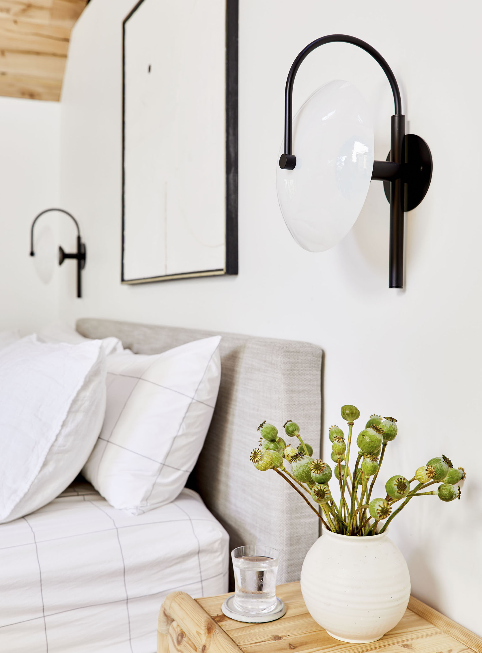
This was the one from the interview. The editor asked Em if there were any things to think about when purchasing a bed with an upholstered headboard. The one that stood out to me the most was to potentially avoid choosing light fabric, especially in linens and cotton. Why? Well, the oils from our heads over time can get on the headboard and it can look pretty gross. I guess I had never thought of this for two reasons. A. I’ve never owned an upholstered headboard (something I hadn’t realized until writing this post) and B. My head almost never has spent time touching my previous headboards (to be fair I’m fairly short and sleep on the bottom 3″ of my floppy down pillow like a little weirdo). Emily (and Arlyn about their old bed) both said that their husband’s sides were way worse than theirs… Emily was referencing the mountain house bed. Something to think about!
This is also pretty funny timing because I am in the process of choosing a light fabric headboard but I’m not worried since my head will rarely be touching it as previously stated. But if you are looking for an upholstered headboard and know that you and/or your partner’s head will be making a fair amount of headboard contact, maybe consider a darker-toned fabric.
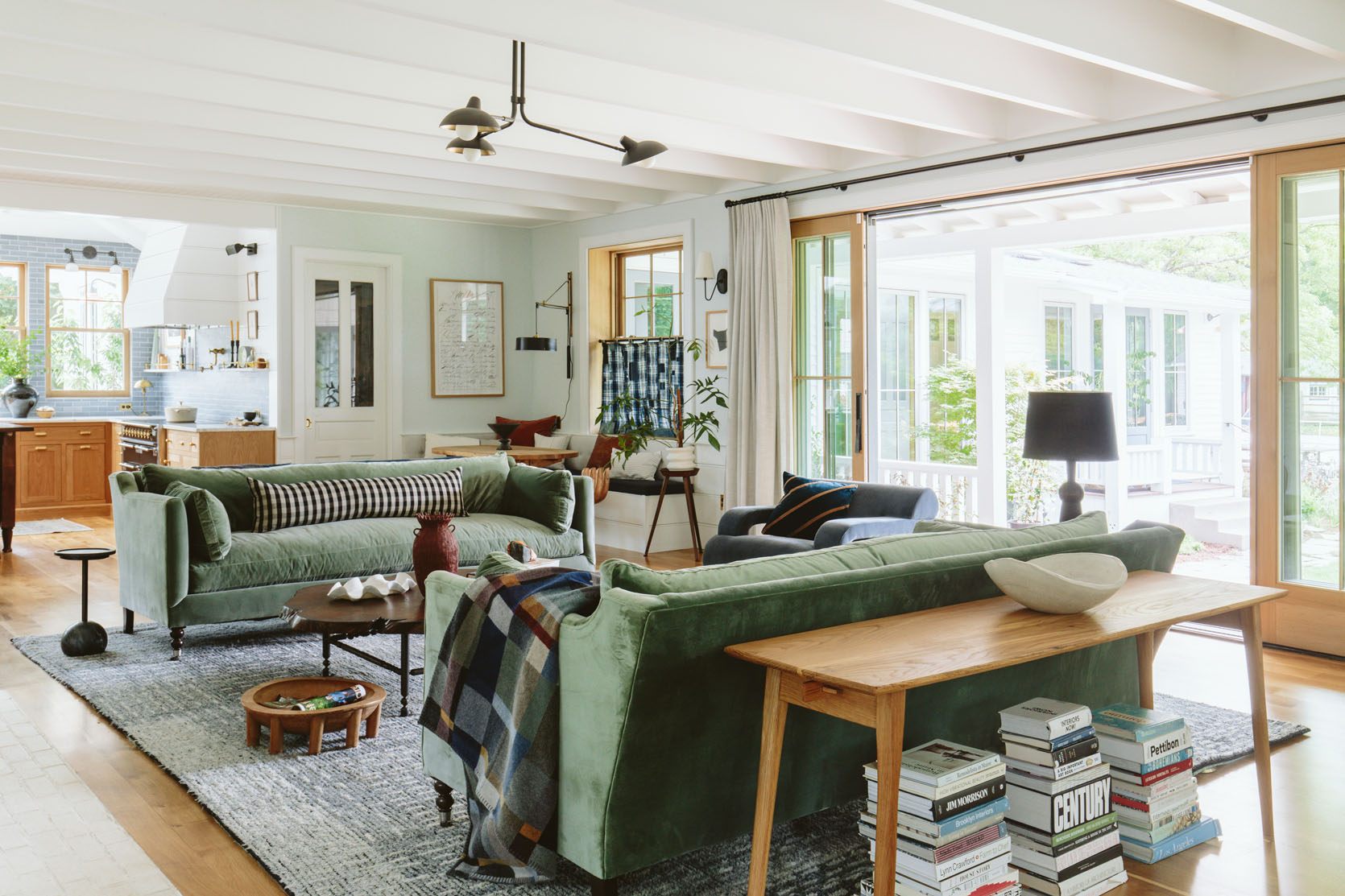
Em’s pups are maybe the cutest and sweetest dogs in all the land, but boy do they just love to perch ON TOP of the back pillow cushions of their living room sofas like they are watching over everyone. As cute as it is, it does really mess up the shape of those cushions. And sure, Emily and Brian could have, and potentially still could, train them not to go up on the sofa cushions but of course that is going to take a good amount of training and is currently not a priority for them. But if you want to get AHEAD of this, consider a tight-back sofa with some cozy throw pillows. Problem avoided:)


When I asked this question, Em quickly stated that dark floors and dark rugs DO NOT hide dust and dirt better than lighter floors and rugs. For some, this might be a “yes, we know that,” but for others, this might be more of a head-scratcher. Again, when you’re making a ton of design decisions all at once, you might just think something like dark floors hide the dirt better, DONE! Check it off the list. Well, sadly that’s not the case. We recommend going light to medium with flooring and making sure your rugs have a lot of color variation in the threading. Even if it’s a solid color! Also, if you have pets, you should also consider their hair color. Outside of the dark blue family room, the Henderson pups are good to go in most of the farmhouse with their white/blonde locks and do not leave too much visible evidence. I myself have dark wood floors and am constantly vacuuming because you can see everything (and I don’t have pets or kids!). Any future home of mine will have lighter floors despite how pretty the ones I have now are.

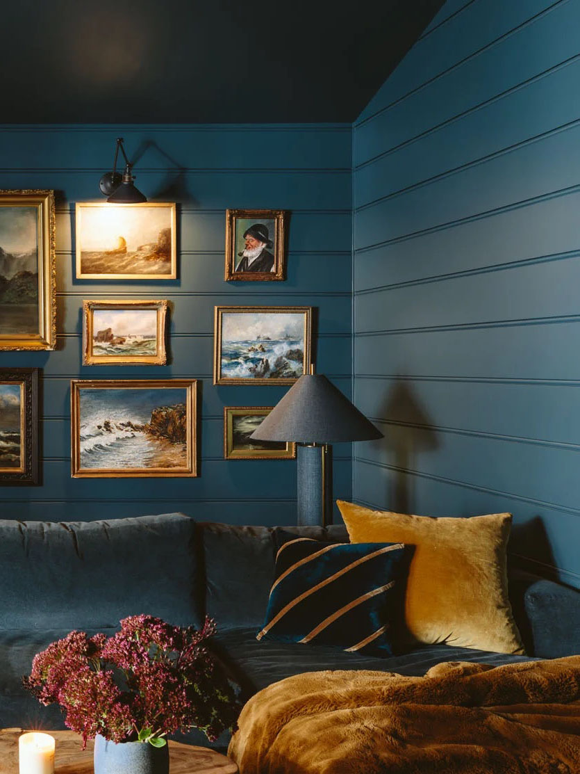
There’s nothing like cozying up on a big comfy sofa with a hot tea or a glass of wine. Heaven, right?! But then when you want to set your drink down, the coffee table is a million miles away! And thus the battle of deciding to move from your comfy location to set your drink down (to then have to move to pick it up again) or hold it until you are all done begins. What is the solution? Sorry, it’s another piece of furniture. But boy, will it be worth it. But say your deep sofa or sectional is up against a wall, no problem. Just scooch it a little forward and slide a slender sofa table behind it. Honestly, your sofa will look better if it isn’t flush against the wall, so it’s a win-win! Emily chose those awesome bookcases that fit perfectly, but you could also fairly easily, with some standard power tools, build a DIY simple skinny wood console (especially if it’s between your wall and sofa where most people won’t even see it:))
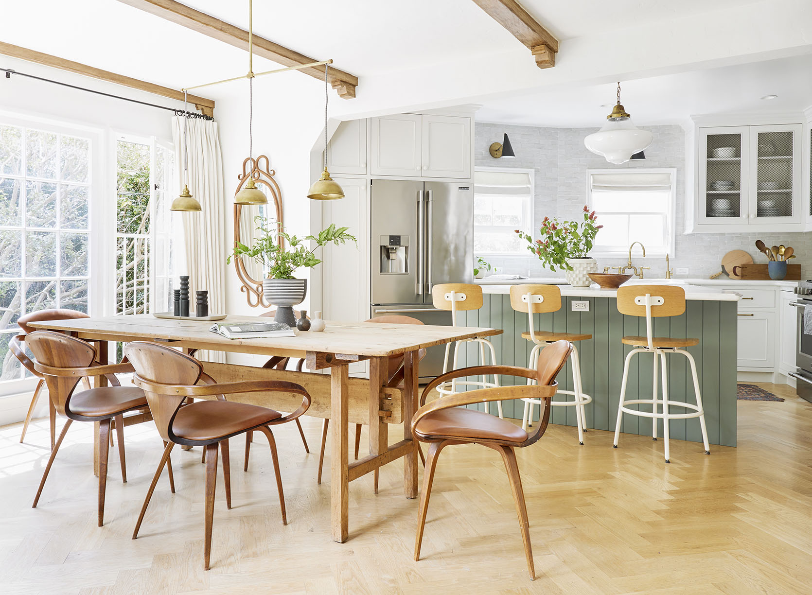
This was another one from Emily because she has made this mistake more than once. Oops! Make sure that if you have dining chairs with arms, they will fit under your dining table. I can almost hear the symphony of “Duuuuuuhs” as I type this, but you’d be surprised how often the dimensions on a site do not include the tabletop width, just the overall height. That means you may think, given the height, that your armed dining chairs will easily slide under your table, but then it arrives, and no such luck. Measure twice, confirm with the retailer, and buy once:)
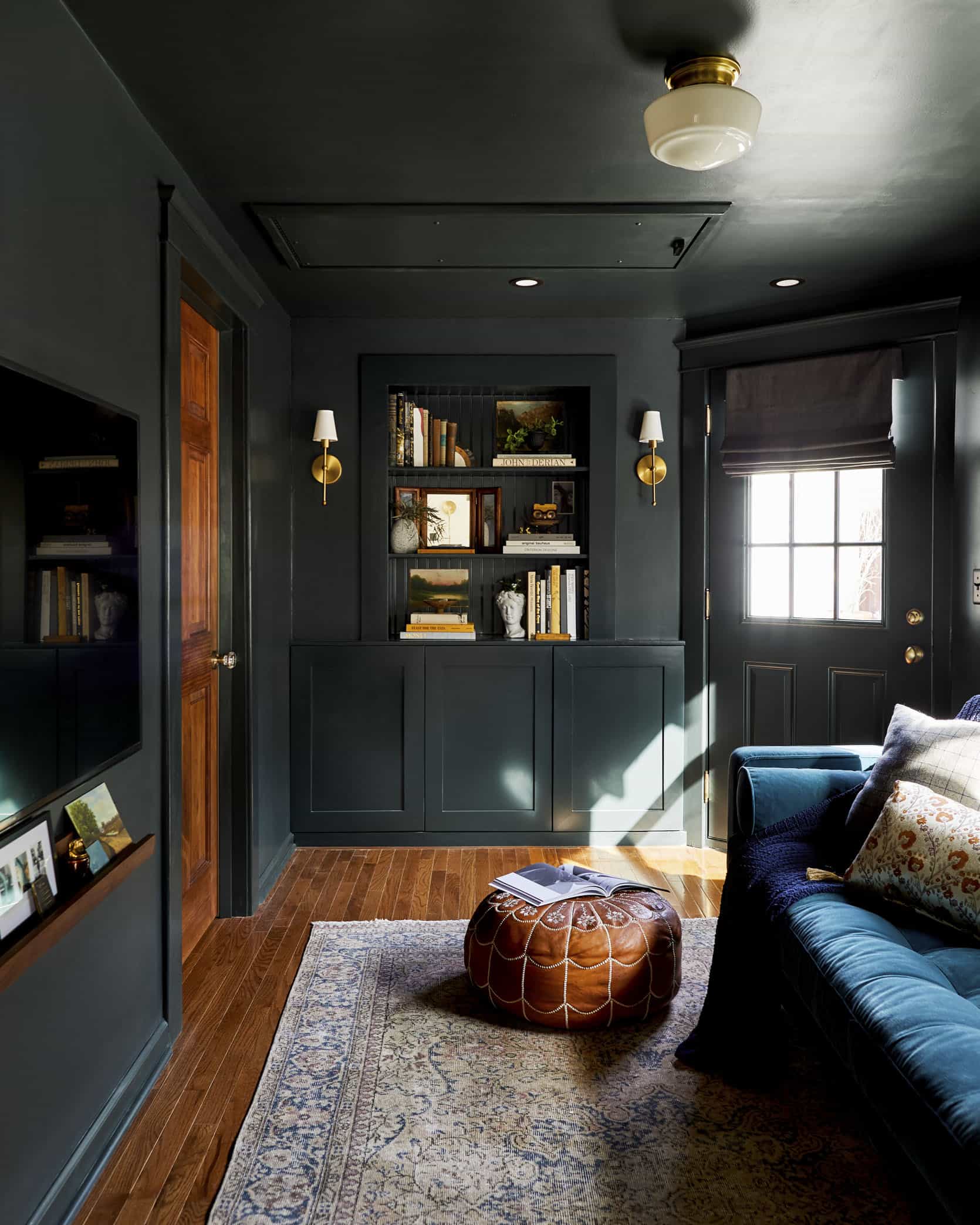
It would seem like common sense that to make a small, dim room feel bigger and brighter, you’d paint it a light color, right? WRONG! Of course there are always exceptions, but Emily’s rule is to lean into the darkness. A small, dim room painted, say, white or a light gray will likely make the room feel dull, sad, and maybe even smaller. Instead, lean into that coziness and paint it a deep, rich color (consider color-drenching the trim and ceiling too!).
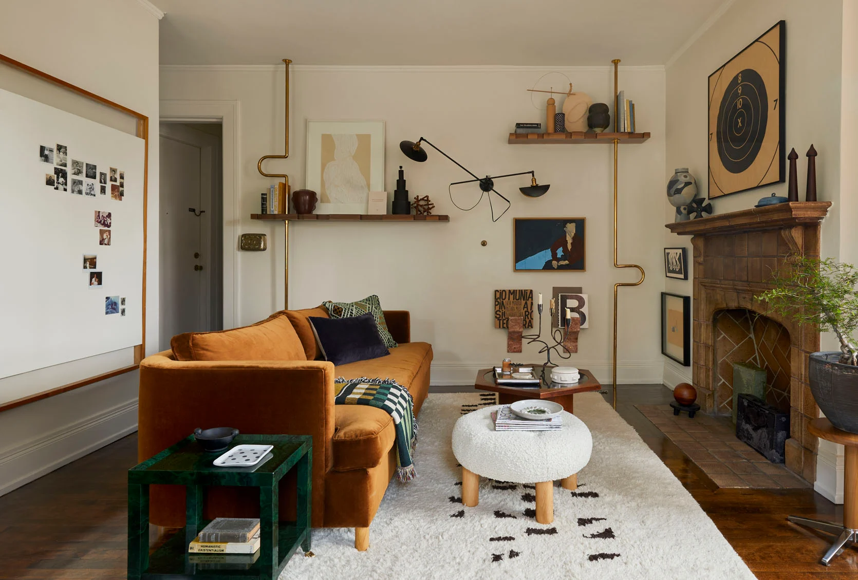
This one is free! I know it can seem counterintuitive (especially in a smaller space), but your room will feel/look better. You want your walls to have a little breathing room. This may mean you might want to consider a different layout. Take my living room above. I could have placed the sofa against the shelving wall (in the name of more open space), but it would have felt off and cramped (I know that sounds weird, but visually it would make sense). Instead, I floated the sofa where it is now, not only creating a living room zone (apart from my office zone on the other side of the room), but having it float makes the room feel like it has more space in a really nice way. So even if it’s just a few inches off the wall, try not to push your sofa or chairs against any walls, especially if curtains are behind. Built-ins are the only exception:)
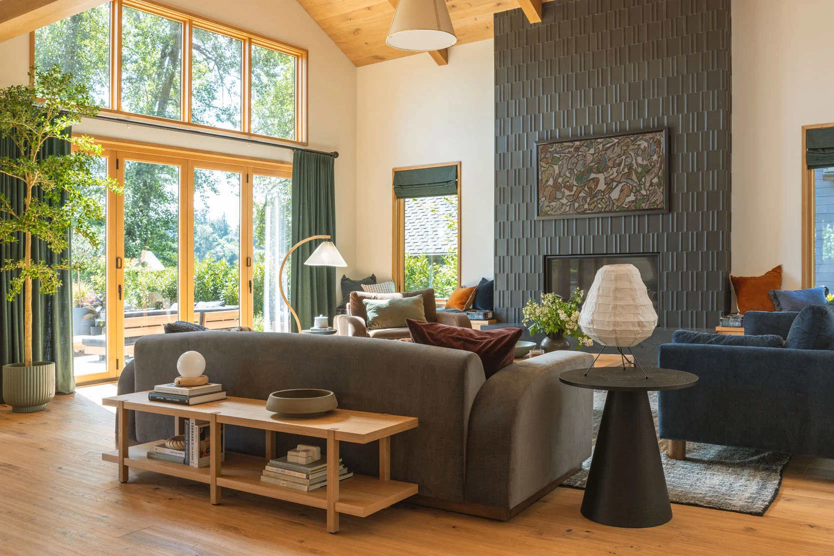
Look, there is nothing technically wrong with a matching furniture set. Heck, my parent’s had a bedroom set my whole life, and I never thought twice about it. But if you are someone who wants their space to look more like a designer had a hand in it, I would stay away…unless it’s outdoor furniture. Emily is totally fine with matching sets when they are outdoors. But let’s go back inside. We (and most designers) swear by a more collected look. That means within a decided color palette, finding pieces that go but don’t match…siblings, not twins. Take the River House living room above. Are the sofas and chair from our sofa line? Yes. But none of them match, yet they look cool and interesting together. Cohesive, not cookie-cutter. However, you can totally do matching sofas (and we have), but then avoid getting the same style for your accent chair.
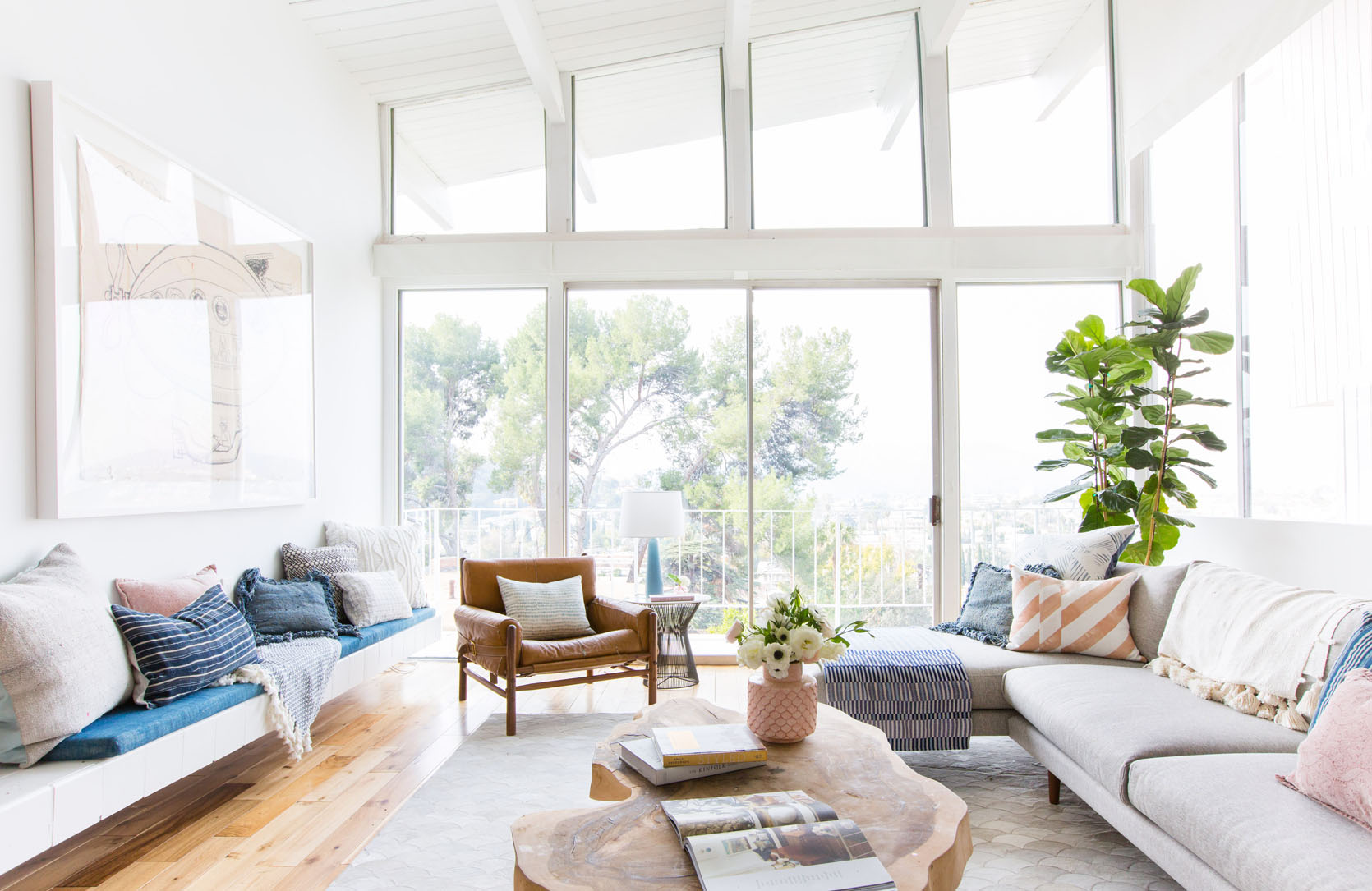
Deciding on a color palette early will make your life SO much easier as you continue to design. So often our spaces are filled with a mishmash of pieces from previous homes or hand-me-downs with new additions you fall for in the moment. But you may not always know where those new pieces are going to fit in with the overall vision. However, if you decide early on the color palette, you can shop with confidence knowing that what you buy WILL work in your room. Here’s a whole post on the best way to choose a color palette if you don’t know where to start:)
Hope that by pointing out these common design choices, you can have a better game plan when designing and/or buying furniture. And as always, if you have any cautionary reno or decorating tips, drop them in the comments.
Love you, mean it.
Opening Image Credits: Photo by Sara Ligorria-Tramp | From: Mountain House Primary Bedroom
]]>I will begin this post by saying that I’ve never had my own workspace. Since I started working remotely from home in 2016 for Apartment Therapy, I either had a desk set up in the living room or just bounced between my dining table, sofa, and bed. I’ve never had to put much thought into what kind of room would keep me focused when I was feeling frazzled, or spark inspiration when my creativity tank was at zero. So when we moved to North Carolina and I finally got my own home office, I ignored it. This, of course, means it became the junk room of our upstairs: ironing board and iron left out for easy access; storage containers (both full and empty) stacked in corners waiting to make their way into the garage; a hodgepodge of furniture.
People coming to visit, and I needed to quickly stash away the tool bag and a lingering load of unfolded laundry? Into my office they would both go. You know the drill. We all have these types of spaces. But lately, I have been really struggling with my attention span and also feeling fairly uninspired. Maybe it’s the natural ebbs and flows of a creative’s mind, but it made me stop, look around my office, and put some thought into giving this area the attention it deserved. (Though, tbh, this probably happened because I was procrastinating doing some other project, so wallpaper options magically popped up on my screen for perusal as a distraction…)
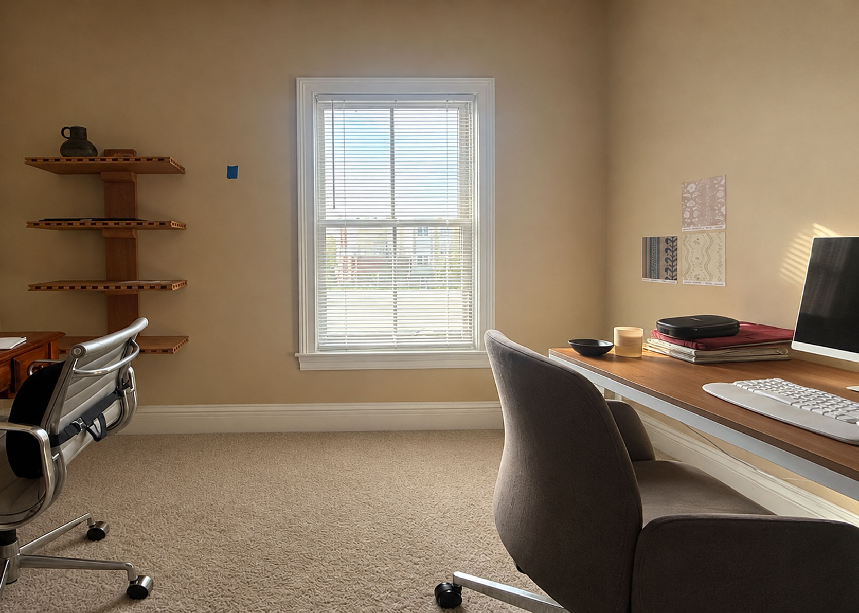
Here she is, in all her junkroom glory. But I need to be honest with you…to take these photos, I took out a giant art box (it holds a mirror I haven’t decided on a placement for) that has been leaning against that window wall for months; I folded the ironing board and put it in the hallway just outside; I cropped out storage containers with my daughter’s too-small clothing castoffs. I’m an honest, vulnerable writer, but we all have our limits on how far we’re willing to keep things real.
The room itself is a rather plain box. It’s quite petite, designed likely for the scale of a home office or baby nursery. The window you see there doesn’t let in a ton of light because of an overhang.
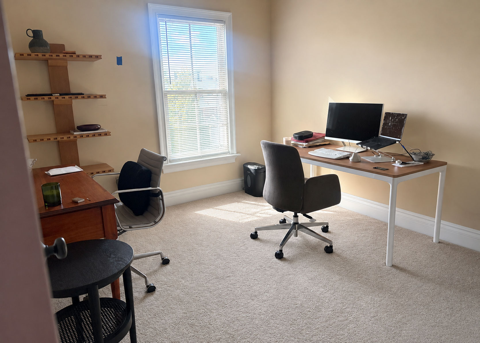
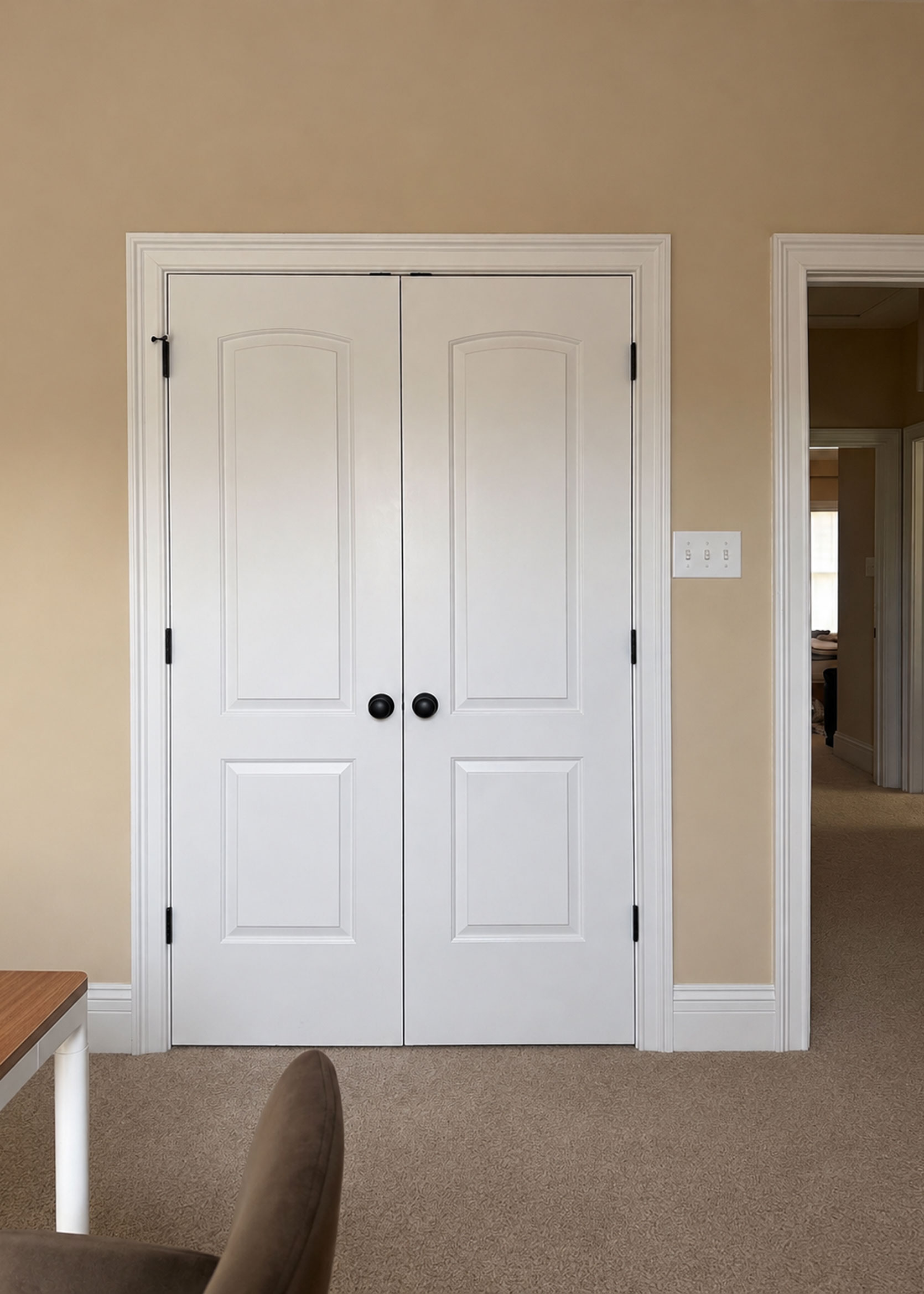
I had to up the exposure in Photoshop here because it’s rarely ever this bright in here. But it’s just two blank walls, one wall with an offset window, and then a partial wall across from it with a double-doored closet. That’s it. When we first moved in, and we had very little furniture, I promptly bought the red-toned wooden desk from Craigslist. It was cute, but the way the side drawers came down on both sides of the center drawer meant I was constantly hitting my knees in the corners when crossing my legs, or hearing a loud WHACK sound from my desk chair arm when I turned even a little bit. Don’t get me started on the overstimulation of getting that same desk arm stuck on the drawer knob when I moved around. On top of that, with my work setup that includes a large external monitor, a laptop stand, a keyboard and mouse, I had almost no room to even write in a notebook. It was shallow and not very wide, so I knew it was just a temporary solution.
It was around that time of daily annoyance from lack of surface area that I started seeing a physical therapist for pain in my neck and shoulder. He quickly recommended a standing desk if I was able to swing it, to give me the option of standing more, but also because I could lower the desk to exactly the height I needed for the best ergonomics, given how petite I am in stature. So I got to work acquiring this version from Branch, and I love it. I wanted something simple, not super bulky, but without the standard T-shaped legs you tend to see on this type of furniture. It has three presets, which I’ve configured to the height I need for working sitting down, the height I need for standing, and then a resting height where I can push my chair in under the tabletop.
I’ve so far left the other desk and chair in the office for the occasional guest (like Jess!) or when my husband works from home, though he also doesn’t have enough space for all his monitors, so he tends to stick to the dining room. The black side table is another holdover from like three homes ago; I just threw it in here to get it out of my living room after I brought in the gateleg table next to the sofa.
The only thing in the below photos that has any intention behind it is those shelves from the Pierce & Ward collection for West Elm. I splurged on them this summer because I couldn’t get them out of my mind. I plan on using it as a decorative trophy shelf of sorts for some of my work, like my book, magazines I’ve worked on, etc., with pretty things mixed in.

But here is where my true dilemma comes in. Once I started tinkering around, I found myself a bit stuck on a color palette. I am definitely a “do as I say, not as I do” decorator. I’ve written every story imaginable about having a jumping-off point for your design decisions, or building a palette before starting to help be your guiding light. I didn’t do any of that in my home office. I just started pulling things I thought were pretty and hoped they worked together. With the plethora of design inspiration there is out there on our social and Internet feeds, I’m much more inclined to select items in a much more chaotic way. I don’t want a space that feels perfectly pulled together. I want rooms to feel like they came together by accident, full of things I loved. Of course, being able to pull off something like that is a skill set alone that I may or may not possess.
For the sake of moving this story forward, let me tell you where I started in here: The wallpaper. I ordered MANY samples from many different companies. Florals, stripes, checks, abstracts, a variety of colors and patterns. I settled on this pretty print from Chasing Paper. And then…I changed my mind. I wanted something more dramatic in color and just a bit funkier. That’s where I landed on this groovy olive and ice blue stripe from Wallshoppe. I loved it and knew it would give me the combination of moodiness, punch, and playfulness I was hoping for. Except for one thing: I couldn’t get out of my head about what to do with rounding out the colors.

Wallpaper | Wall Shelf | Curtains | Adjustable Sitting-To-Standing Desk | Desk Chair | Rug | Storage Bench
This was my first pass moodboard. It’s fine, but not where I hoped to fully land. I was finding it very difficult to break from the blue and green of the paper. I tried a peacock blue rug to try and make things more interesting, but it all felt flat to me. I still love those curtains from Anthropologie, but the wavy border was too on point with the wavy wallpaper. The only place I liked where I went with it is the golden hue of the velvet on the bench (it looks weird in this photo, but it’s actually a great looking bench with storage for a great price! Check it out, for sure). Except that I have a mustard velvet bed and a mustard velvet sofa, so again, it was just pulling a page out of my same playbook. It was safe, that’s for sure.
I pulled in some other options, but everything ended up being some version of blue or green or neutral, and while that’s a fantastic combination of colors, I wanted something a bit fresher. I’ve used that duo many times over in my designs, and I was hoping for something more original for me, but my brain alone wouldn’t take me there. I felt stuck.
My next step was what I’d recommend to anyone do if they were lacking ideas: Hunt down inspiration. Dilute your brain with beautiful things, and then pluck out what makes your eyes bug out of your head in delight, and break down what you can borrow from it for your own home. What else could I do with olive green, hints of light blue, and warm wood tones? Oh, something I should also mention: I’m not interested in painting. Peel-and-stick wallpaper is so easy to put up and take down without much effort on the back end when you’re already stressed during a move. As much as I think a complementary hue along the millwork would be beautiful, I’m keeping it all white. Same goes for the carpet. This is a rental, so it stays, and it’s fine.
Below, you’ll find five color palettes that felt well-rounded and robust to me. While they don’t all directly apply to my specific shade of olive or blue I’m using in the wallpaper, I was able to expand my mind a bit for what else to pair with these colors. Here’s the first one:
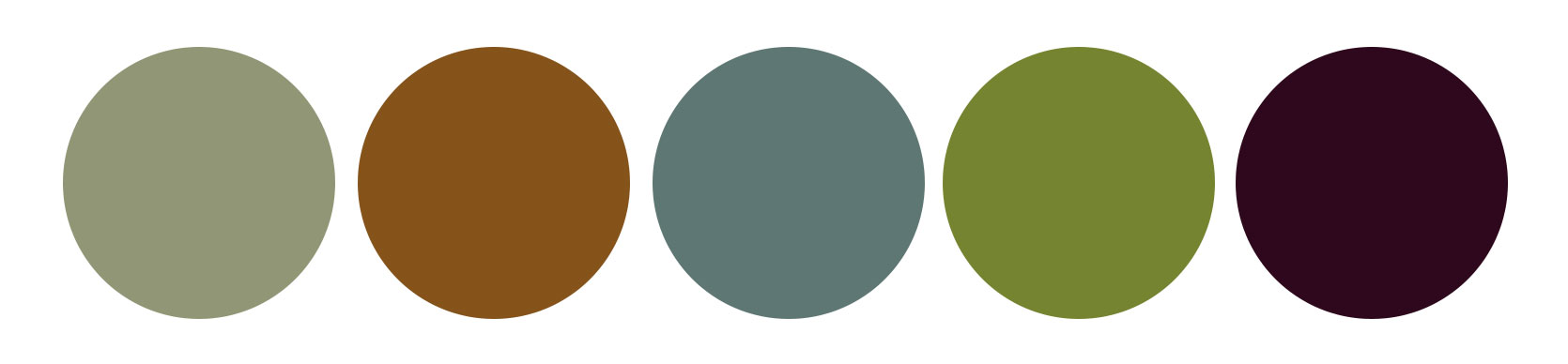
The green here in the first slide is a warm sage, and the blue only comes in through the painting, but it was the amber, bright grassy florals and rich burgundy grapes that piqued my interest. It was a good reminder that sometimes all you need is a flash of some other hue to add that effervescence I’m looking for. I obviously have no plans to have a bowl of purple grapes just sitting on display in my office, but I like the idea of threading these shades through in small moments.
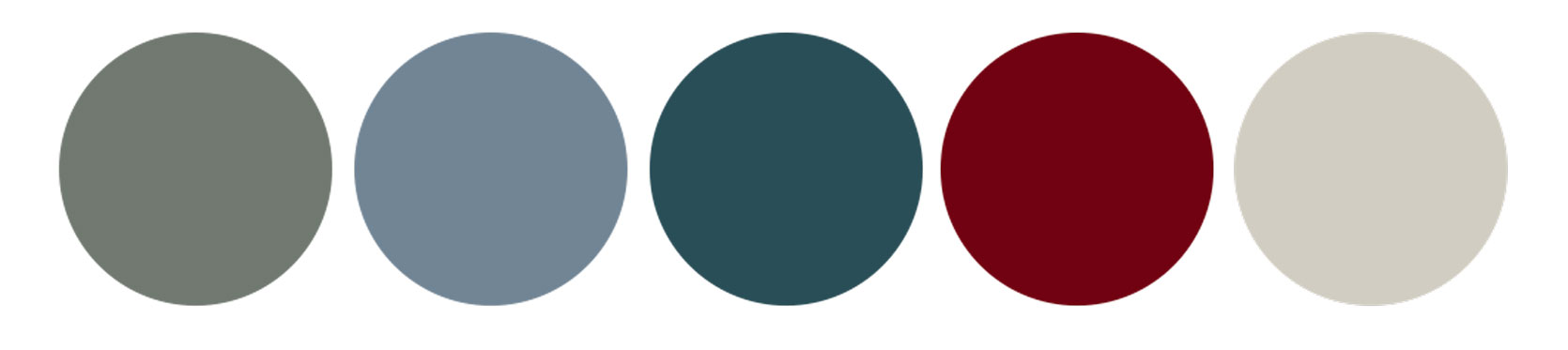
When I first bookmarked the above image, my eye read the millwork color as mint, but now that I’m looking at it again, it’s very clearly aqua blue. Whoops. But I’m leaving it, because if that mint were olive, it would all still work, just be a bit less “sweet.” Seeing the denim or chambray upholstered armchair made me crave an upholstered piece on the blank wall opposite my desk in a hazy or icy blue, as well. The pop of red from the stem’s berries got me craving a berry-like jewel tone.
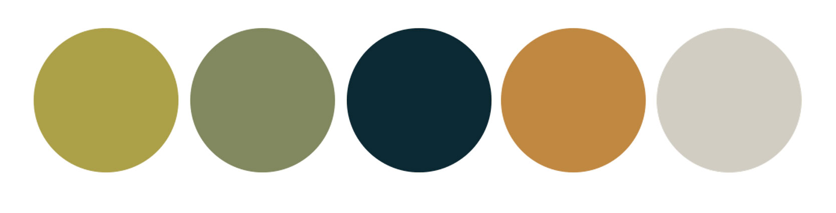
This chartreuse is very different from the aqua we just saw; it intrigues me. What I take away from this one is the bravery to opt for colors that are stronger and less milky. As much as I think cooler-toned greens are lovely, I do think they’re oversaturated from a trend perspective, and I love this move away from the stern to juicier, saucier pigments. Pickle brine green might not be what immediately comes to mind when you have a room to paint, but…maybe it should be?!?
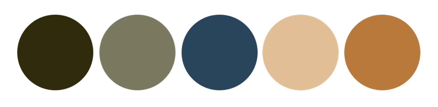
A few things in the above image caught my eye: How layered and rich this room looks, the mix of patterns between the wallpaper, draperies, pillows, the top and skirting around the desk/table, and the tiger-print chair. It’s a beautiful layering of blues and greens, but with an unexpected orange moment via the sconces and the pin board. They almost look like they’re glowing in the sun. We see that same warmth in the swirl of the tissue box cover on the tabletop, and the amber of the candle vessel. If you click through the images, you can see all the details of the room and how different all the colors look depending on the sunlight. I thought those lampshades were dark hunter-esque green, but turns out they are minty velvet!

And then finally, I got here. I couldn’t look away from the mauve and the aubergine and the olive and the flax. It got me so excited to try something new. It made me realize that I’ve never decorated a room with any shade of purple, but it felt immediately right to me. Then I remembered these curtains I had pinned a while back that had a light blue ric-rac ribbon running down tiny aubergine florals, and it came flooding into my soul. Olive, sky blue, mauve, and aubergine. Yes! Rounded out with neutral wood tones and some natural rattan in something like a lampshade of a sconce, and a flax linen-wrapped moodboard, and I came back to life!
I played around with some products and could feel the excitement percolating in my chest. It’s not perfect, and there are some things to figure out (like if it’s feasible to have a rolling office chair sitting atop a rug that’s on top of carpet), but here are the vibes I settled on:

Wallpaper | Wall Shelf | Curtains | Roman Shade | Adjustable Sitting-To-Standing Desk | Desk Chair | Rug | Upholstered Bench | Sconces | Throw Blanket
It’s bold, eclectic, a touch heavy-handed, and very much me. I do tend to struggle with how much contrast I can peacefully live amongst design-wise, but I realized in this journey that I want my office to be a place that feels alive. That laughs out loud. That tickles my brain when it’s slumping. My bedroom can be a calm, stripped-back room, but where I work needs to excite me. And the above definitely checks that box.
As much as this post was about me challenging myself to break through my color boredom in a room I felt stuck on, it’s also a call to you, readers, to go on your own color journeys if you feel the itch, and try something new. It just might be the thing to shake you back to yourself; and hey, you might surprise yourself with where you land!
Until next time, friends…(and stay tuned for where I firmly land with this room design!).
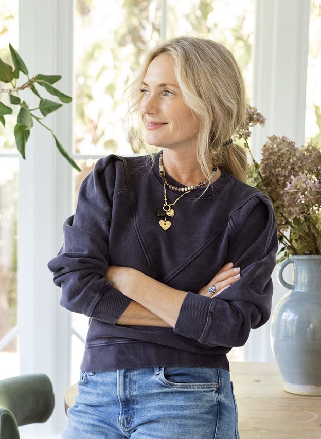
]]>The fun has begun, and while I wish I could clone myself at times as that lady did, instead I got to spend the day(s) gathering a lot of my favorite stylish pieces for a big show-and-tell to give you all gift ideas FOR HER (ahem…for YOU?). This gift guide is full of a lot of new beautiful things I found, many of my MVPS of 2026 that are consistent in my life, and some on my own wishlist. Listen, I can’t try them all on, nor am I an expert in fashion and beauty, so it’s mostly just stuff I love that I think is easy to wear and makes me feel good. That’s it. If you want my deep-dive testimonials on each product, stay here, but if you just want to peruse all my favorite things, head to the shop page (where there is even more). 2026 Holiday Shopping: Let’s Go!!!

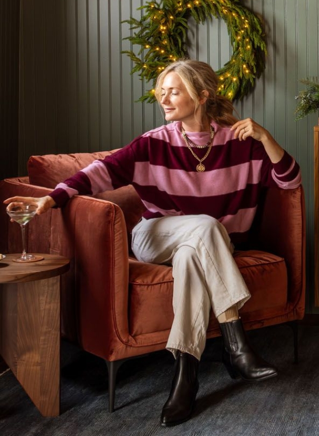
This is an easy one for me – cool texture that works so well with silk OR denim in a T-shirt shape (so it’s easy to dress up or down). The whole vibe is one that could lean fall OR holiday, but individually each piece is pretty evergreen.
Burgundy Faux Leather Top: This is a banger for me. Dressy and cool, but so easy to wear. Also, that texture is so good, not to mention the dropped shoulder.
Midi Slip Skirt: Love this print and colorway so much. Easy to dress up and down and seasonless. The little lace trim is such a nice touch:)
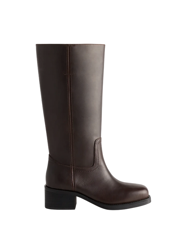
Leather Tall Kitten Heel Boots: My favorite boots of the year. Comfortable, cool, not too high of a heel. The leather is so high quality.
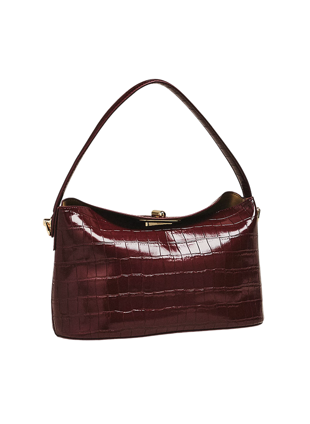
Croc Crossbody Bag: The texture, color, and shape – all classic but with a fresh twist. It feels high-end in a cool way.

Rym Shirt: This is surprisingly comfortable and easy to wear due to the stretch (it’s not stiff at all!). This comes in other colors, too, and is really great to layer under a cardigan or jacket.
Red Blouse: So beautiful! I just ordered this for the holidays. That red is so perfect, and it feels very special-occasion.
Hana Shirt: I love this shirt so much – the collar details, the colorway (indeed, it feels very me). I just suggest you size down.
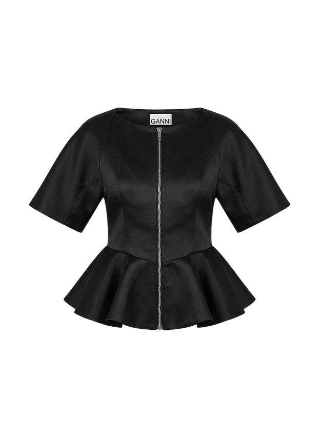
Ganni Peplum Zip Blouse: The shape is so fun to wear, even with jeans going out.
Better-Than-Silk Blouse: Love the colorway (of course, ha), and that fit is so easy to wear and won’t hug or tug.

Little Cheetah Silk Dress: The drape, the print, and the cut are all so comfortable yet make me feel confident. This is a four-season dress for sure, but it’s silk (so it’s so soft and drapey).
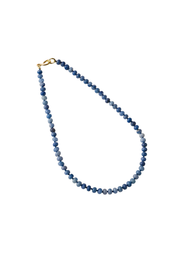
Rainbow Stone Necklace: I wear this most days because it looks good with everything (add a gold chain to round it out). This one is in the colorway Dune, but there are plenty of other options.
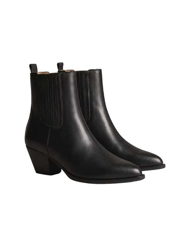
Western Chelsea Ankle Boot: The pointy toe and chunky heel look so good under jeans but also make a long dress feel edgier.

Haleigh Pintuck Midi Dress: This is a great year-round dress. The fabric is thin and soft and falls so pretty!
The Bear Lodge Cardigan: It’s so thick and still drapey, and I can’t wear it without getting like 90 compliments – many from men, which is pretty funny.
Leather Block Heel Boot: A high-quality kick-it-around boot for the prairie. They have become one of my new staples.
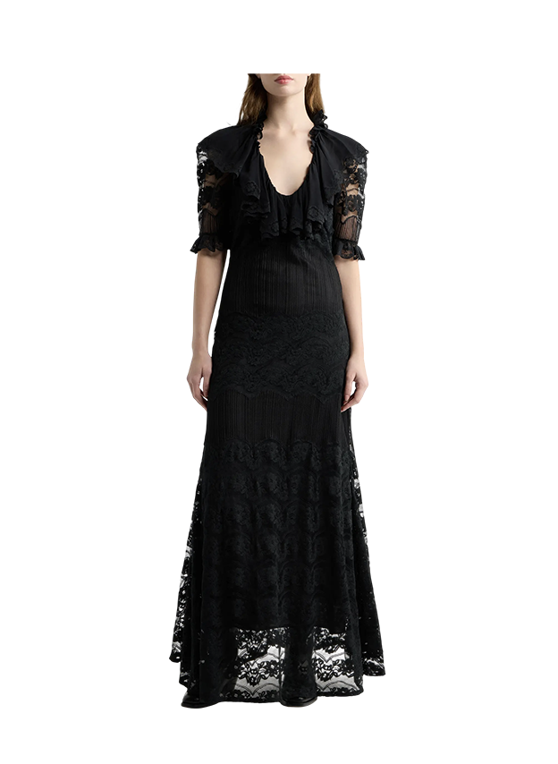
The Trousseau Dress: The details are so beautiful, and the flow and volume would be so fun to wear for special occasions.
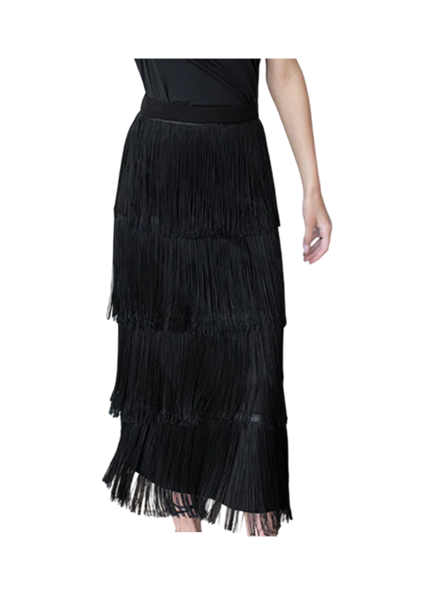
The Fringe Midi-Skirt: Who doesn’t love a little (or a lot of fringe)?! Playful, elegant, and in black so it’s not too loud. (This is on my wish list!).
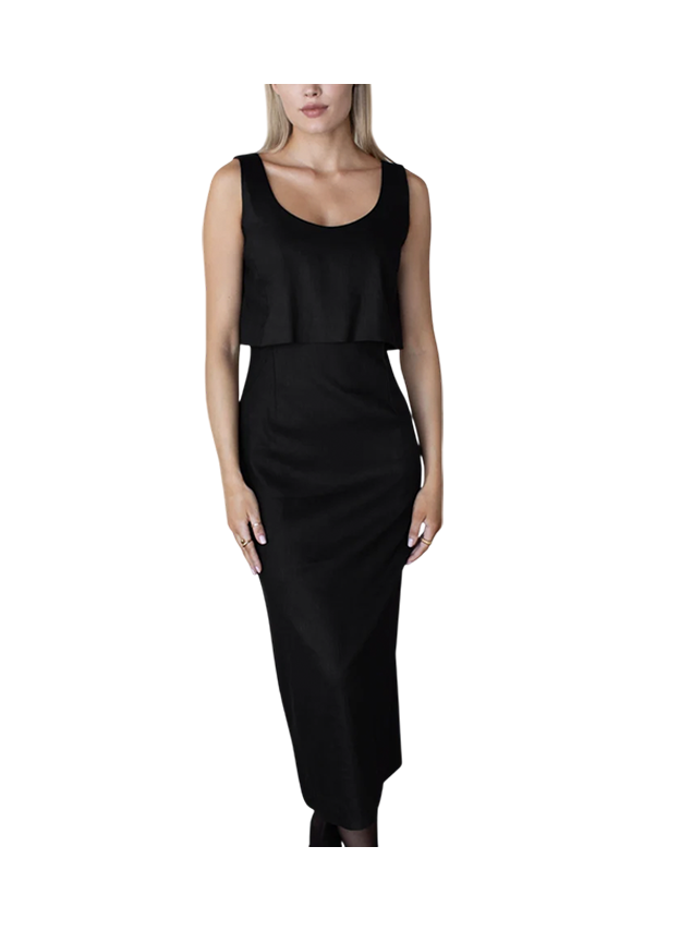
Roma Midi Dress: So timeless yet unique = a splurge-worthy party dress.

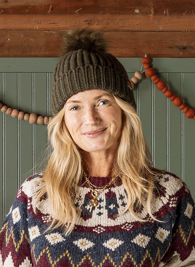
I’m going to wear this outfit all winter!
Fair Isle Crewneck Cardigan: Perfect colors and cut. Chunky and cute and just pops so hard, in a good way. Does it get more classic than this??? So perfectly timeless.
High-Waisted Cotton Leggings: These are so comfortable I bought 5 pairs in different colors and patterns. I wear them most days, and I love how non-compression-y they are. Size up if you want extreme comfort (like you can sleep in them).
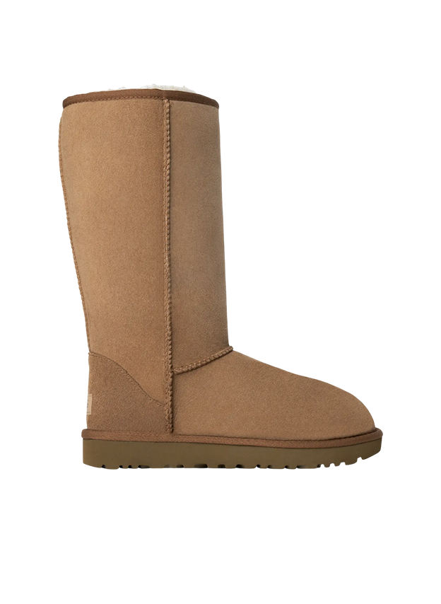
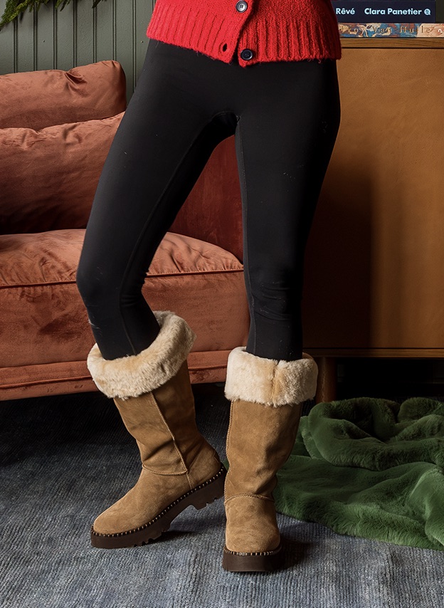
UGG® Uptowner Tall Boots: Merry Christmas to me!!! I bought these for myself and will be wrapping them under the tree. I LOVE these. They have the comfort and quality of Ugg but have a waterproof sole for stomping around in the weather, and that shearling cuff is so chic. We are going to Colorado after Christmas to ski, so I’ll be Après in these every night.
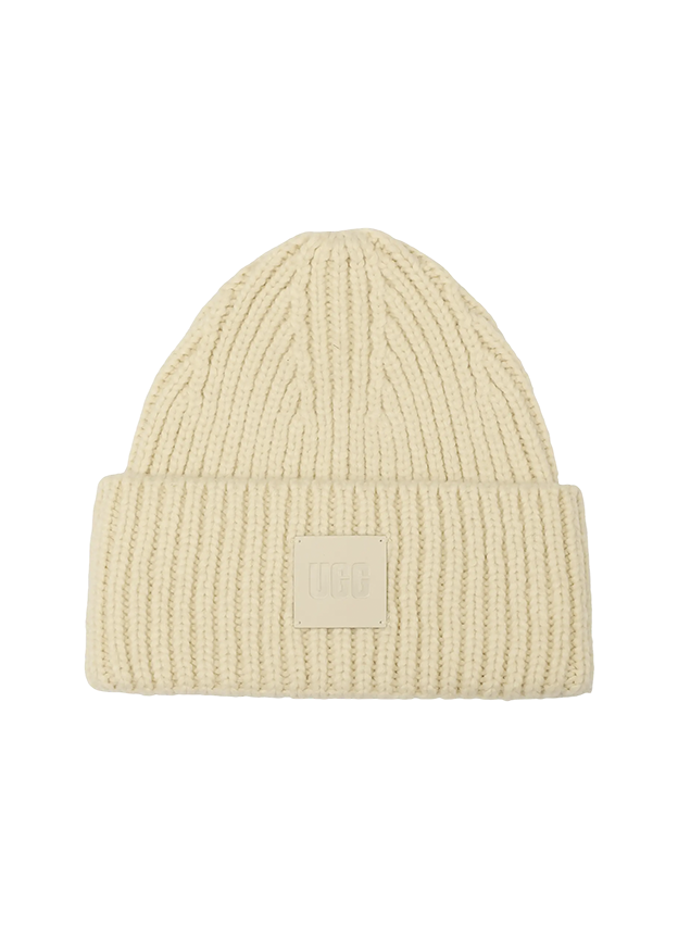
Chunky Ribbed Beanie: The perfect amount of chunky in the way that makes me feel cool and stylish.

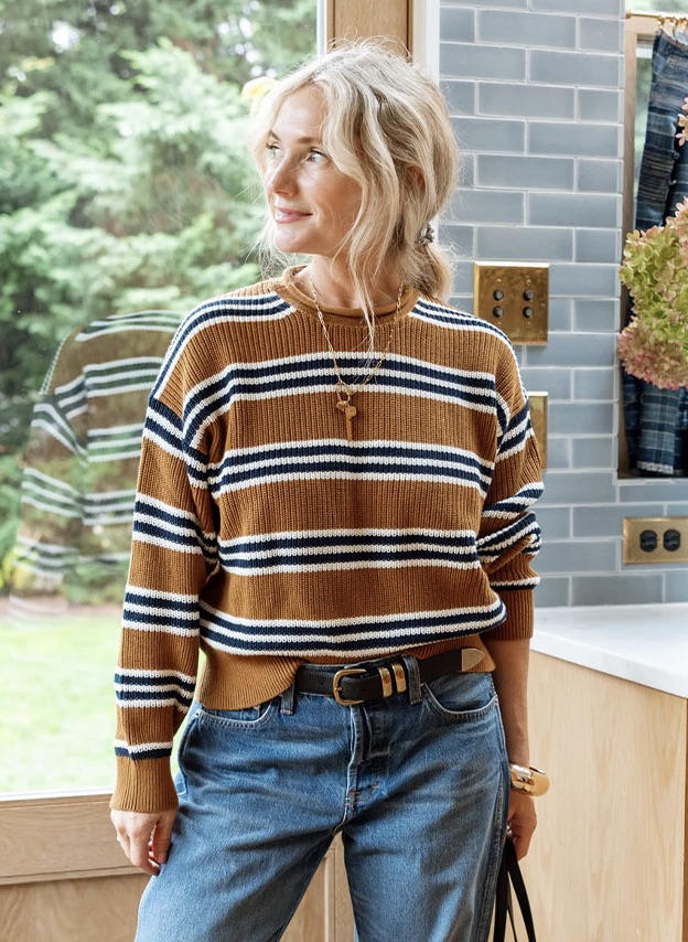
Funnel-Neck Cardigan: The colorway of the stripe is, to me, ideal (and small, so not too bold).
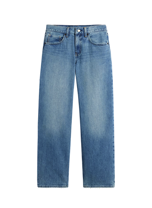
Low Rise Loose Jean: Obsessed!!!!! Cool and flattering (and not too low-rise, I promise)
Comfortable Western Bootie: Western, but make it SO COMFORTABLE. Korkease FTW, forever.

Fair Isle Mockneck Sweater: This colorway is perfect!!! And a great cut that is so flattering.
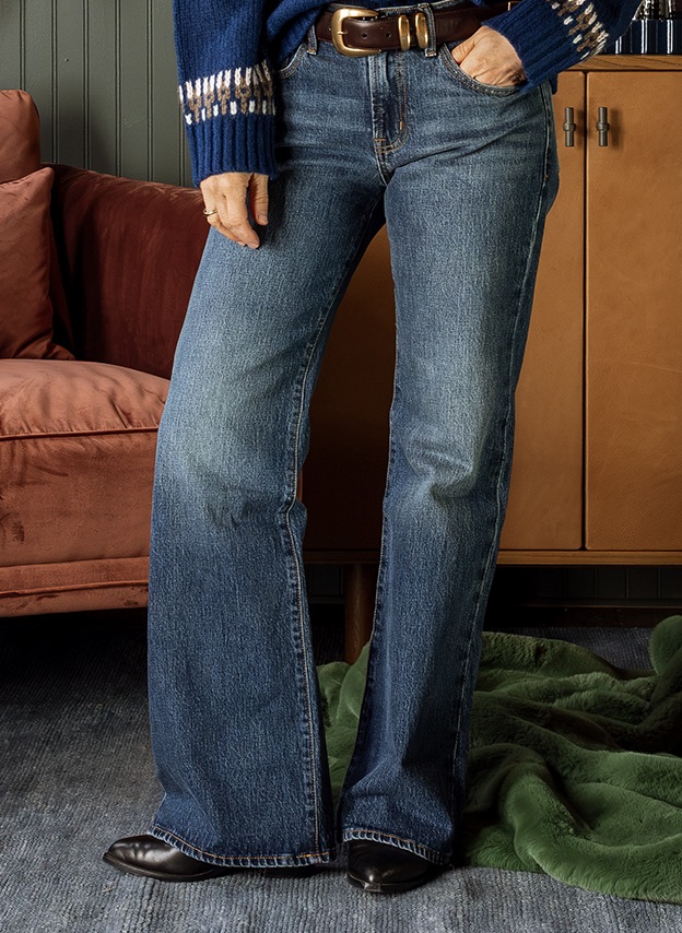
Mid Rise Relaxed Flare Jeans: Tucks me in while being comfortable and has a fantastic wash.
Western Chelsea Ankle Boot: The pointy toe and chunky heel look so good under jeans. Plus, they give you western vibes without going full cowgirl, all while being pretty comfortable!

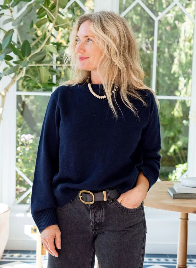
2025 Rollneck Sweater: This sweater is the perfect cool and kinda slouchy sweater but still looks put together. I love the rollneck and large roll cuffs, too. It’s roomy (by design), so size down.
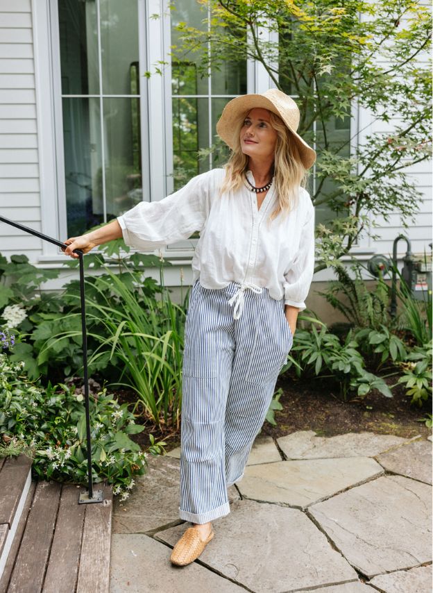
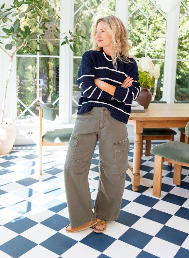
Twill Baggy Barrel Cargo Pants: 10/10 on these pants. Comfortable, Cool. Great cut. I’ve been wearing them non-stop.
CashSoft Chunky Beanie: A really affordable chunky beanie in a great shade of gray (comes in red, too).
2-Eye Lug Sole Boat Shoes: I tried on many others that were itchy or rubby on the inside, so these are the softest for sure. They are lightweight and so, so comfortable.
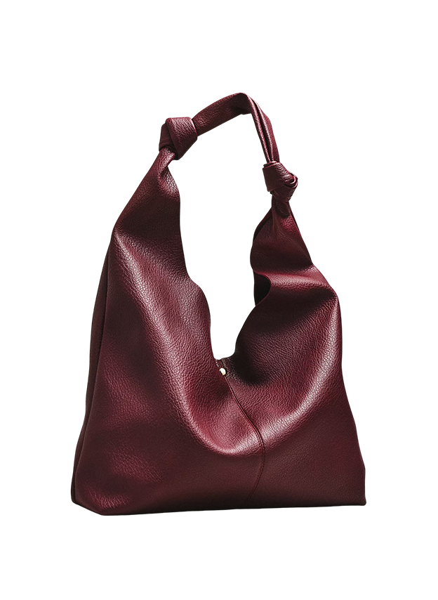
Love Knot Slouchy Bag: So easy to throw everything (including a laptop) in here. Great color and casual vibe (but easy to dress up).

Donegal Fair Isle Sweater: So beautiful, high quality, and great for all of winter (very Après!).
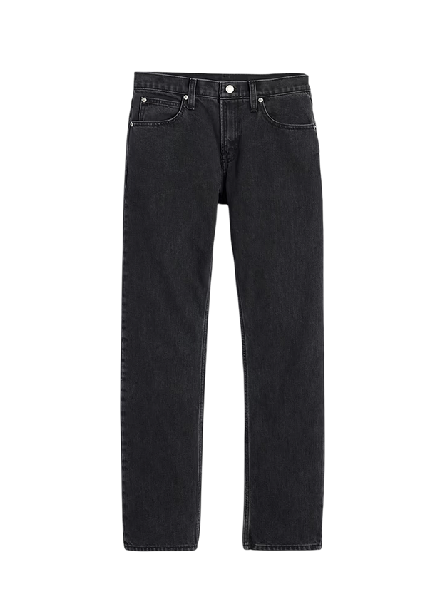
Mid Rise Straight Taper Jeans: Such a cool, trendy cut that has the perfect mix of a little stretch but mostly rigid and contained.
Saltburn Knit Beanie: LOVE this. The generous proportions make your head look good (versus a really fitted one that I don’t love on me).
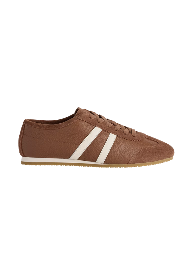
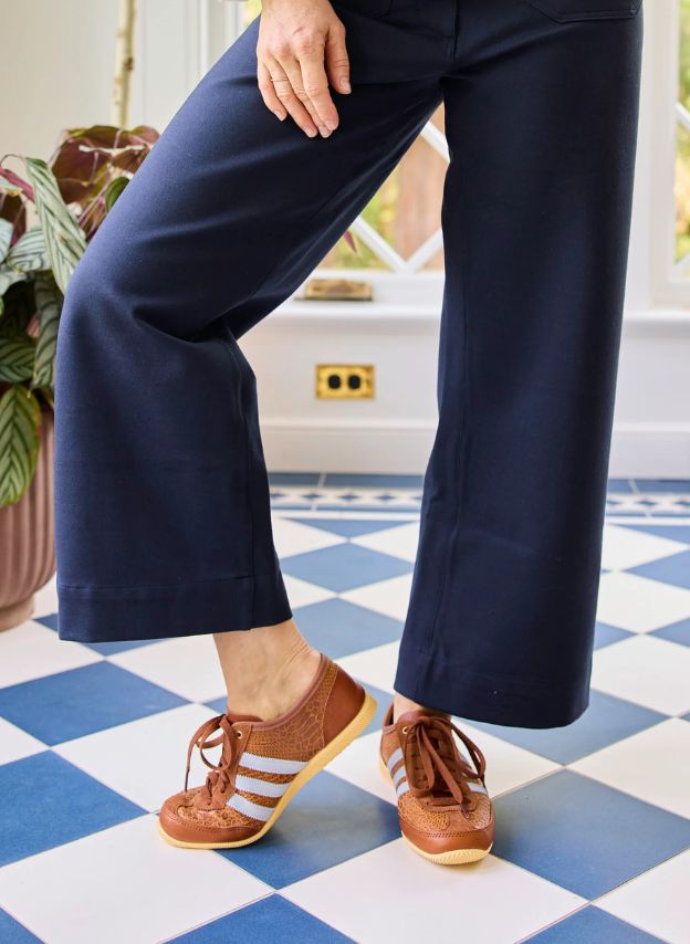
Italian Leather Street Sneaker: I wear these ALL THE TIME. They look great with dresses, even.
Fair Isle Sweater: Soft, drape-y, and thick (but not stiff). Great for fall through spring, inside or out.
Striped Cashmere Sweater: So soft, boxy in the best way, and drapes perfectly. Just how I like them.
Cashmere Oversized Sweater: It looks basic, but it’s so soft and perfectly cut. I pack this for most trips because it’s oversized and layers over easily but isn’t long (and thin enough you can still 1/2 tuck). So soft. 10/10.
The Arden Crewneck Sweater: Great dropped shoulders and roll neck, not to mention the perfect color palette. Consider sizing down. This comes in a lot of other colors now, some that feel way more “holiday” if you are into that!
Fisherman Cropped Cardigan: It was an enthusiastic “HELL YES” when I put this cardigan on. It looks extremely expensive and totally classic. I wear it all four seasons, with and without shirts underneath.

Wesley Plaid Long Coat: THIS COAT IS IT. A fantastic pattern, with big pockets, a fun hit of blue, and a great lining. This is an outfit all on its own, and I feel like it takes any basic outfit and turns it up to 11.
CashSoft Chunky Beanie: A really affordable chunky beanie in a great shade of red (I like how my face looks in chunkier beanies).
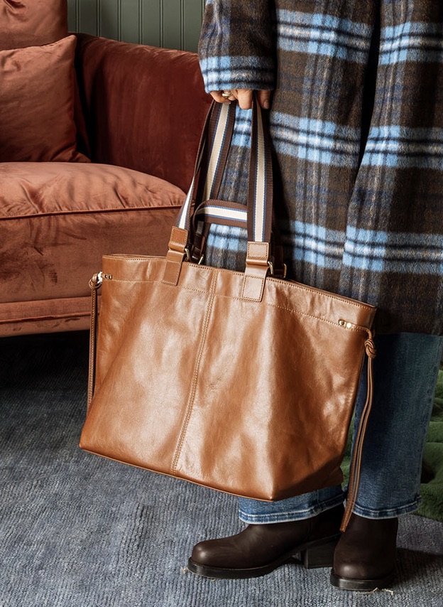
Teagan Leather Varsity Tote: I LOVE THIS. The leather + stripe is cool + elegant, and the generous proportions make it a great everyday bag or a carry-on.


Plaid Brown Jacket: An overcoat that is sooooo beautifully tailored. The colorway is stylish, while still being subtle.
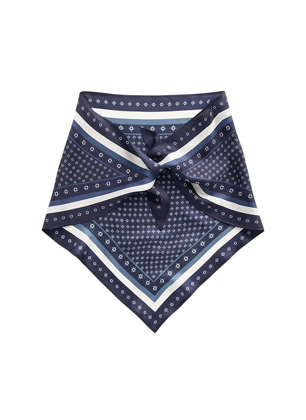
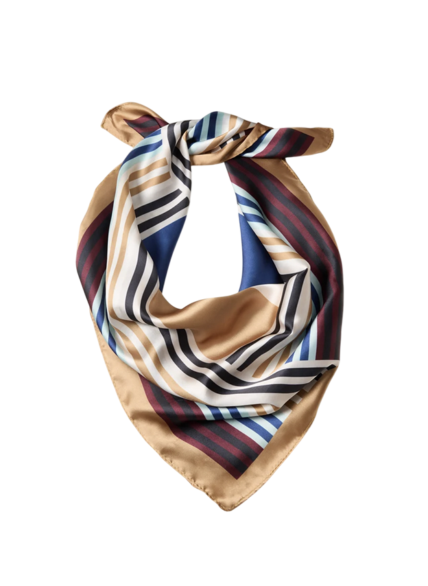
Amber Geo Bandana: Beautiful silk bandana in a perfect colorway.
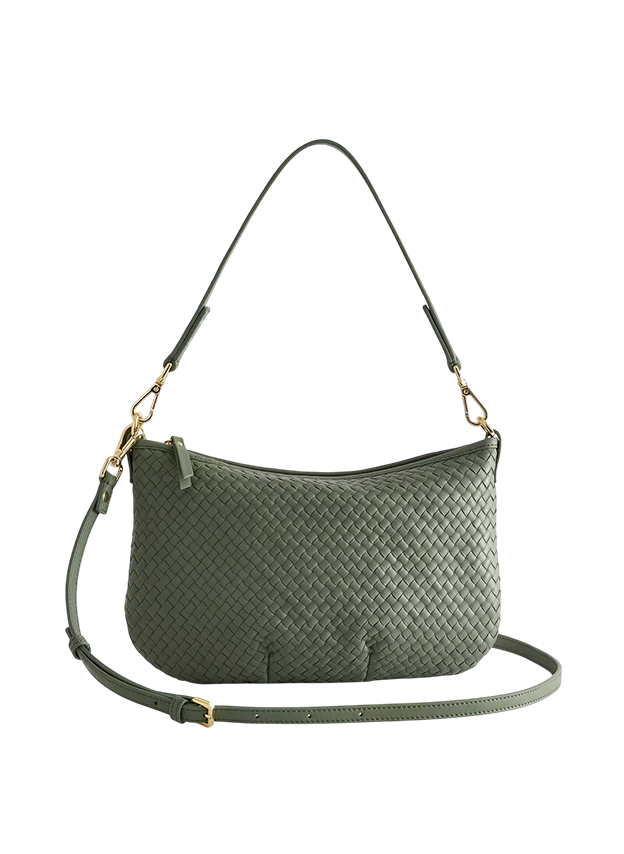
Handwoven Mini Shoulder Bag: Giving Clare V. for sure (but 1/3 the price). Has multiple straps for different wearings.

Robbin Jacket: A beautiful, high-quality everyday coat for three seasons. It’s even easy to layer over sweaters, and the color works so well with blues, and burgundies (and creams, greens, blacks – I love ochre so much).
Scallop Knit Triangle Scarf: New trend, and I’m here for it. This color is so good, and the edges have the cutest scallop trim.
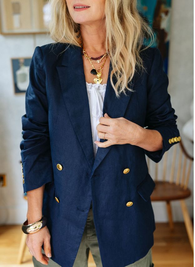
Relaxed Double-Breasted Blazer: It’s lined, structured, and has the richest color (not dull) with a roomy shape that is still flattering (so it’s easy to layer under).
Gaia Jacket: This looks so luxurious and high-end (and therefore a great gift). Sign me up.
Denim Chore Jacket: It’s a fantastic cut, lightweight (for denim), and has a nice structure without being too stiff and uncomfortable. Just really easy to wear.
Keep Your Cool Liner Jacket: Lightweight and for a brisk morning in the fall, it’s actually perfect.
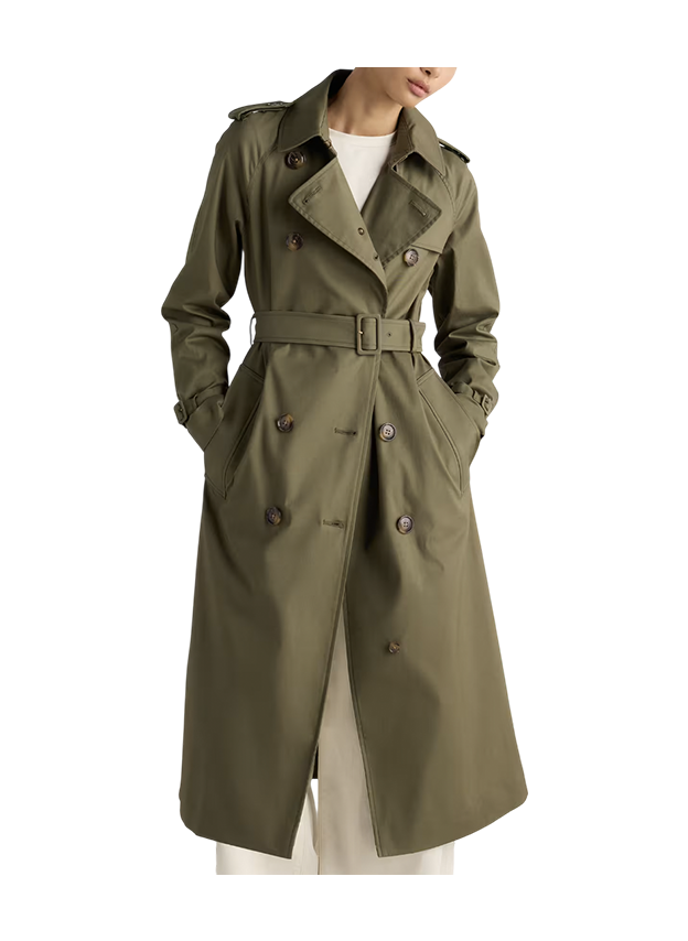
Comfort Stretch Trench Coat: It’s just perfectly classic, not being too bulky, and drapes really well.
Packable Puffer Jacket: Easy to wear and just so cozy. Packs itself into its own pocket and comes in a lot of colors.
Bella Stretch Wide Leg Jeans: The wash is so good. The shape and color are excellent. And for that price? Incredible.
High Waist Straight Leg Jeans: They are fantastic. Comfortable, flattering, and that perfect wash and hem length. I feel GREAT in these.
Mid Rise Straight Taper Jeans: The cut is the perfect taper that feels on trend, not dated.
Mid Rise Relaxed Flare Jeans: These are my new favorite jeans for when I want to wear some heels and feel cute.
Low Rise Loose Jean: Obsessed!!!!! Cool and flattering (and not too low-rise, I promise). Hailey Bieber designed these with the Gap, and they are flying off the shelves.
I believe in comfortable pants, even more than a good pair of jeans (sorry, I’m 47!!). When they are good, they are good and can be dressed down or good for work. These three were my favorites of the year, hands down.
Family Cargo Pant: The best cut for that casual Sunday farmers market vibe (you know what I mean). I have them in blue and green.
Twill Baggy Barrel Cargo Pants: 10/10 on these pants. Comfortable, Cool. Great cut.
Baggy Cargo Parachute Pant: WINNER WINNER CHICKEN DINNER. They are so lightweight but still structured enough to be really flattering (cut to give a nice gap between the legs). I love that they have pockets (great around town and for house-cleaning pants because I keep my phone in the pockets while listening to podcasts).
Western Chelsea Ankle Boot: The pointy toe and chunky heel look so good under jeans. I wear these all the time because they edge up any outfit just enough.
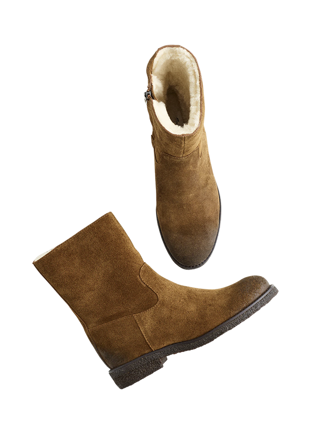
The Archival Ankle Boot: Beautiful suede and sherpa lining. So cozy and chic.
Comfortable Western Bootie: Western, but make it SO COMFORTABLE. Korkease FTW, forever. These weren’t out when I did my comfortable boot roundup, or they might have won second place. I wear them with dresses, too.
Leather Tall Kitten Heel Boots: My favorite boots of the year. Comfortable, cool, not too high of a heel. Leather is so high quality, and that color is so pretty. Please make in other colors!
Pikolinos Medina Chelsea Boot: Undeniably the most comfortable bootie with a heel I’ve ever owned. So lightweight and flexible. I wear them all of the time and think they are worth the price 100%! I can literally run in them as if they are sneakers.
Leather Block Heel Boot: A high-quality kick-it-around boot for the prairie. A bit heavier (so a heavy pack) and super long-lasting. Just extremely good quality leather.
Suede Waterproof Velma Boots: These boots are so beautiful and waterproof! So they are perfect for walking commuters and a great non-heel option in general.
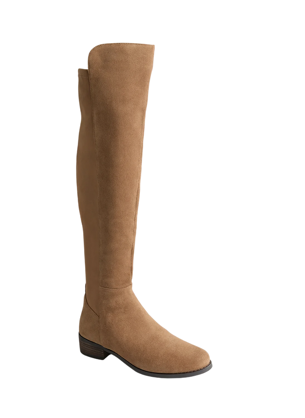
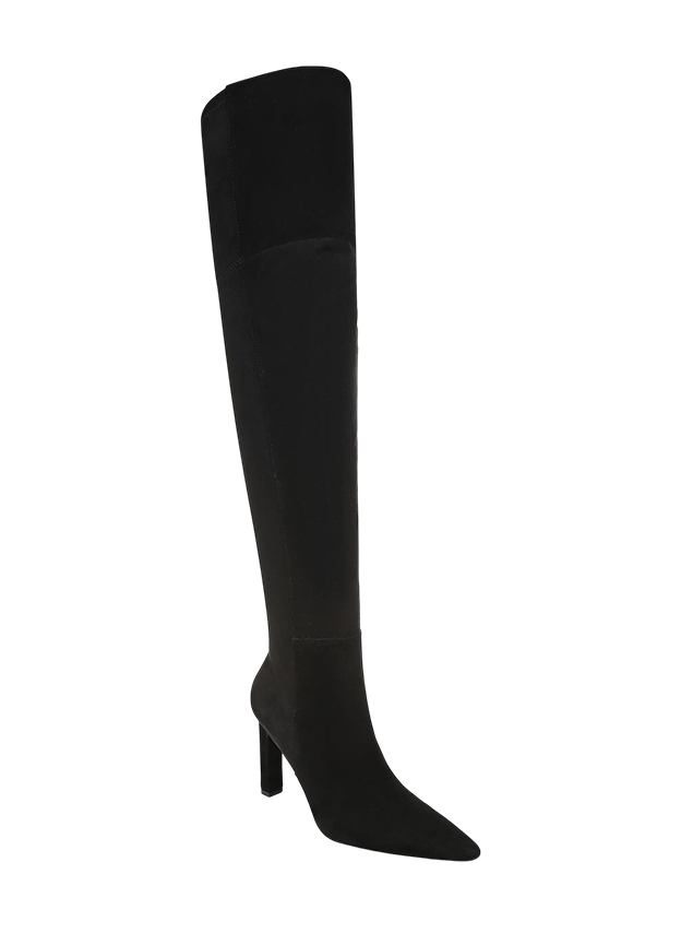
Corine Over the Knee Boot: You are about to see these all over the blog. I LOVE THESE, and they make so many cute outfits. GREAT.
I believe in cute, comfortable, stylish sneakers more than the next person. I have a solid inventory that makes most of my outfits work while being so comfortable.
New Balance Sneakers: I couldn’t decide between the brown and powder blue. Comfy as hell.
Womens Acorn Trainer: If you like sneakers that have a little bit of a lift, these Seavees are my favorites.
Moon Shoe Essential Sneaker: I love how graphic and simple these are. It will edge up any outfit.
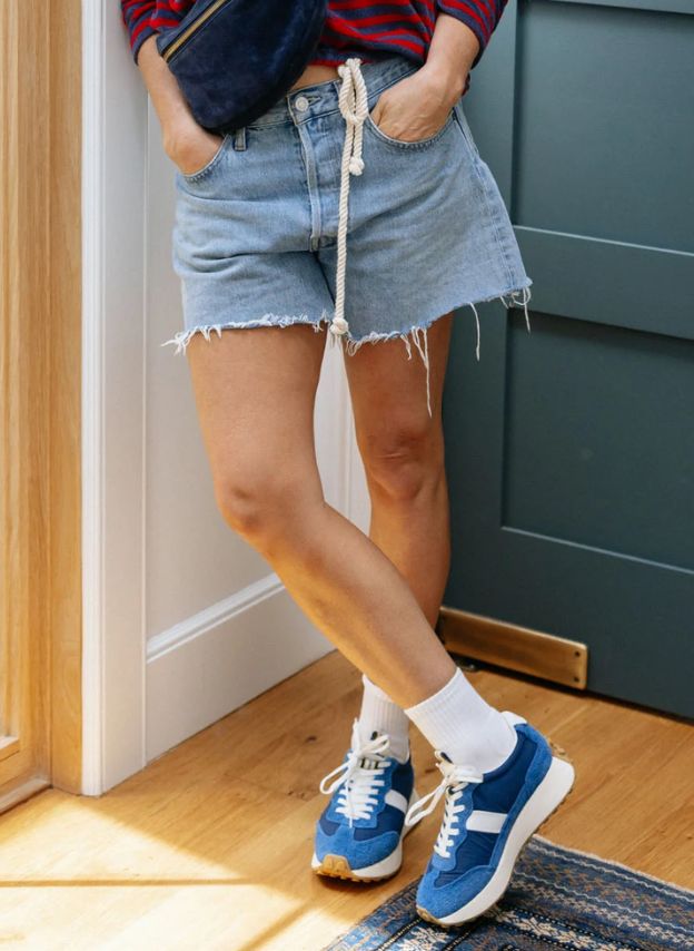
Low Profile Sneaker: Somehow works with everything – even dresses. I wear these all the time when I want to look casual but elevated.
Japan Low Top Sneaker: Sambas are cool. In leather, they are even cooler. Somehow these go with everything.
Back 70 Rocket Sneakers: Oh man, I love these in every. single. color.
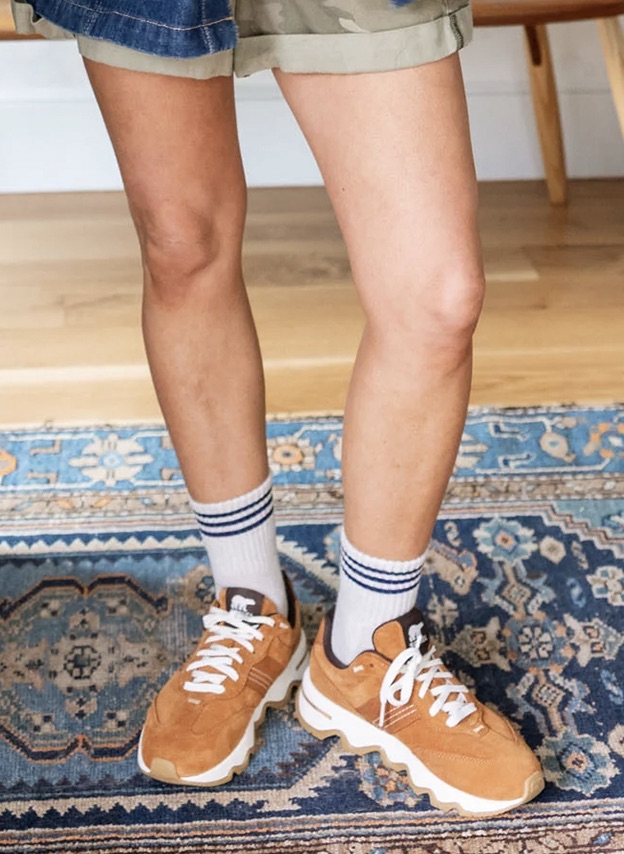
Kinetic Ember LX Sneaker: These SOREL sneakers are both cool and extremely comfortable.
While I’m not a big handbag lady (yet), I like particular bags for certain nights and mostly just have my go-tos that tend to work with everything.
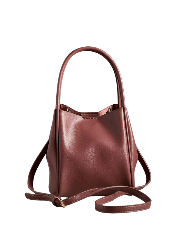
Hollace Tote: So versatile and comes in so many colors. I wear this almost every day (in burgundy). So easy to throw my phone and wallet in, and it’s the perfect size.
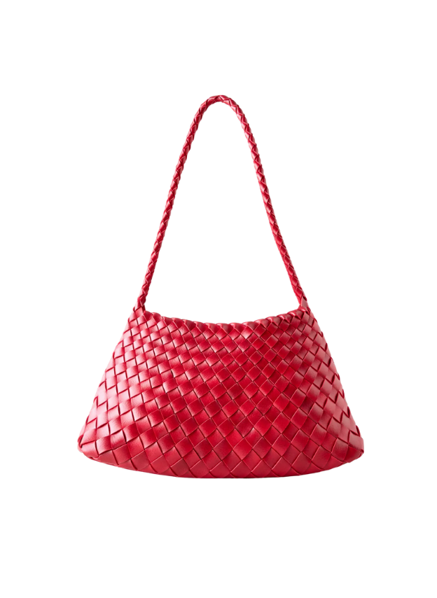
Woven Shoulder Bag: Love the woven look! It also comes in other colors, but the red and cobalt blue are SO GOOD.
Italian Suede Sling Bag: LOVE THIS. Like Clare V. but way more affordable. I have used and abused the hell out of this belt bag.
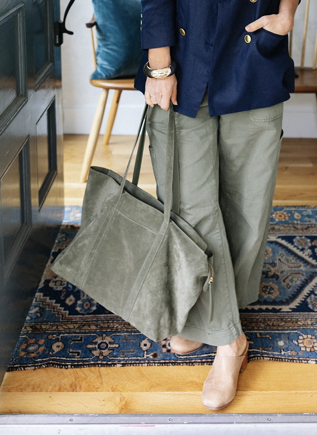
Miranda Suede Slouchy Tote: Such a great and pretty bag! It’s high-quality, fits my laptop plus everything else I need. Oh, and it has an internal pocket and zips closed. 10/10
Teagan Leather Varsity Tote: My new cool day bag when I need to schlep around a decent amount. The stripe and the leather create such a cool texture contrast.
Croc Crossbody Bag: The texture, color, and shape – all classic but with a fresh twist. Feels high-end in a cool way. Oh, and this has a purse within a purse – a really cute zipper pouch that has a long cross-body or shoulder strap. So it’s kinda like 2 purses in one!
Handwoven Mini Shoulder Bag: Giving Clare V. for sure (but 1/3 the price). The real thing has a richer, darker green that I love (get the real thing if it’s in your budget, but this is a fantastic version for much less, too).
Love Knot Slouchy Bag: So easy to throw everything (including a laptop) in here. Great color, casual vibe. The scale is so good, and the comfort of the strap feels so easy and nice on the shoulder.
CashSoft Chunky Beanie: A really affordable chunky beanie in a great shade of red and also gray.
Saltburn Knit Beanie: LOVE this. The generous proportions make your head look good (versus a really fitted one that I don’t love on me).
Chunky Ribbed Beanie: The perfect amount of chunky in the way that makes me feel cool and stylish.
Striped Triangle Scarf: All the style without any bulk. I LOVE this new trend.
Scallop Knit Triangle Scarf: Another one, but it’s a little bigger for more warmth, and I’m here for it. These colors are so good.
100% Oversized Silk Scarf: The colors are so pretty (and get it on sale). I love even just putting it on my bag.
Amber Geo Bandana: Beautiful silk bandana in my dream color. Perfect for fall but not so autumn that you couldn’t wear it all year long.


I’m not a big jewels and gem lady (yet), but I love stacking, especially to dress up my more casual clothes (it works!). So now I have a decent inventory that is easy to throw on to look cool. I think all of these things look cool layered, and individually are great affordable gifts.
Whistle-Pendant Necklace: Buy this for a lady in your life to keep them safe (but still pretty). We all need more going-out whistles!
Layered Necklace Set: They did all the work for us!! These three look great together and add a little bling.
Antique-Token Charm Bracelet: A fantastic gift for any jewelry lover who likes to layer. So playful and charming (and oddly fun to wear).
Knot Bracelet: Simple and minimal on its own, fantastic in a stack.
Delicate Faux Diamond Bangle: So pretty and still affordable! Perfect to layer with chunkier bracelets.
Braided Metal Watch: Watches are back! I love layering this with more delicate bracelets.
Hinge Bracelet: Chunky without being too big. Layers fantastic with thinner bracelets and anchors the stack.
Rounded Bangle: A pretty shape and great addition to the stack while being a great minimal bracelet on its own.
I like adding one crystal or beaded stone necklace in with the gold when I want to dress it down a tiny bit. The contrast and combination of the gold + beads create the look I love.
Semiprecious Stone Necklace: I layer these daily with gold chains, and it grounds the whole collection.
Rainbow Stone Necklace: In a neutral colorway, this looks good with everything (add a gold chain to round it out). This one is in the colorway Dune.
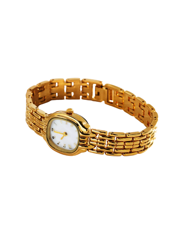
Round Gold Watch: Yes, analog is back. Layer with bracelets for the full effect like I did.
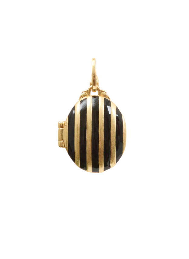
Gold Striped Locket: I’m asking for this from Brian!! A locket, but make it striped (and cool). He was grateful for the assertive hint

It’s not that I take pajamas seriously; I just think they are so important to ending (and starting) your day. Like making the bed for your body. But I’m very specific and mostly wear the Gap below, but when on a girls’ trip or with Brian I might have a cuter set that is still comfortable.
Neela Pajama Top: I call these “vacation pajamas”. Perfect for couples retreats or girls’ trips because they have a little more style, pattern, and color (and still so soft)
Neela Pajama Shorts: Matching pajama shorts – size up if you don’t want them to be too fitted; I’m wearing a medium.
Australian Shearling Slipper: Such a great gift. I can’t tell the difference between these and the Ugg original.
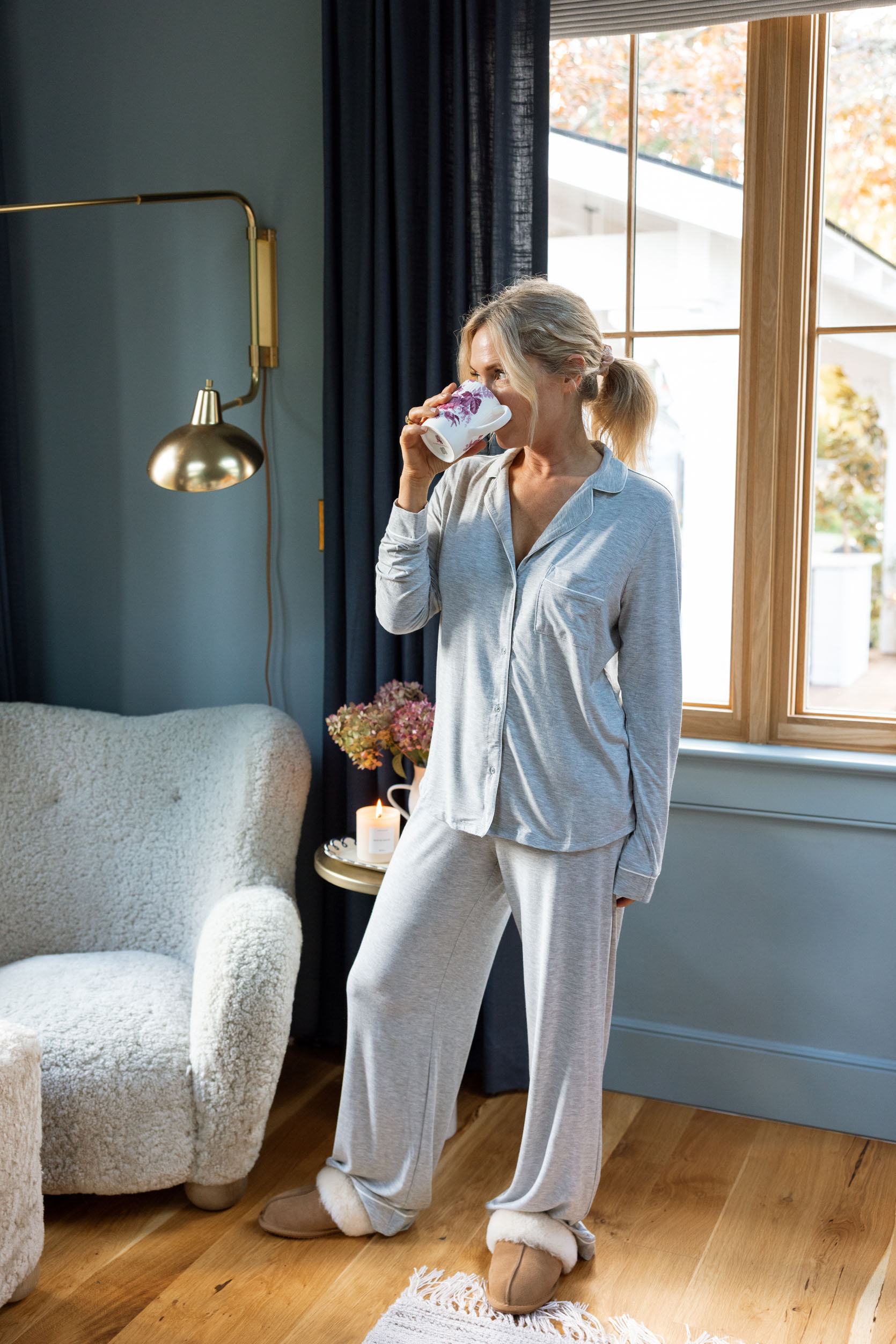
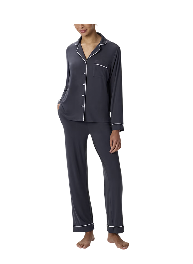
Warning: you will search and search for this set every night and not want to get into bed unless they are on your body. So just buy yourself some backups while on sale (I recommend four matching sets). These come in shorts and different top styles, too. It’s the fabric that is magical (but the fit and drape are perfect, too).
My Favorite Pajama Top: So unbelievably comfortable, soft, thin, feels like you are wearing nothing but doesn’t get tangled.
My Favorite Pajama Bottom: Thin, doesn’t cut in, breathable. True to size (I’m wearing a small and it doesn’t cut in at all). These won my pajama review a few years ago, and I just refreshed after years of wearing.
Bamboo Jersey Pajama Set: These are great, a little thicker and warmer than my other favorites from Gap.
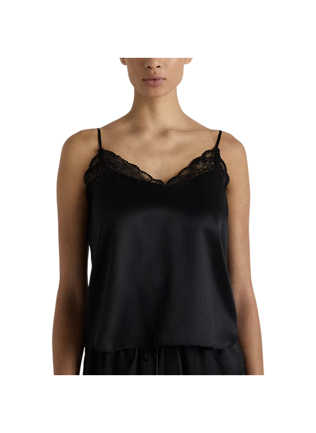
Washable Silk Lace Cami: How pretty, and for silk, it’s way more affordable than its competitors.
Washable Silk Pajama Shorts: To complete the set/look. I haven’t tried them but read reviews, and they claimed it didn’t cut in (and was TTS).
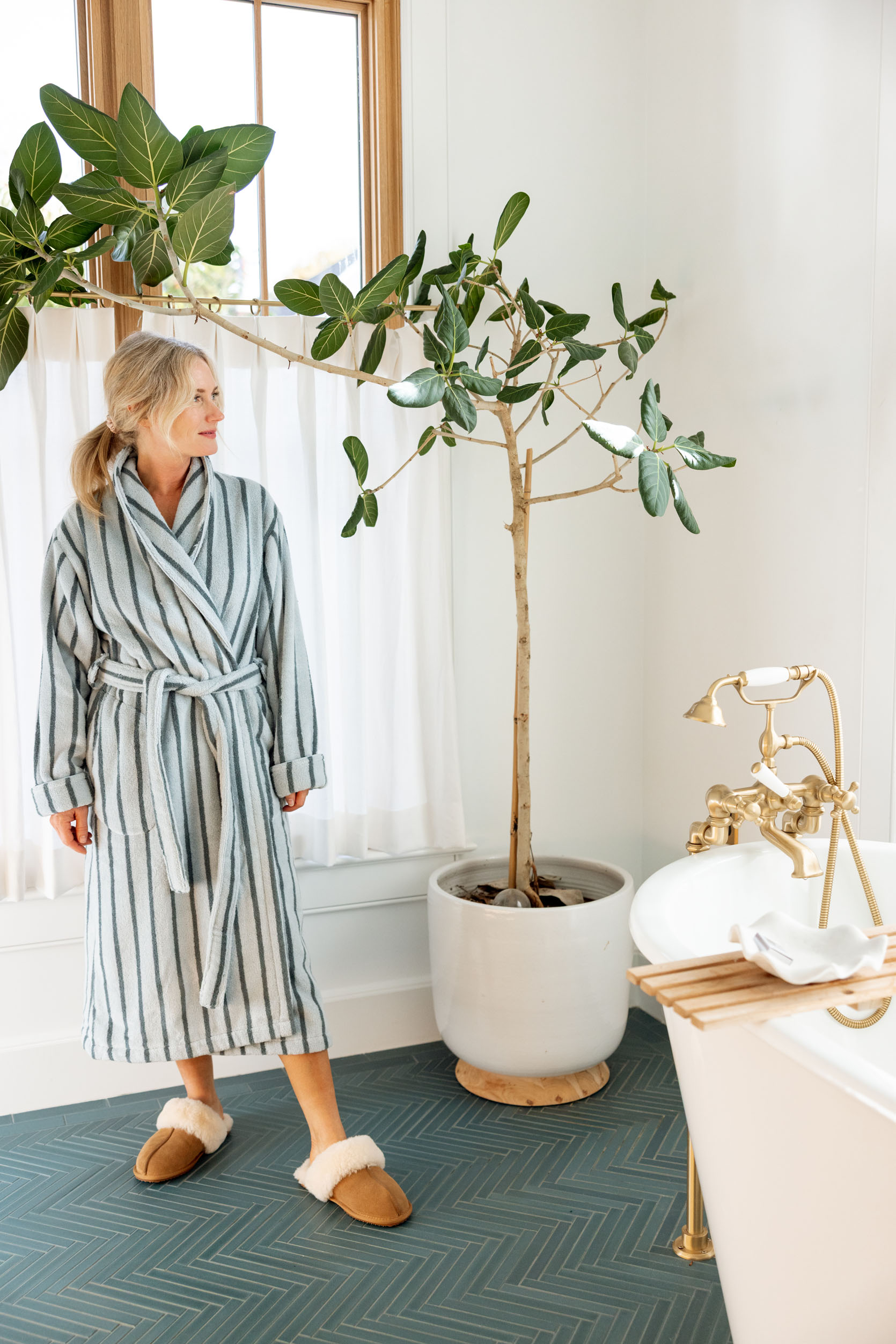
Super-Plush Robe: I love a terry cloth robe for post-shower, but appreciate a pattern to make it more fun. Brooklinen has a ton of patterns and colors.

Mongolian Cashmere Robe: A great gift for cozy mornings and feels luxurious, while just being something so simple. Best worn over a tank (or nothing at all) so you can feel how soft it is. I’ve never had a cashmere robe before, and I believe that they can be really expensive, so this one (while still up there) might be worth the investment at a lower price point.
Australian Shearling Slipper: Such a great gift. I can’t tell the difference between these and the Ugg original, and these are much less expensive but look and feel the same.
Ugg Tall Boots: I can’t do winter without these. I wear them mostly inside because I work from home, all day long. LOVE.
Sheepskin Ankle Boot: A great house slipper that has a nod to moccasins.
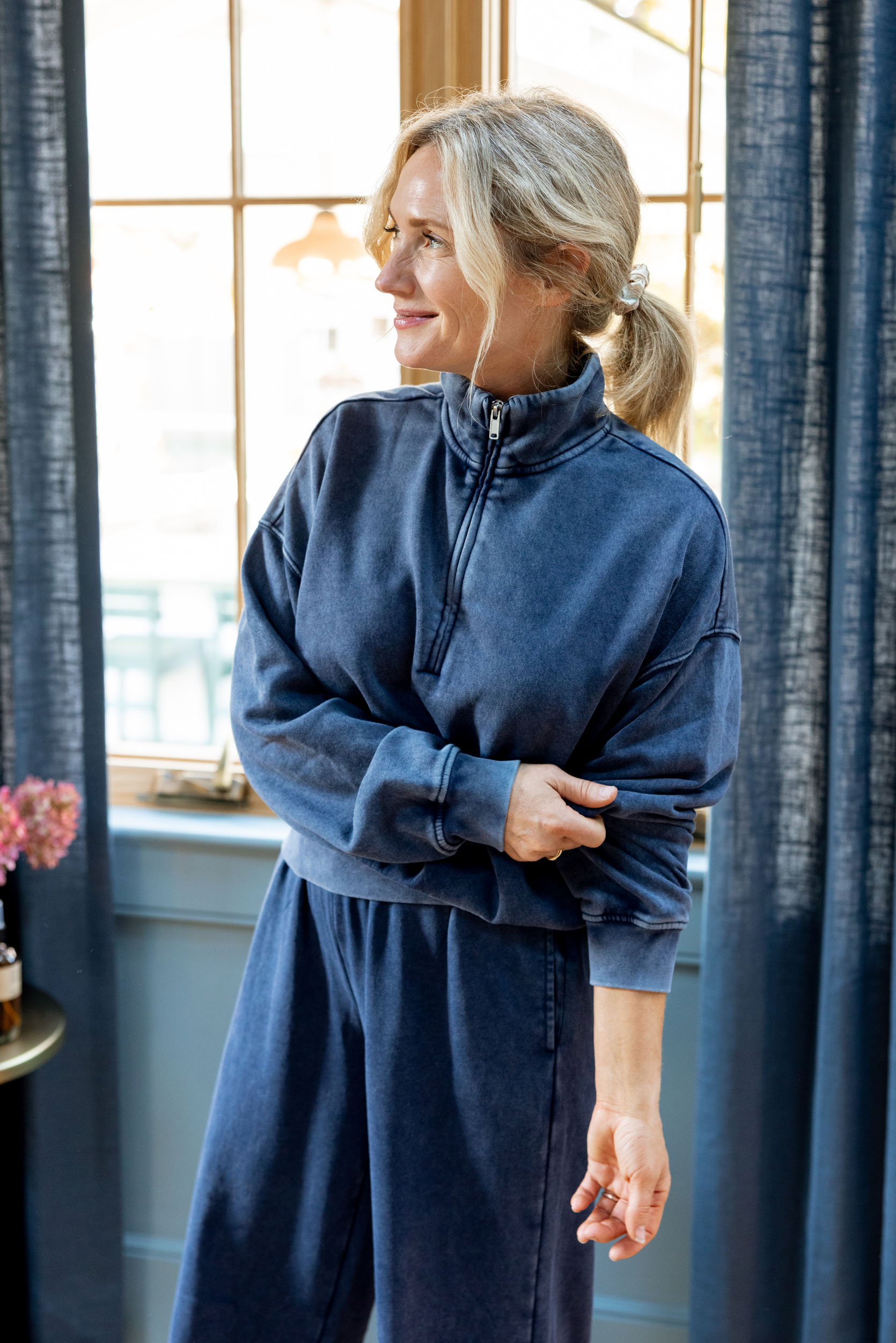
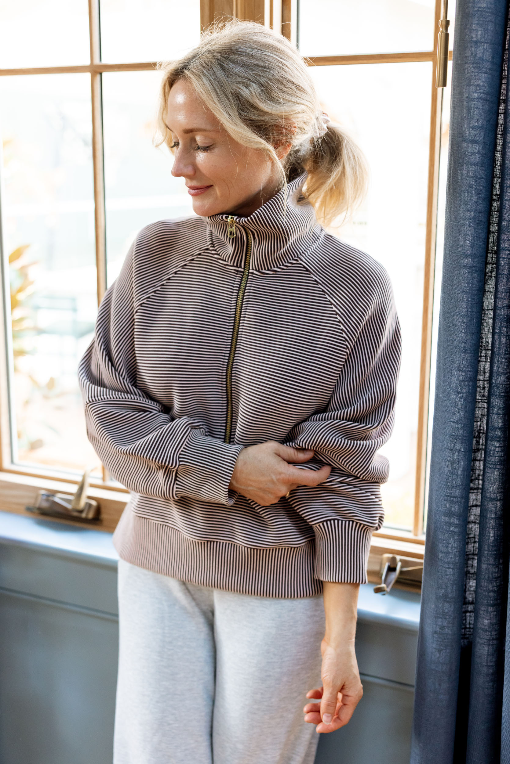
This section ended up way bigger than I thought it would, which makes sense since I work from home in a rainy, dark part of the country (in the winter), so comfort is extremely important.
Soft Half-Zip Wedge Pullover: The perfect vintage-washed navy blue in wide-leg or sweatpants. It comes in a lot of colors and is usually on sale. Go get these!!
Milano Half-Zip Sweatshirt: I love this colorway and pattern so much. Boxy and flattering. These keep selling out (and they aren’t cheap!), but the cut and style are just so good.

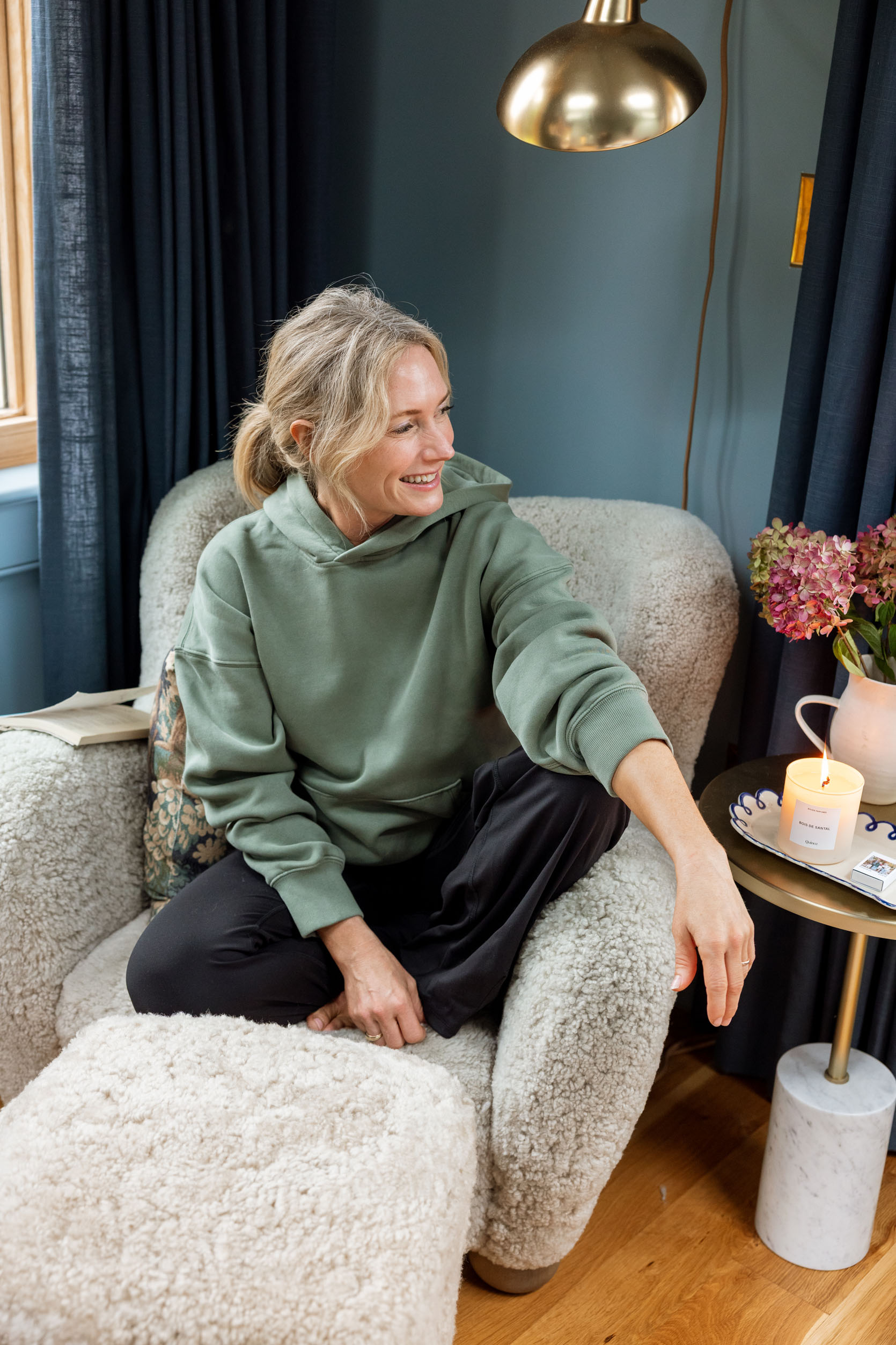
Hawley Half Zip Sweatshirt: 100% worth the splurge. Double knit soft fabric that drapes perfectly. I’ve had this for years, and it has washed perfectly over and over. Feels brand new, and I often don’t even have to wear a shirt underneath it – it’s that soft.
Sunday Popover Hoodie: Viral for a reason – so soft on the inside and still lightweight. Brian has this in men’s, my kids have it in tween sizes. The inside is just so stinking soft, and it’s really lightweight so you can just wear it all day every day.
Vintage Style Zip Hoodie: The perfect wash and cut for the 70s vintage vibe.
Trumpet Long Sleeve Top: Definitely more on the fashion side of sweatshirts (the shoulders and arms have a good volume) with a sportswear edge. I sized up to a medium!
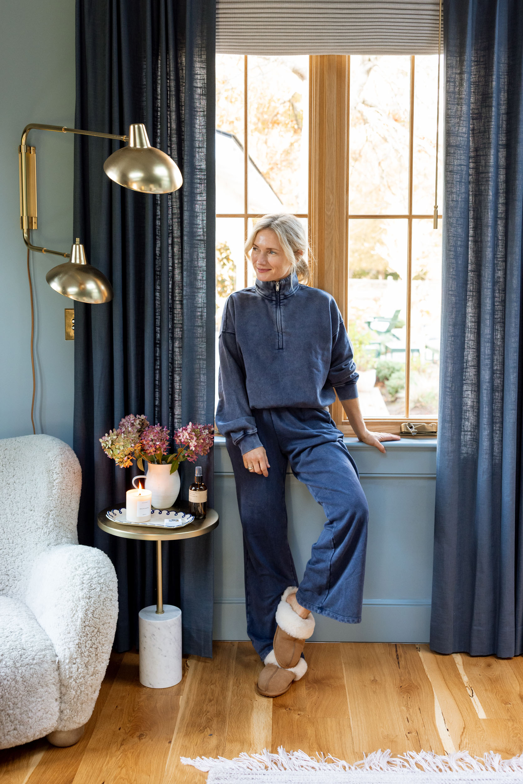

Mid Rise Loose Sweatpants: Make it a set with the quarter zip. So great around the house but also for travel. Again, the vintage-washed color is perfect.
Fleece Wide Leg Pants: So soft (and on trend). Wide-leg grey pants are very in right now; ask my 11-year-old daughter!
Quick Step Bubble Pants: Flattering and so comfortable, without being just skinny.
High-Waisted Cotton Leggings: These are so comfortable I bought 5 pairs in different colors. I wear them most days, and I love how non-compression-y they are.
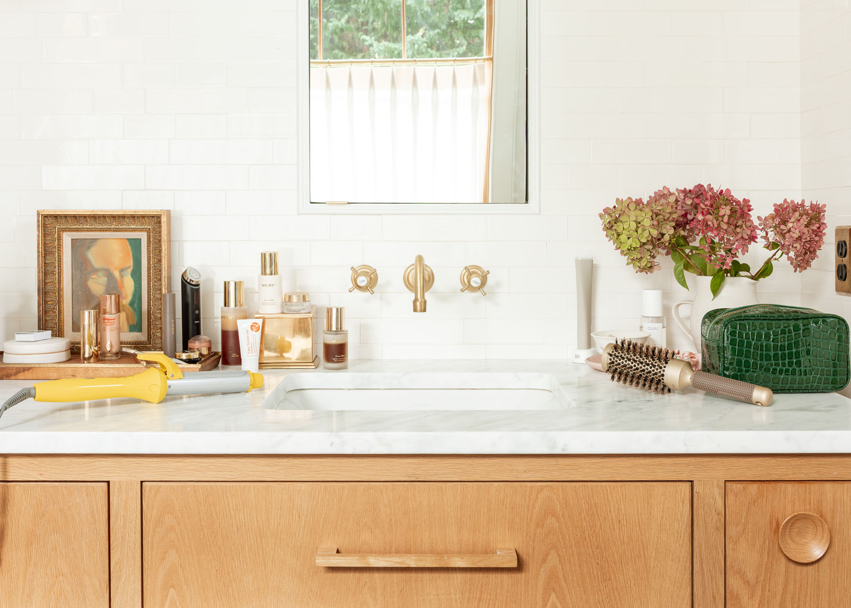
Listen. I’m not a beauty influencer, so if you want someone who has tried all of the things, I’m not it. I try things out, find what works well, and I stick to it. Every now and again, new technology or a new product usurps an older one, but don’t think I’m not as much of a sucker for all the “chasing youth” influencing as everyone else. But if you want to know what I know and love, here goes.
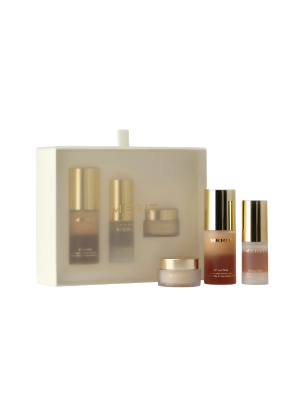
Merit Gift Set: This just came out and was sent to me, so I tried it. I LOVE IT. I went through this and immediately bought the full-size bottles. The double cleanser feels both foamy and moisturizing, then the glow serum and night cream (which technically isn’t even out as a full size yet, which is a BUMMER). This gift set is such a good gift, y’all. Feel free to send it to me!
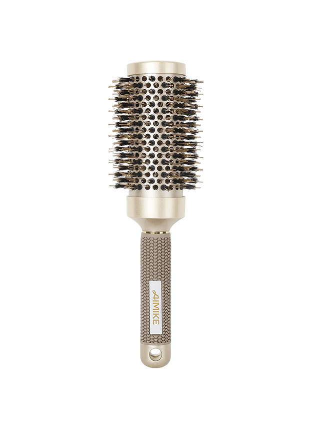
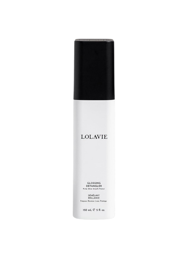
Blow Out Brush: A fantastic $14 blow out brush. I was influenced by this one, and it has made such a difference in my frizz during blowouts. I’ll take 3!
Anti-Frizz Shampoo: So great for those of us with frizzy hair.
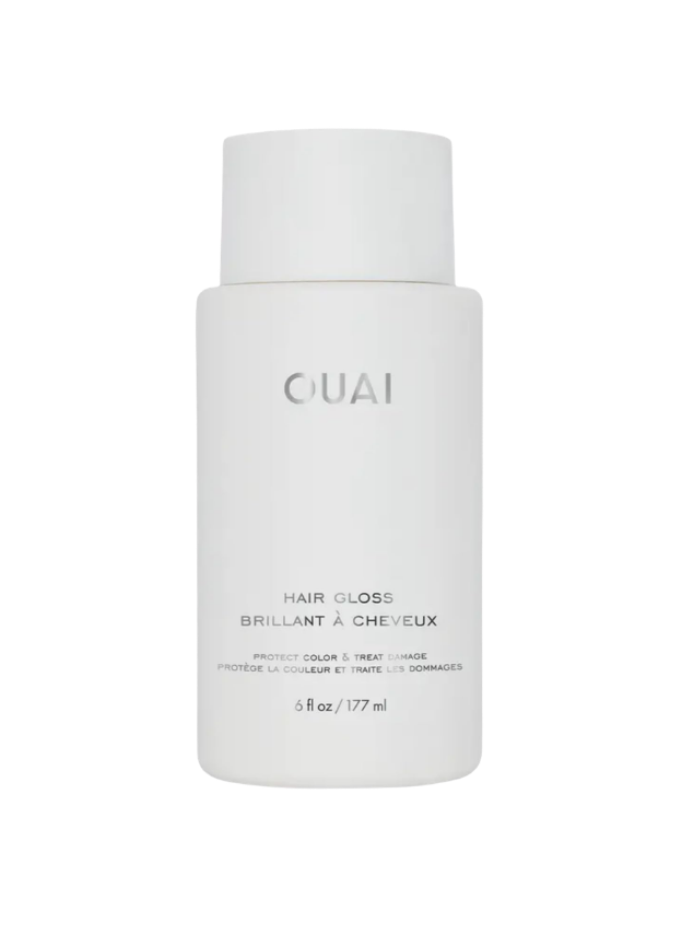
Ouai Hair Gloss: I’ll do anything for shiny hair, and this one has really great reviews.
Briogeo Scalp Revival Mask: I have extremely dry scalp, and when I do this monthly, it clears it all away.
Ouai Hair and Body Mist: Marlee got this for me, and I spray it every time I leave my bathroom on my hair. Smells SO GOOD!!
Nutrafol: You’ve heard of it. It’s a commitment, and it totally works.

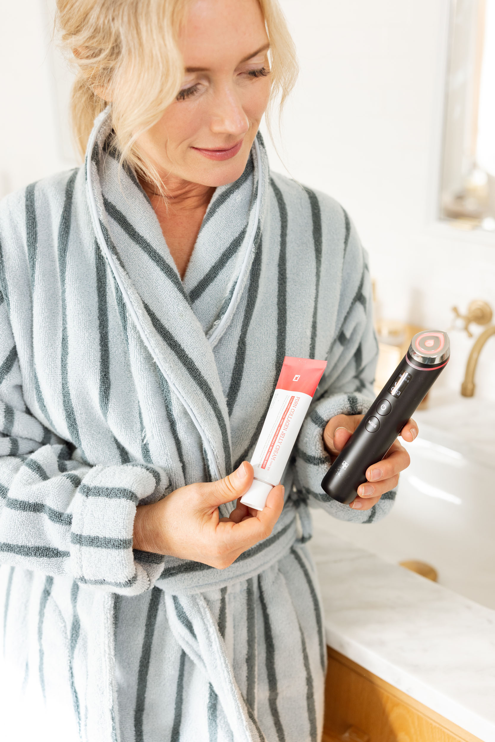
As far as gadgets go, there are only a couple that I’m super into. This collagen-boosting wand is easy to use (it times out when it’s over; 3 minutes has a lot of settings and feels effective). I always notice a glow (you have to use serum, and I use Medicube). It feels both topical and sub-dermal, with immediate and long-term effects.
Medicube Red Light Wand: I look glowy for hours after I do this (and so easy to use even once a day).
PDRN Collagen Gel: I go through this in 6 weeks and immediately order another. Glowy, plump skin.

DermaFlash Peach Fuzz Remover: Hands down a necessity for me in perimenopause. The peach fuzz is out of control (I blame it on the Nutrafol, lol), but no facialist will dermaplane anymore, so I had to take matters into my own hands. This makes a HUGE difference in how it looks, feels, and how moisturizer, serums, and makeup go on. It was a one-time necessary purchase for me.
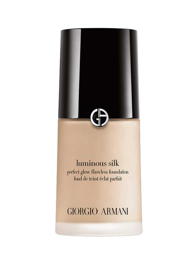
Armani Luminous Silk Foundation: The best foundation for those of us who need long-lasting, moist coverage that isn’t thick. I’ve been wearing it for 16 years.
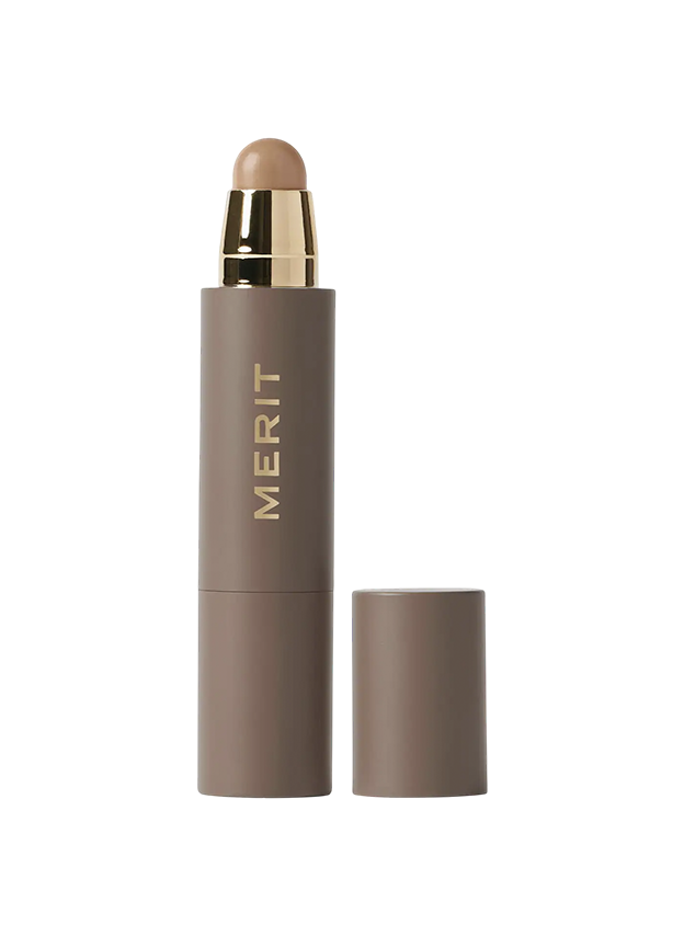
Merit Concealer: Such great coverage under the eyes (and around the nose), without feeling thick.
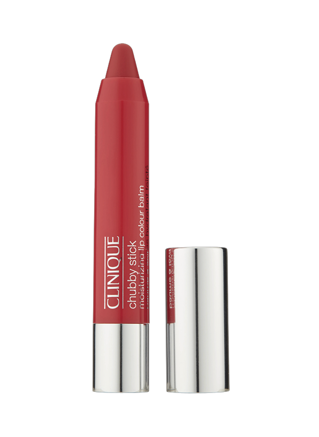
Clinique Chubby Stick: Still haven’t found anything better for everyday, easy-to-wear moisturizing lip color (no mirror needed).
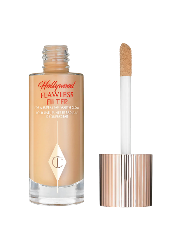
Charlotte Tilbury Highlighter: Three dabs on cheekbones and one on the tip of your nose. Done.
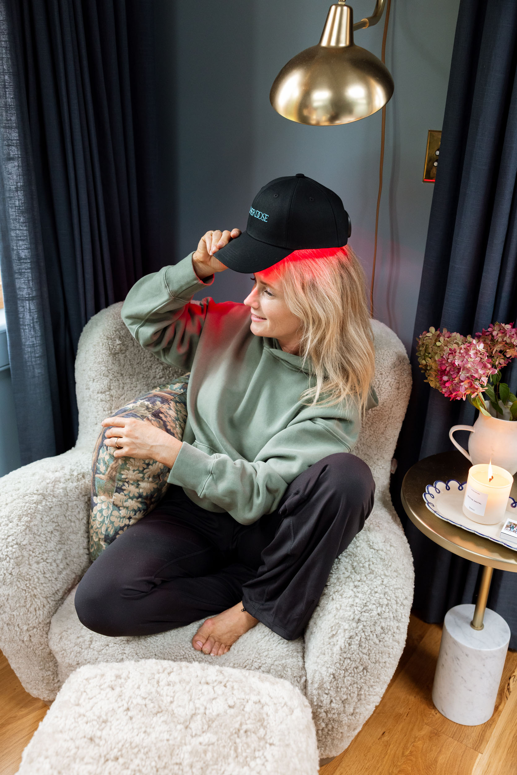
Red Light Therapy Mask: If you use this consistently, it makes a noticeable difference. I have started using it while I do my gratitude meditation (on the days I’m not a scrambled mess, lol).
Sauna Blanket: Listen, it’s not for everyone, but it’s such a fun hack to do while watching TV. Mood-boosting and great for heart health.
Red Light Hat: I got this in 2024 – so easy to wear while I work from home, and it really helps with my hair regrowth. Brian can wear it, too. We both like that it’s relatively discreet (I wish they took the branding off the front, and then it would just look like a hat!).
Infrared Sauna Blanket: I’ve had mine for years, and I still love it. Listen, it’s not for everyone, but it’s such a fun hack to do while watching TV. Mood-boosting and great for heart health.

My Favorite Weighted Vest: I don’t stray from this weighted vest (there are a ton of brands, but don’t let them fool you – you don’t need more bells and whistles or to spend a lot of money). I don’t love the adjustable ones because I don’t like to lose parts, so it’s almost easier to just have two different weights…which I do:)
Wireless Running Earbuds: Stays in my ears and has such a long charge (I can binge a whole audiobook!).
I clock a lot of miles, and my main objective is to not have to think about what I’m wearing while on the walk. So I choose comfort over performance wear, and have shoes and jackets that meet all my weather and pocket needs (while being so easy to throw on). It’s not high fashion; it’s a long-ass walk to feel good.
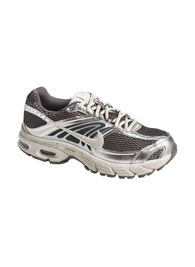
Air Max Moto 2K Sneaker: Listen, they are just unbelievably comfortable for long walks (or days of house and yard work). The cushion is incredible.
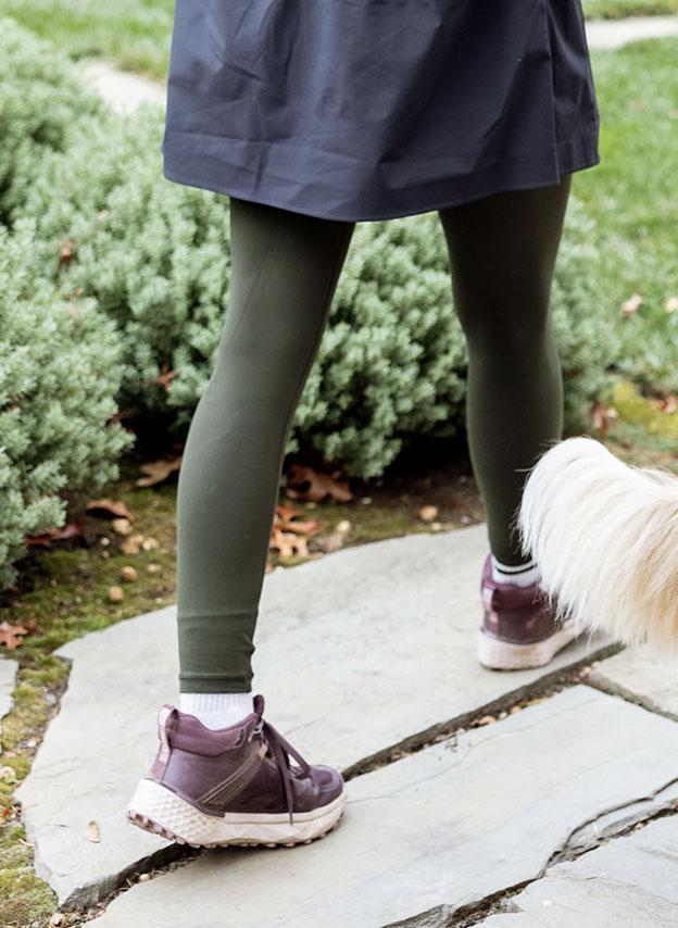
Konos TRS OutDry Mid Shoe: 4 years strong! They come up high enough that I can walk through wet grass without getting my socks wet, and they keep my feet warm in the winter. 10/10
Well, that was long!!! And I have so many more things to share, but I had to call it here, and you’ll find way more over on the shop page where it’s easy to scroll, and if something catches your eye, hopefully it helps with your gift shopping this year. xx
*Photos by Kaitlin Green
]]>I believe this is my third time writing about one of the best flea markets…Downtown Modernism. Because of that, I won’t bore you with all of the details; aside from that, it’s in Los Angeles, only happens twice a year, is the perfect size, and the vendors primarily sell mid-century-era goods. For me, this is total heaven. Here’s the current problem: I don’t need anything. The main spaces in my home are done, and since my boyfriend went out of town the morning of the market, I couldn’t even attempt to convince him to get things for his home. However, my dear friend Franchesca needed some art, and I clearly needed to be an investigative journalist and show off all of the things that caught my eye for this vintage-loving community (spoiler alert: I didn’t leave empty-handed. I’m sure “no one” saw that coming).
But there is one thing a professional investigative journalist does…they come prepared. I did not come prepared. Despite Franchesca and me being avid flea market lovers, we did not bring any cash. Not the biggest deal, as most markets have ATMs. But there is a $10 entrance fee, and their ATM had not arrived yet. We felt like idiots. Nothing like getting your butt up to get there at 7:45 (which was a little later than planned) to then get to the front to be understandably told, “Sorry, ladies. You can see if someone in line has extra cash, and then you can Venmo them.” As we were trying to figure out what to do, who else but EHD alum Mel Burstin sees me, says hello, and knowingly asks, “Do you need cash?” Needless to say, she was our angel, and in we went. So before we start looking at the amazing vintage, THANK YOU, MEL!
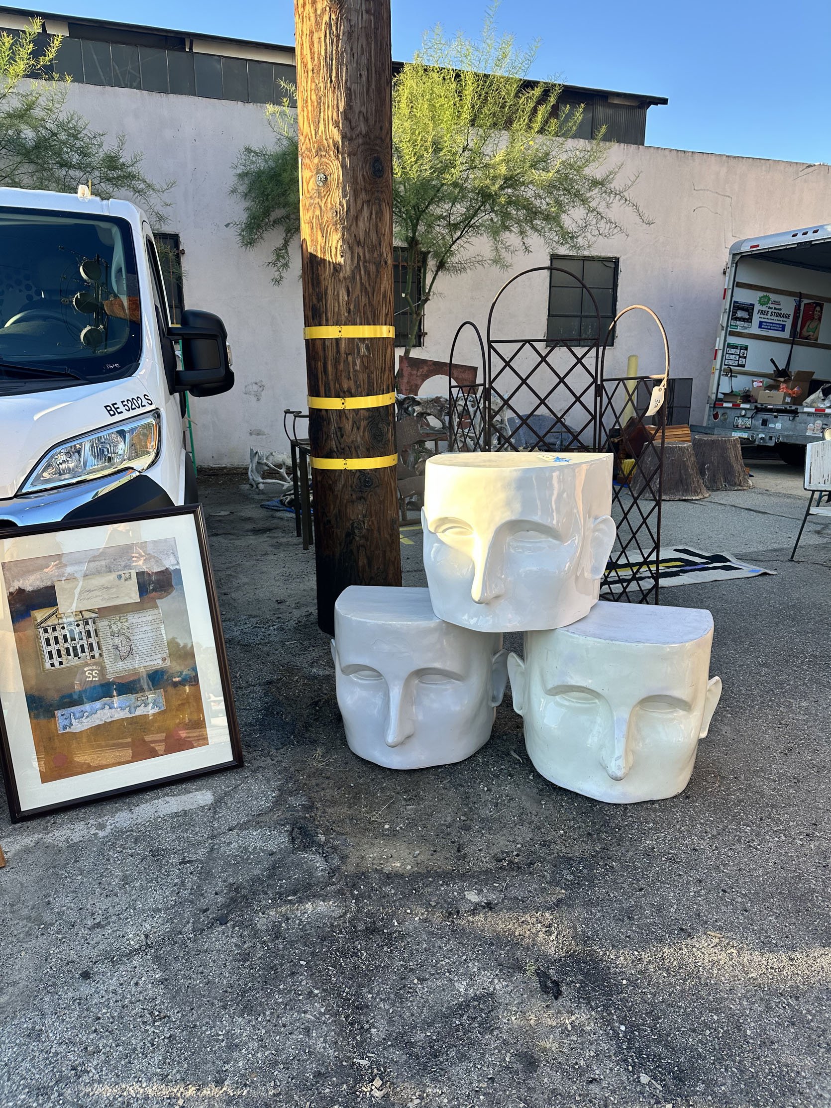
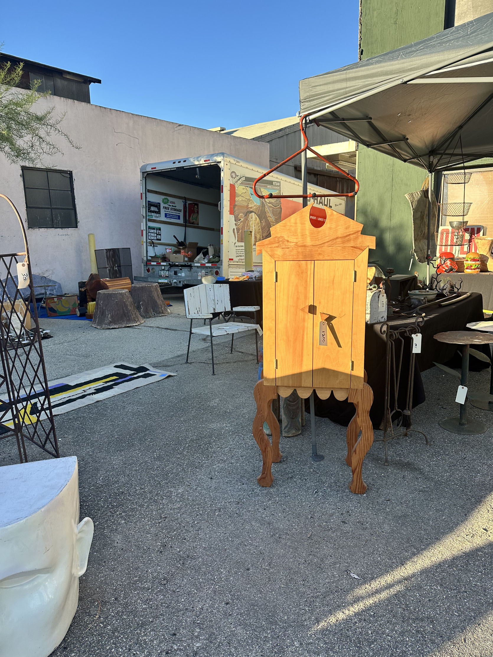
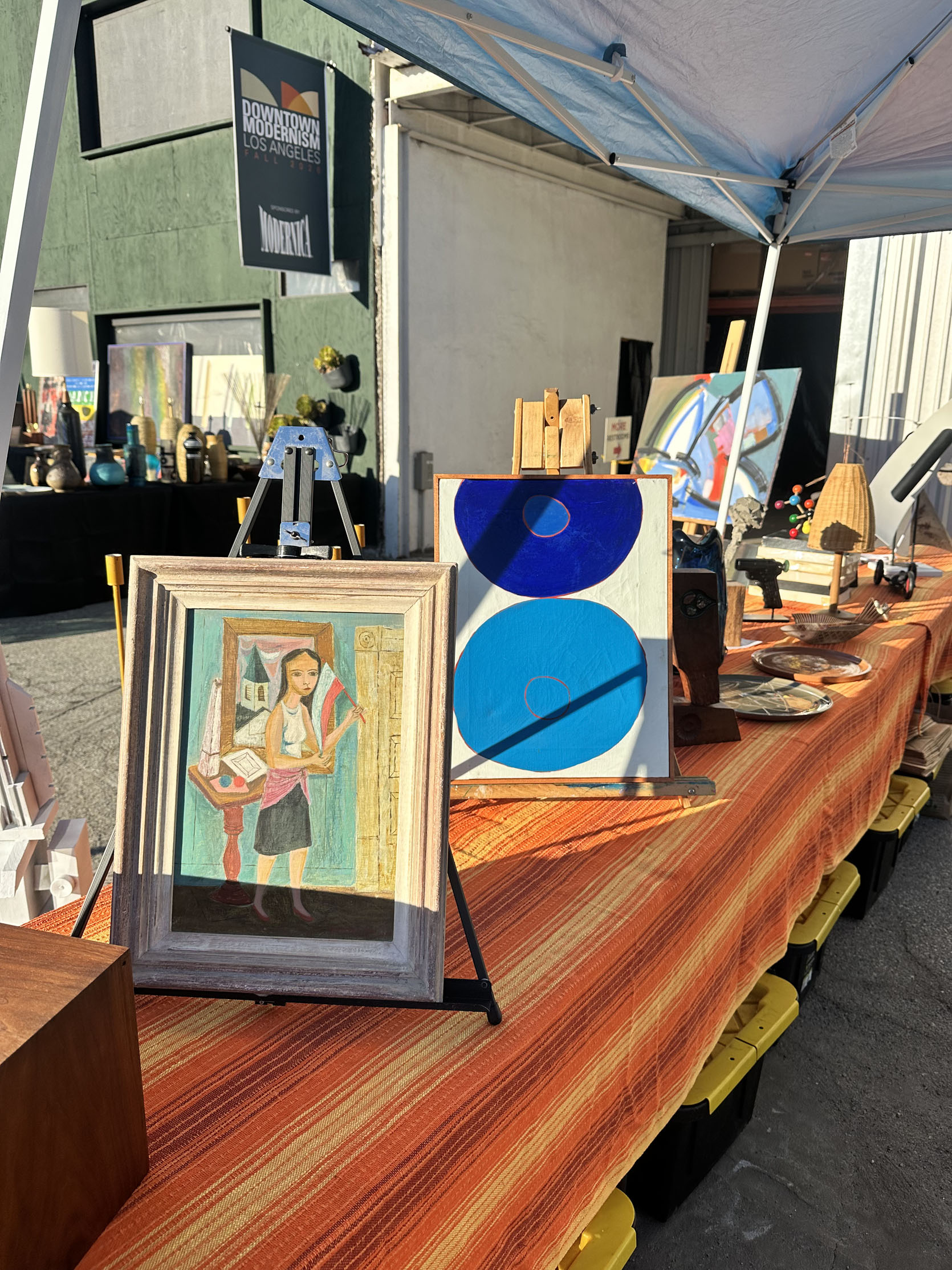
At the end of the first lane of the market, I saw these guys. Aren’t they outrageous in the best way? Yes. Will they be for everyone? No. And honestly, I wouldn’t necessarily say they are for me. But I could envision the face tables in a really cool garden as these incredible sculptures/tables/planter holders. I forgot to check the price, and to be honest, I’m not sure whether they are safe for the outdoors. But I think they are kind of a perfect introduction to the market as a message that this isn’t your average market. That cabinet is also something that I was drawn to but likely wouldn’t buy if I had the $1,200 to spend. It’s more 80s than I tend to go for, but I love the more organic wood grain with the ultra-modern shape. I could see it in a super high-end home where there’s only one “funky” piece that adds a fun contrast.

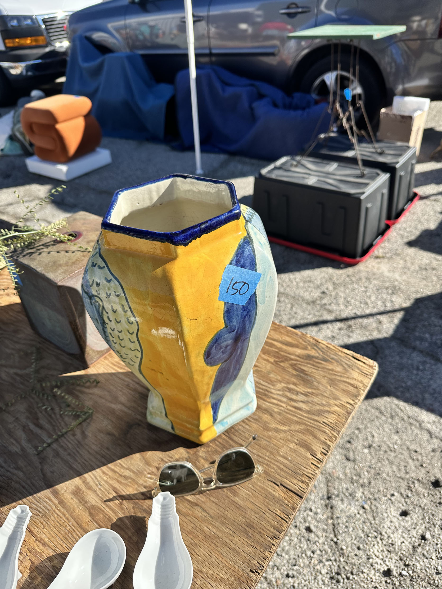
This vase was actually the first thing I took a photo of. I knew I didn’t need it (especially for the price), but I was so drawn to the colors, the shape, the hand-painted design. In the right space, this would look so cool.
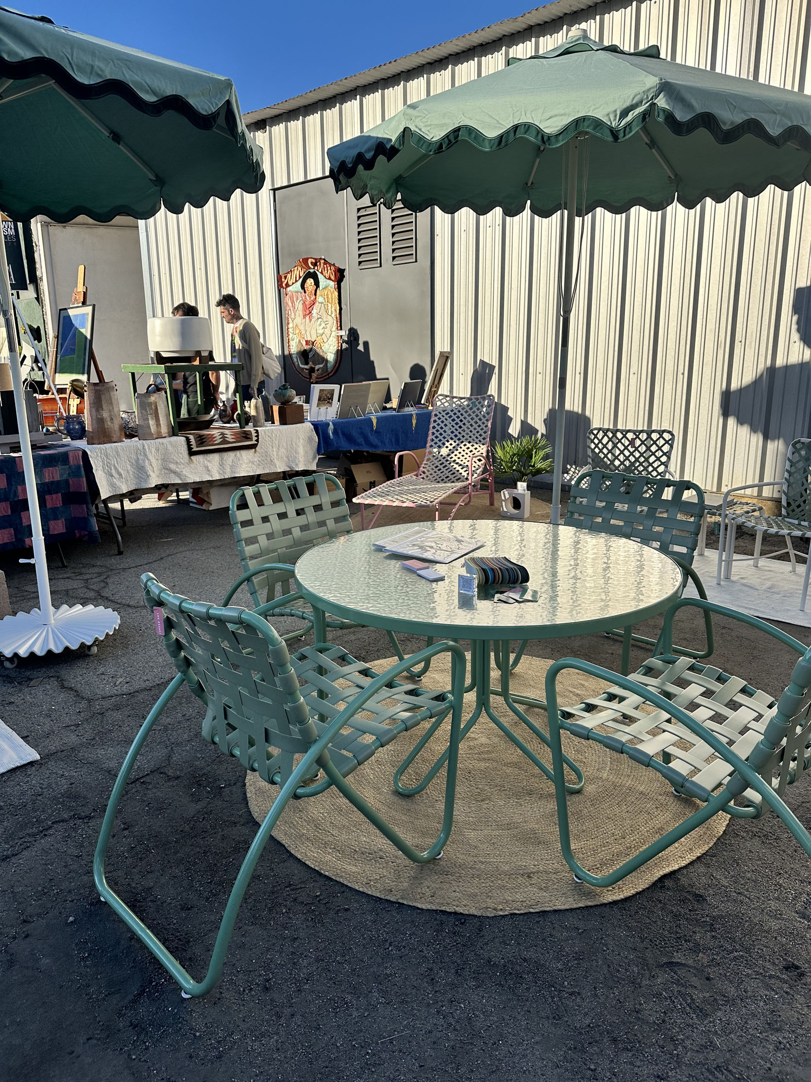
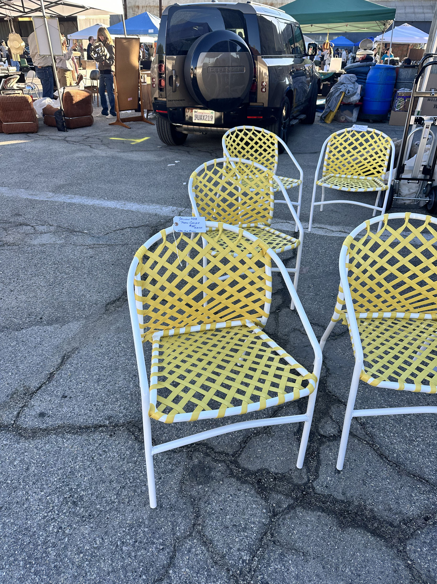
Something that we noticed was the uptick in fun vintage patio furniture. The photo on the left is a company called Los Resort, and they restore old patio furniture! The shape of that set was so cool. The chair frames are the best. The yellow and white chairs were from a different vendor and cost $45 a chair. I don’t know why, but I feel like these styles could be making a comeback in the next couple of years…
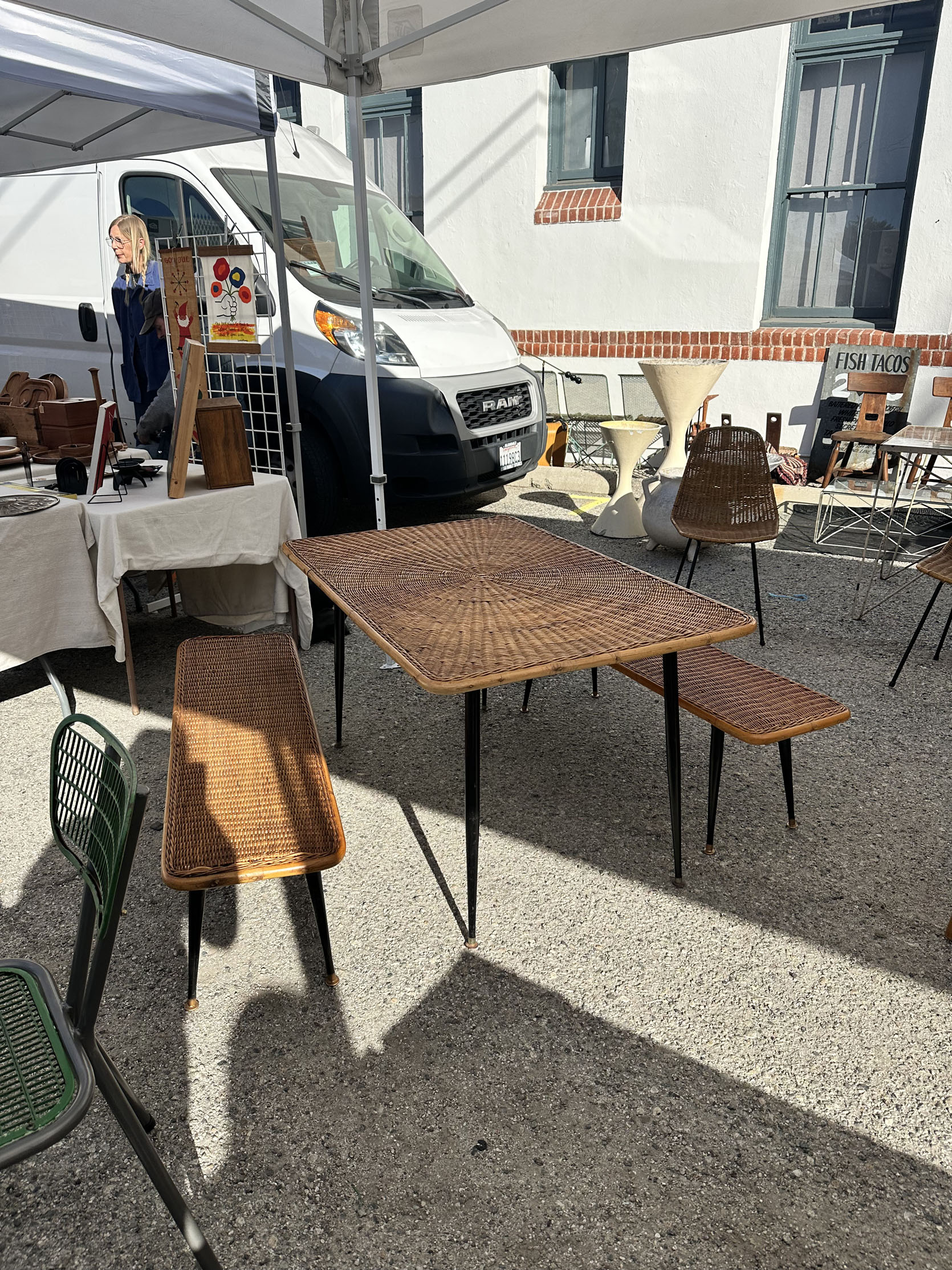
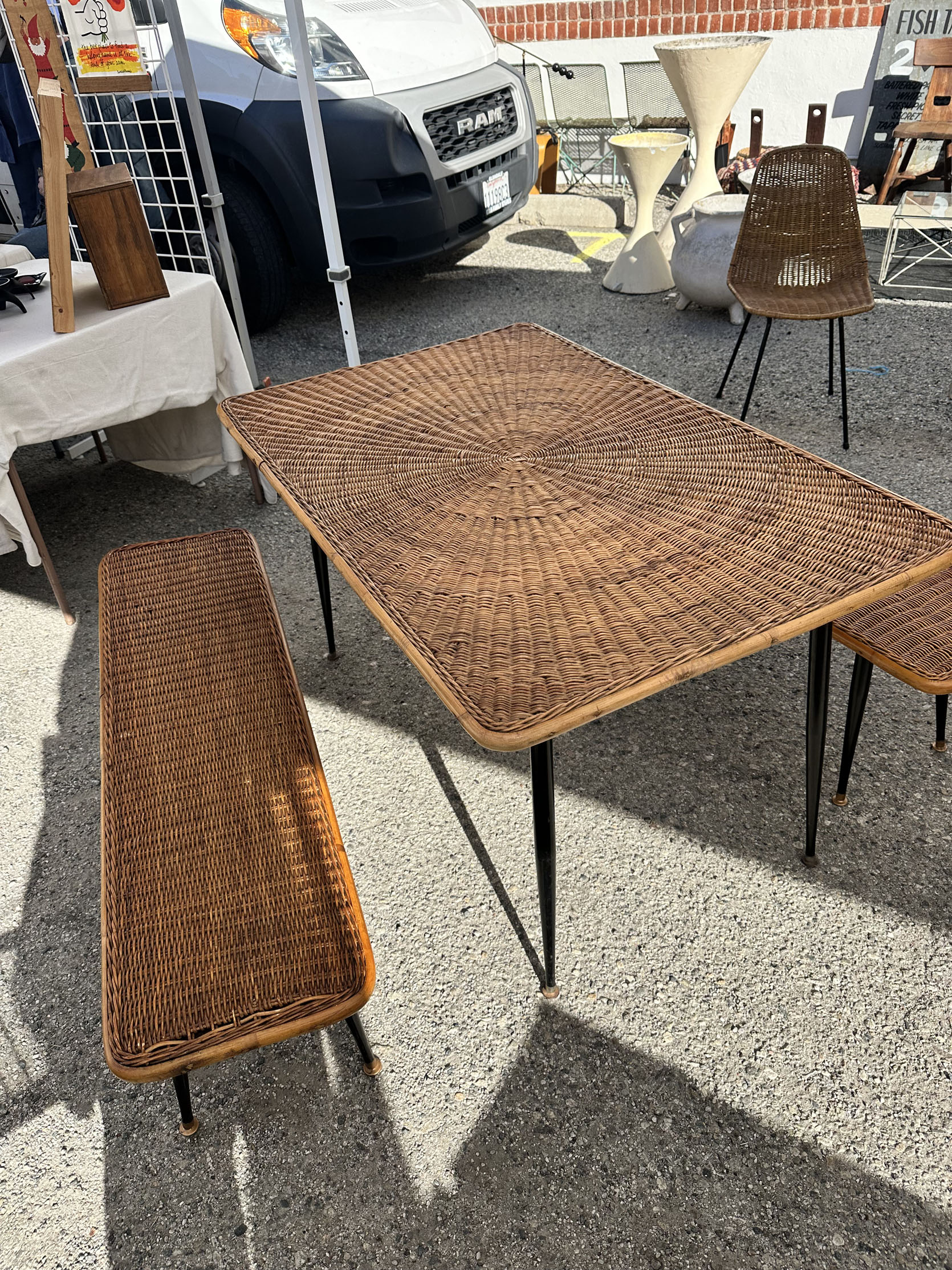
This set had us swooning! This beauty was $3,500 and just unbelievable in person. Franchesca was scheming to try to take it home:) But it was meant for someone else (we hope!) who will give it a good home. The wicker table, while the coolest, I would imagine a tablecloth would be pretty necessary if any food were to be consumed on it. I’m normally not the most worried about “how to clean things” when I’m shopping, but the idea of semi-permanent crumbs in wicker would likely stress me out.
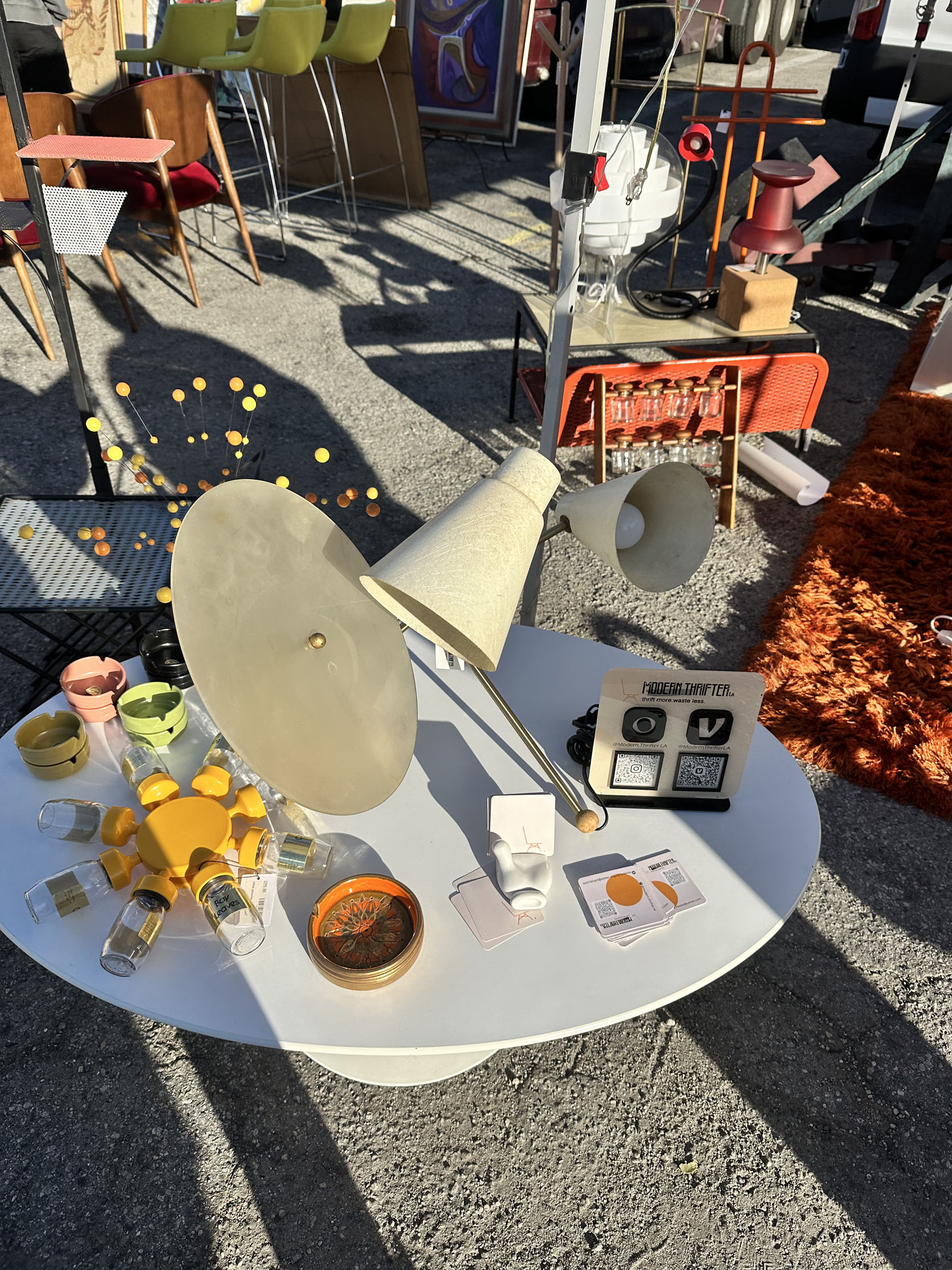
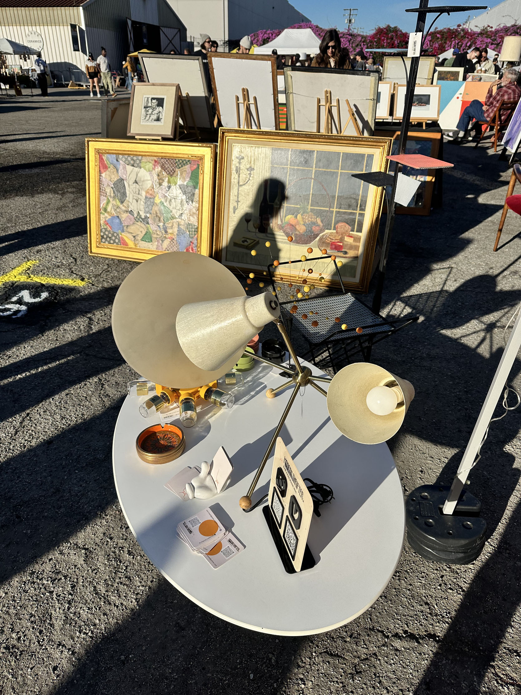
I’ve said it before, and I’ll say it again: I’m going to need a bigger home in the nearish future because there are too many incredible lamps that I need more space for. This one is a great example. MCM Italian (I think) from Modern Thrifter LA, with 2 lights and an ambient reflective plate. It’s a piece of functional art! $395 isn’t cheap, but it’s also not much more than what many major retailers are charging for non-vintage pieces.
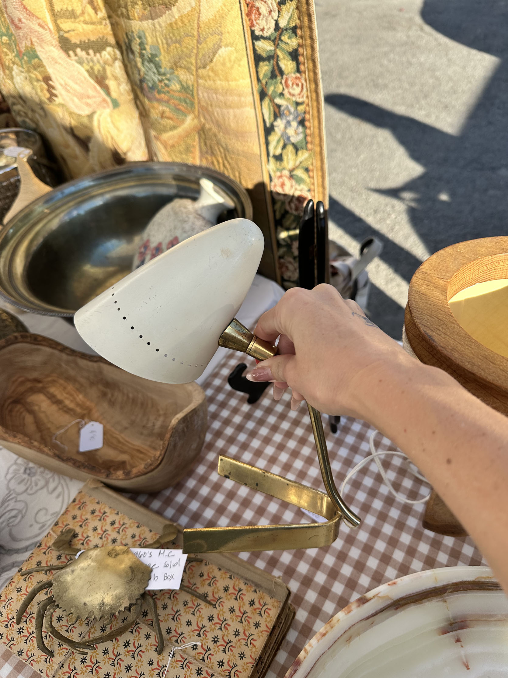
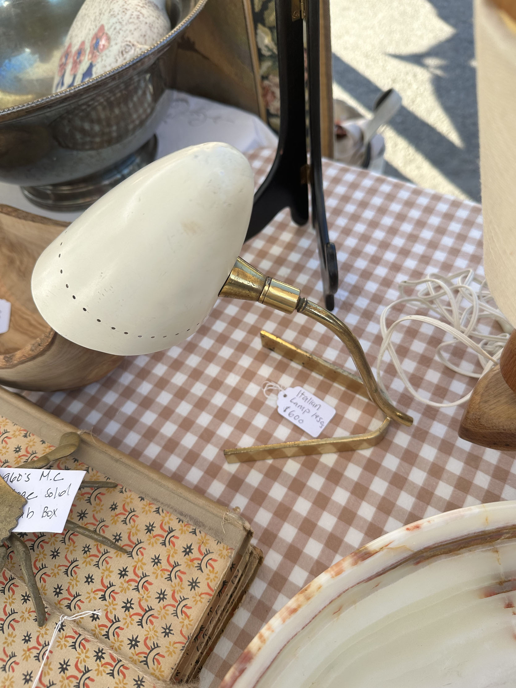
Another Italian table lamp that I absolutely loved. It was perfectly small but not too mini. It was $600, which was more than I would have wanted to spend.
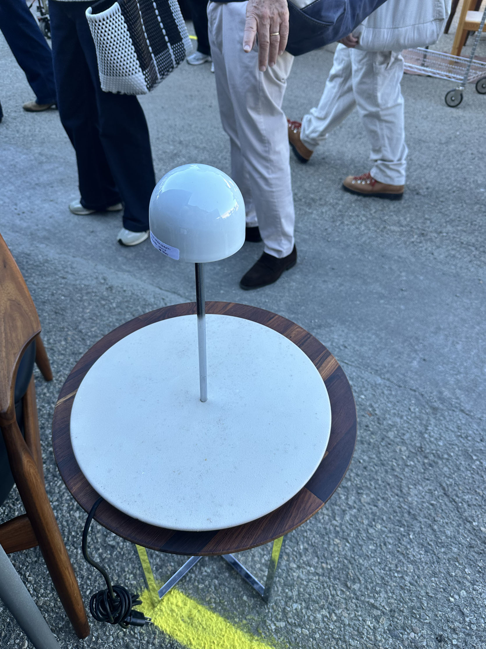
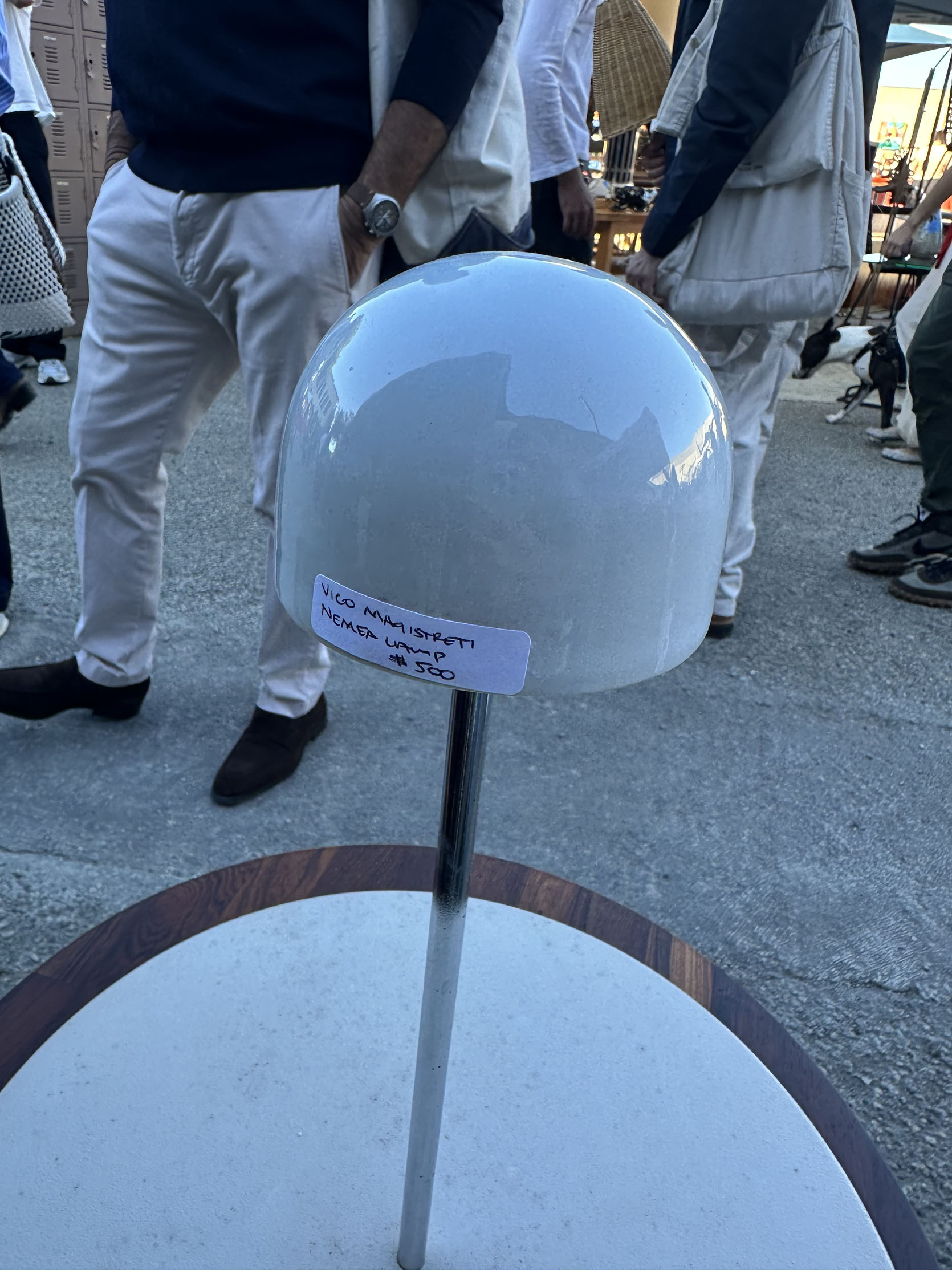
I know this one is pretty specific, but I thought it was insanely cool. It’s a late 1970s Vico Magistretti Nemea Lamp, and while $500 is a lot, when I looked online, they often sell for more than double that.


Now, as I said in the beginning, art was Franchesca’s mission, and I was happy to support. Franchesca’s style tends to lean more classically romantic than mine, but we both love a little playfulness:) This will all make more sense when you see what she bought. I like that Downtown Modernism has more abstract/modern artwork than a typical market, but they also have nearly every style.

As a reminder, Franchesca and her husband Ben were my friends who lived in the apartment above me for years (and I got to design their bedroom). Well, they were able to buy a home last year (bittersweet, but they are still close!), so they are now in a slow but intentional decorating mode.
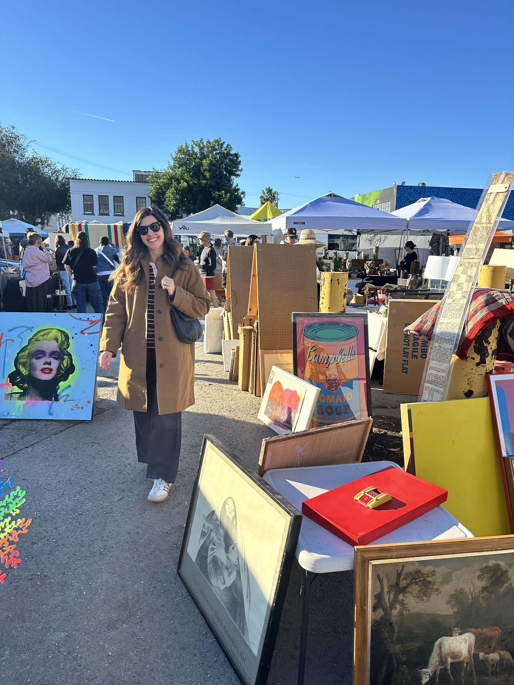
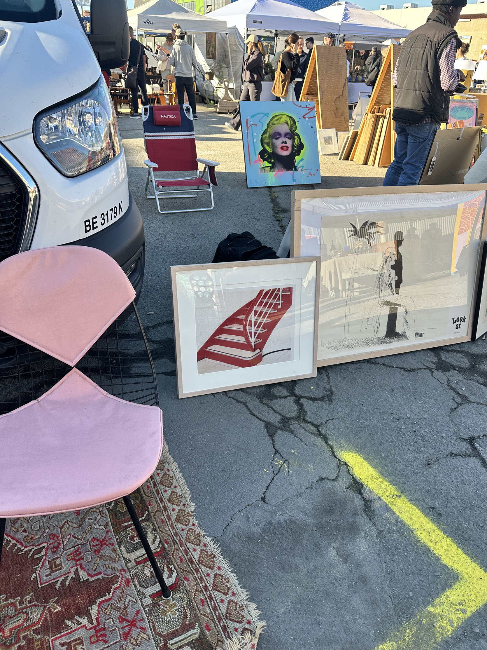
There’s my flea buddy surrounded by pieces that really weren’t her style, ha. I really loved that red staircase photo. Should have asked for the price just to see:)
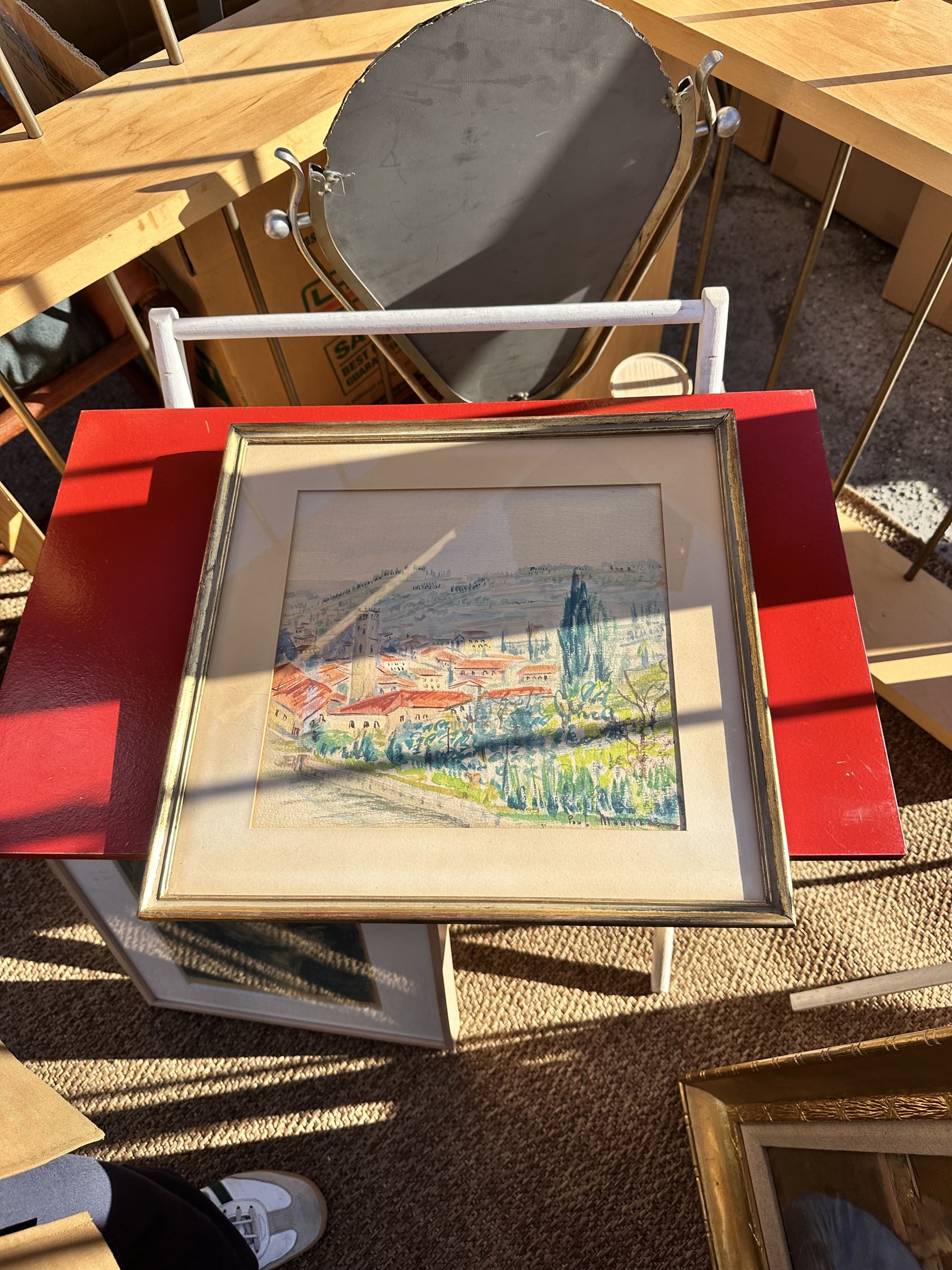
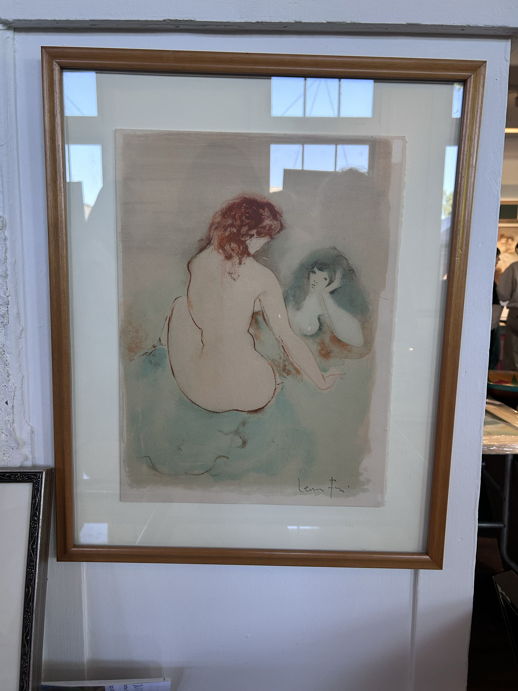
Ok, both of these spoke deeply to her heart. This first one was an original piece in the original frame for $350. The price was a bit more than she wanted to spend, so she passed. The piece on the right was much harder to pass up for her. It’s a piece by Argentine-Italian surrealist artist Leonor Fini. It was stunning, but at $600, Franchesca decided to wait. She got the vendor’s information if she changes her mind:) But please look up Leonor Fini. Her life and work seem pretty remarkable from the little bit I’ve read so far.
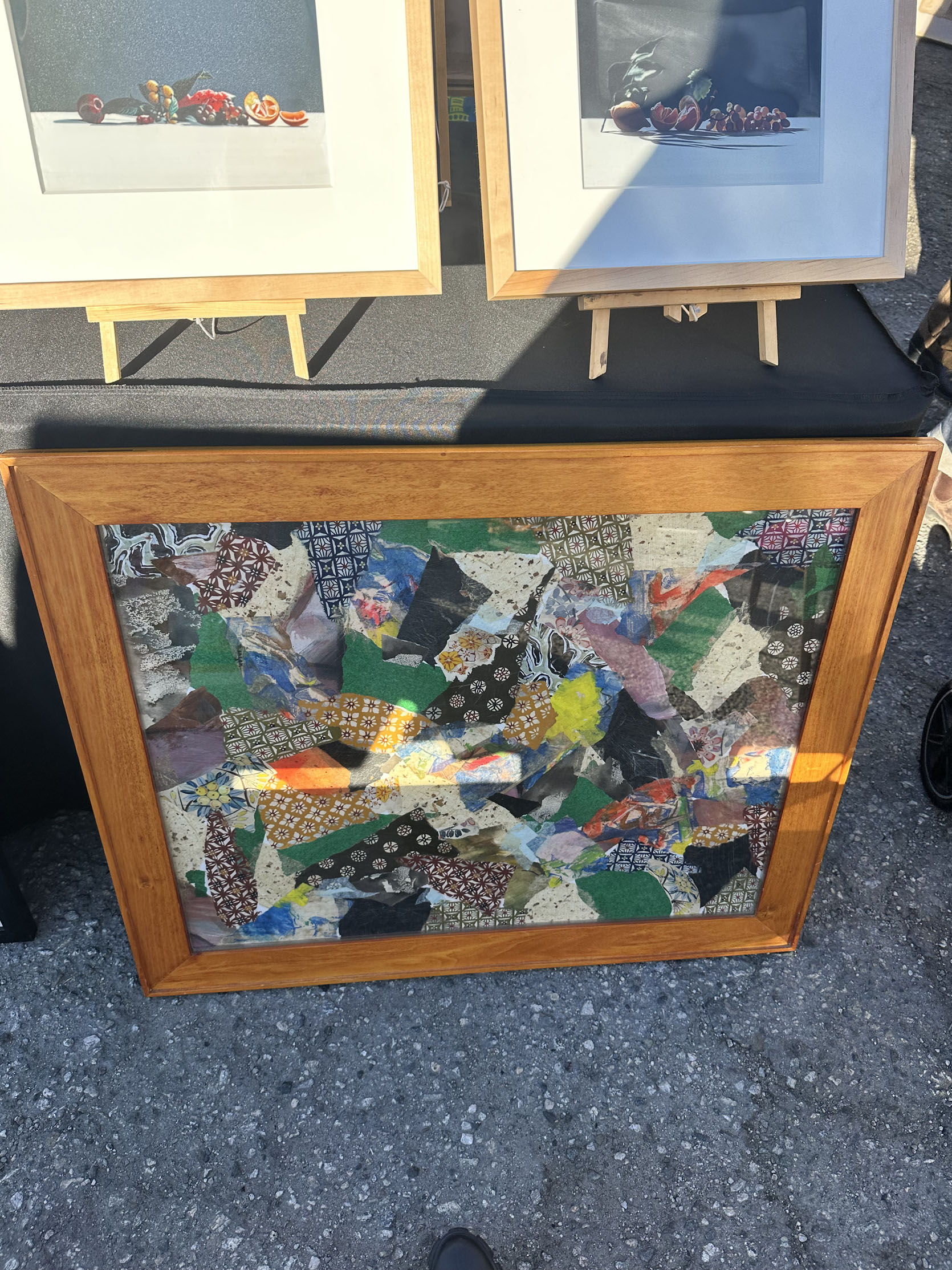
These were just pieces I liked and wanted to share.
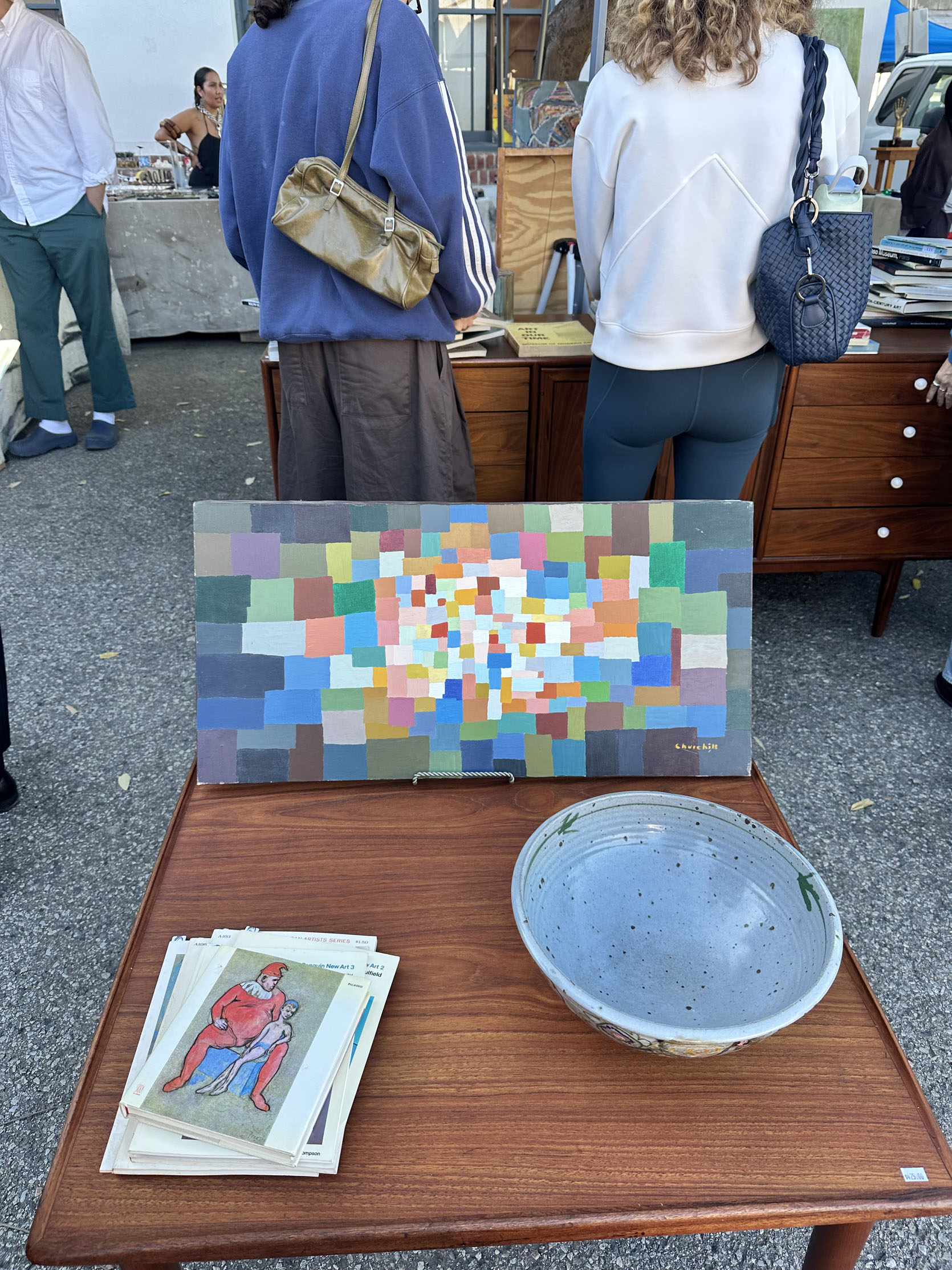
This one I really loved, but at $1,025 it was sadly a definite no. Also, I know I’m pointing out a lot of expensive things, but there are also many more affordable pieces there too!
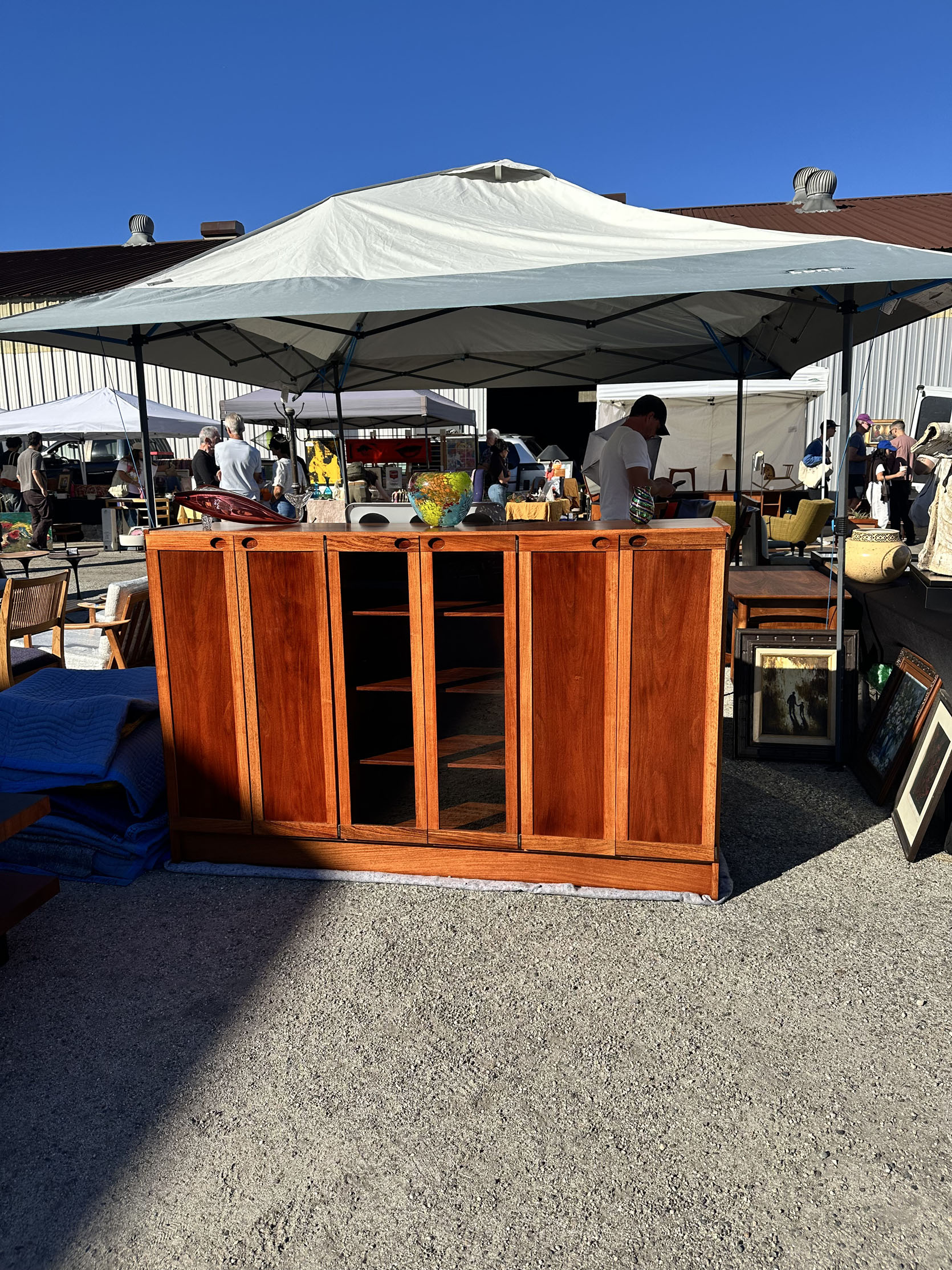
And the prices aren’t getting lower yet. I stopped in my tracks when I saw this. The vendor wasn’t around to ask the price (well, I accidentally asked a shopper, thinking it was the vendor- whoops). Regardless of that, I just wanted you all to see it. The inset handles, the two-tone wood, the open and closed storage – perfect.
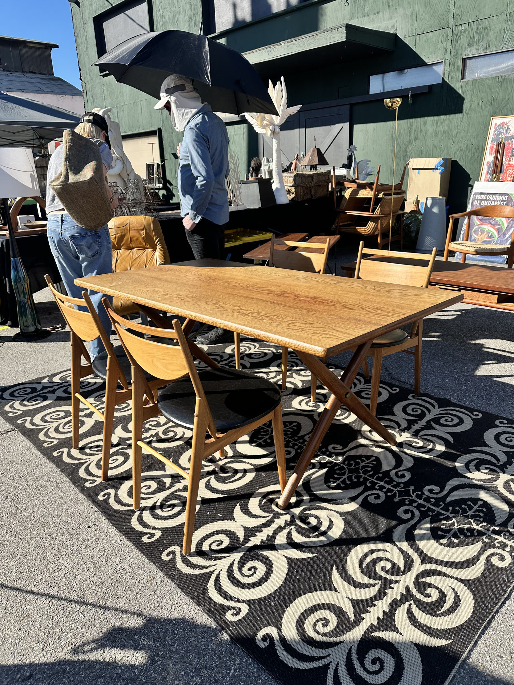
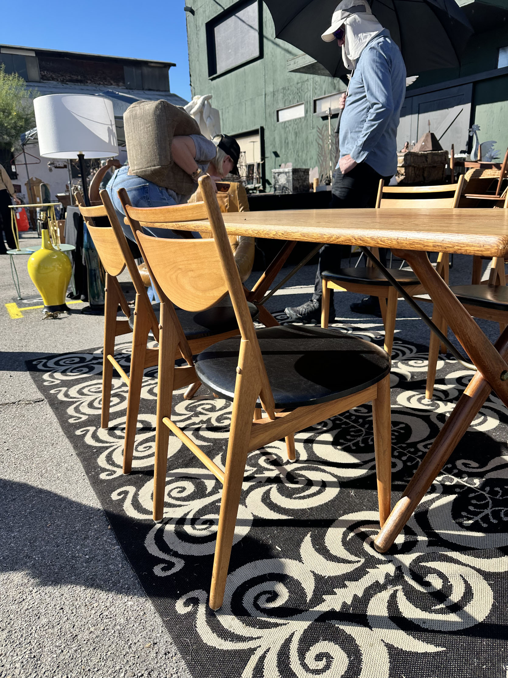
I did ask the price for this dining set, and it was $3,750. Honestly, for a table and four chairs, you’d likely spend close to that at a major retailer. But with this, it’s a 1957 by Glenn of California, which was a pioneer in MCM furniture manufacturing from the 40s to the 60s. The vendor told us that this set was a rarer design of theirs. I loved the chairs the most, and that leather seat is original. The lines are so beautiful.
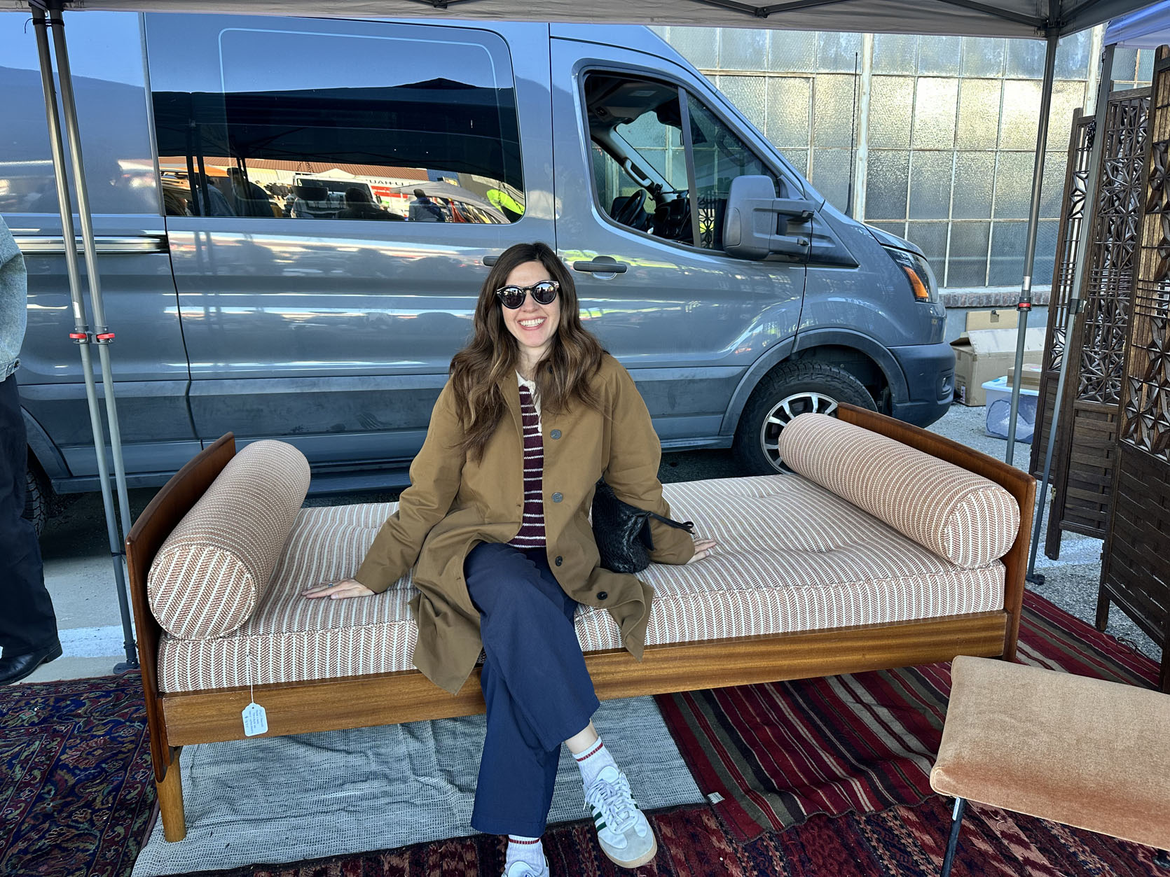
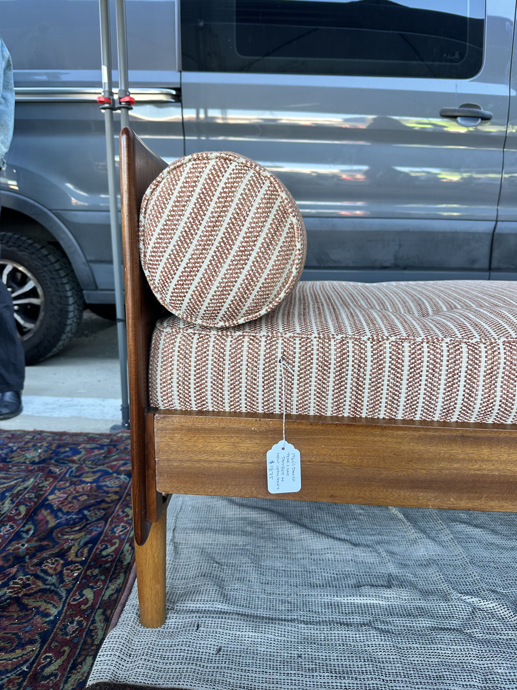
This 1960s Danish teak and oak daybed for $1,875 (with new upholstery) was a great size and really comfortable! It’s from Modern for All.


This settee on the left is proof that there is a variety of styles at Downtown Modernism. We loved the arms and the two-tone look! I spotted those red velvet chairs while Franchesca was at another booth, and I had to snap a photo. The shape is perfectly exaggerated, and I feel like red velvet is a less common type of color/fabric combo for an MCM chair, right? If that’s correct, it needs to happen more.

THAT BASE. No words. It’s perfect.

Of course, I needed to stop by artist and vintage seller Melinda Forster‘s booth. It’s always my favorite. I’ve bought two of her ceramic pieces before, but her vintage finds are also so good. No one should be surprised that I love this chair with the circle cutouts
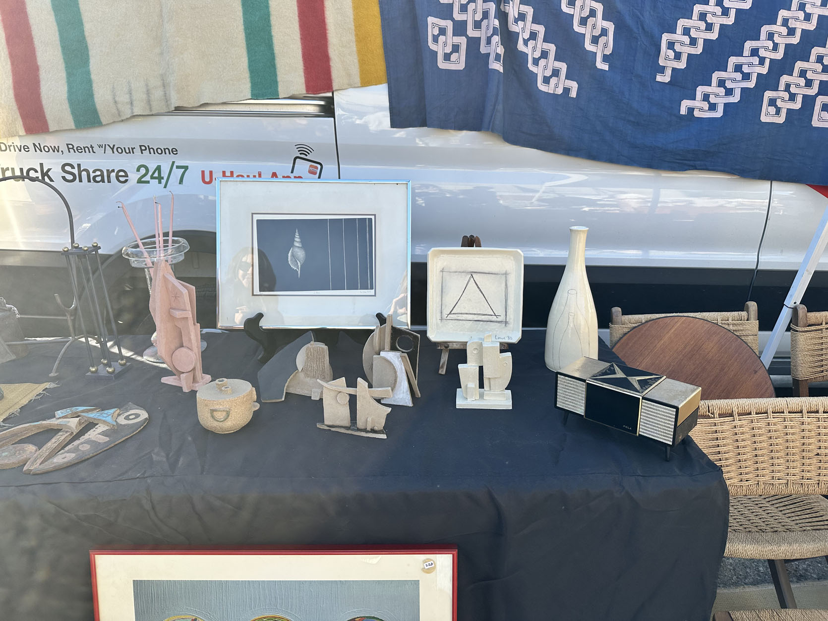
Here’s a mix of her work and some vintage. It took a lot of strength not to buy another piece, but I knew I simply didn’t have the right place. Oh, and another great thing I loved about her booth this year was that she had a clearly marked (that’s important) table for items under $30. So nice and helpful!

This was also at Melinda’s booth, and I just thought it was so fun. It’s a 1970s Pierre Cardin Serving Set that was made in Japan out of plastic and mahogany. It has a serving tray, salt and pepper shakers with a caddy, and two pitchers. I didn’t see a price, but when I looked it up, one site is charging $675. I have a feeling hers was a lot less than that, but you never know!
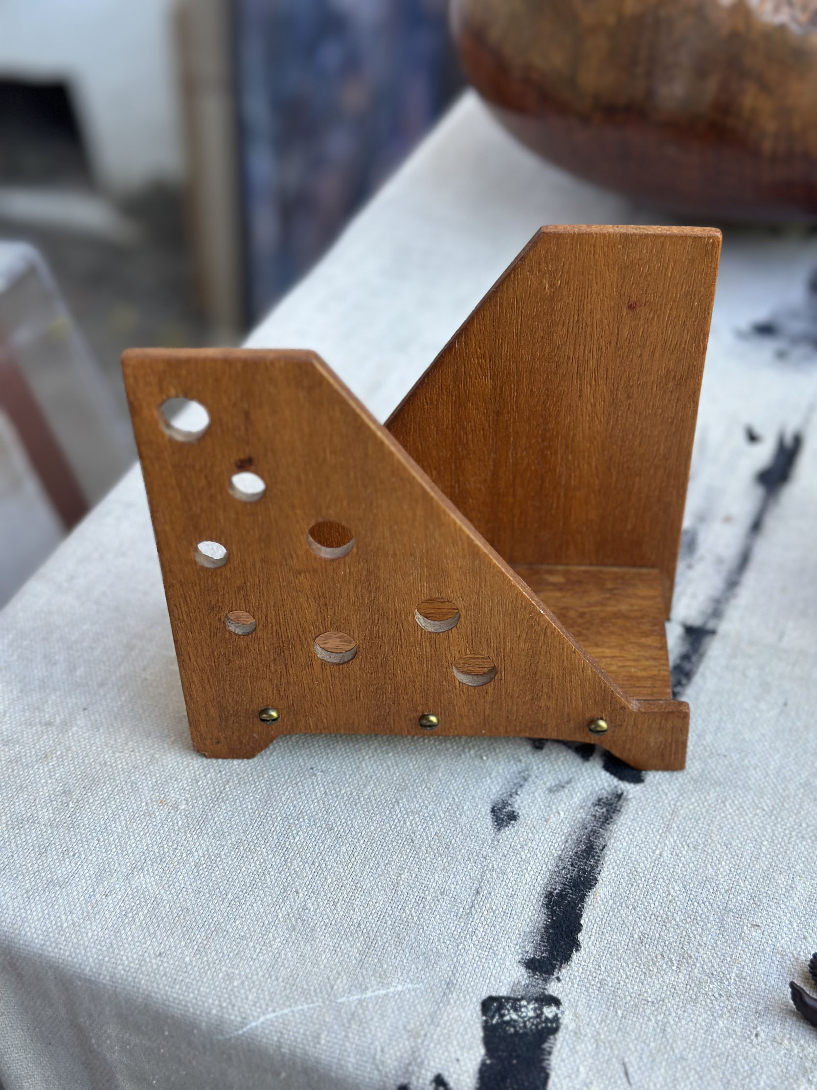
I didn’t need it, but I loved it. It was $75 and would be a really fun napkin holder for a table, right?
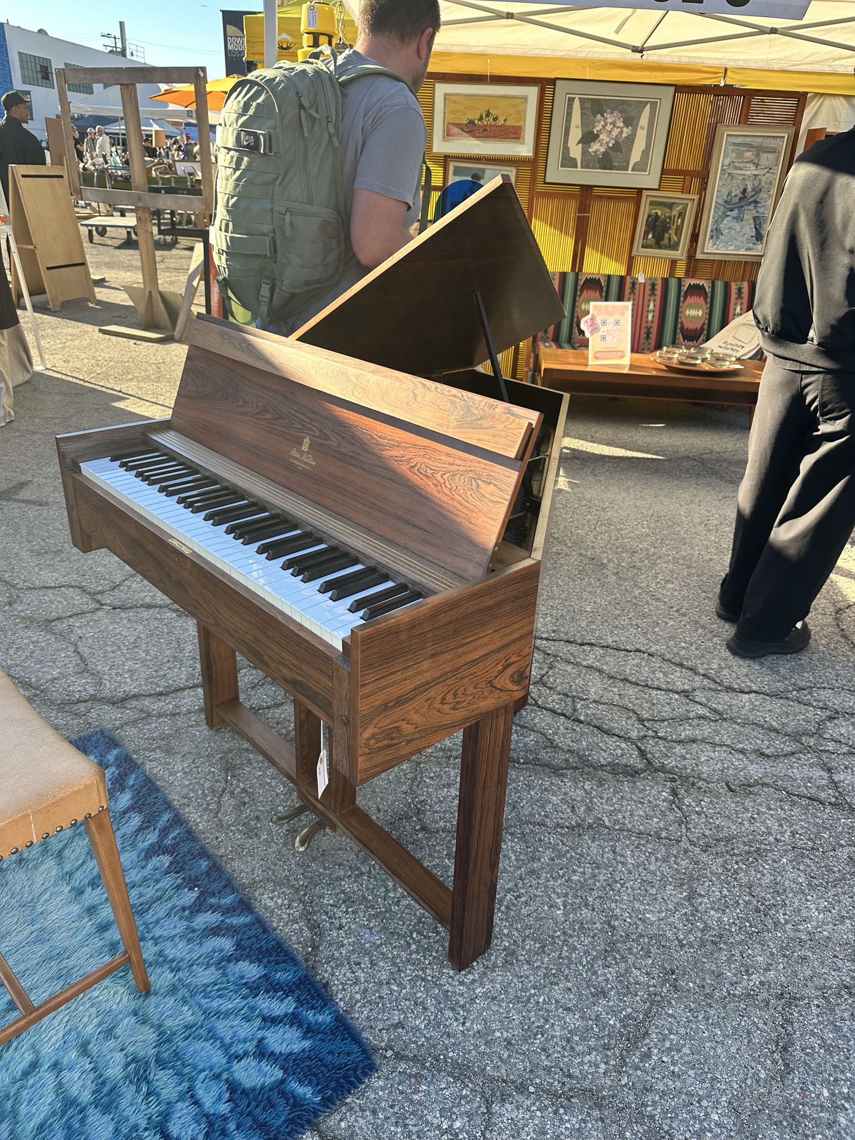

I didn’t almost buy this, ha, but I was blown away by it. I’m not sure I’ve ever seen a more modern wood piano like this. Both Franchesca and I couldn’t stop looking at it. The vendor, Furniture Fosters, was selling it for $5,9995. According to them, it’s a Steen Nielsen Hammerspinet, which is a rare, mid-century Danish piano and harpsichord hybrid housed in a Brazilian rosewood case. 10/10.
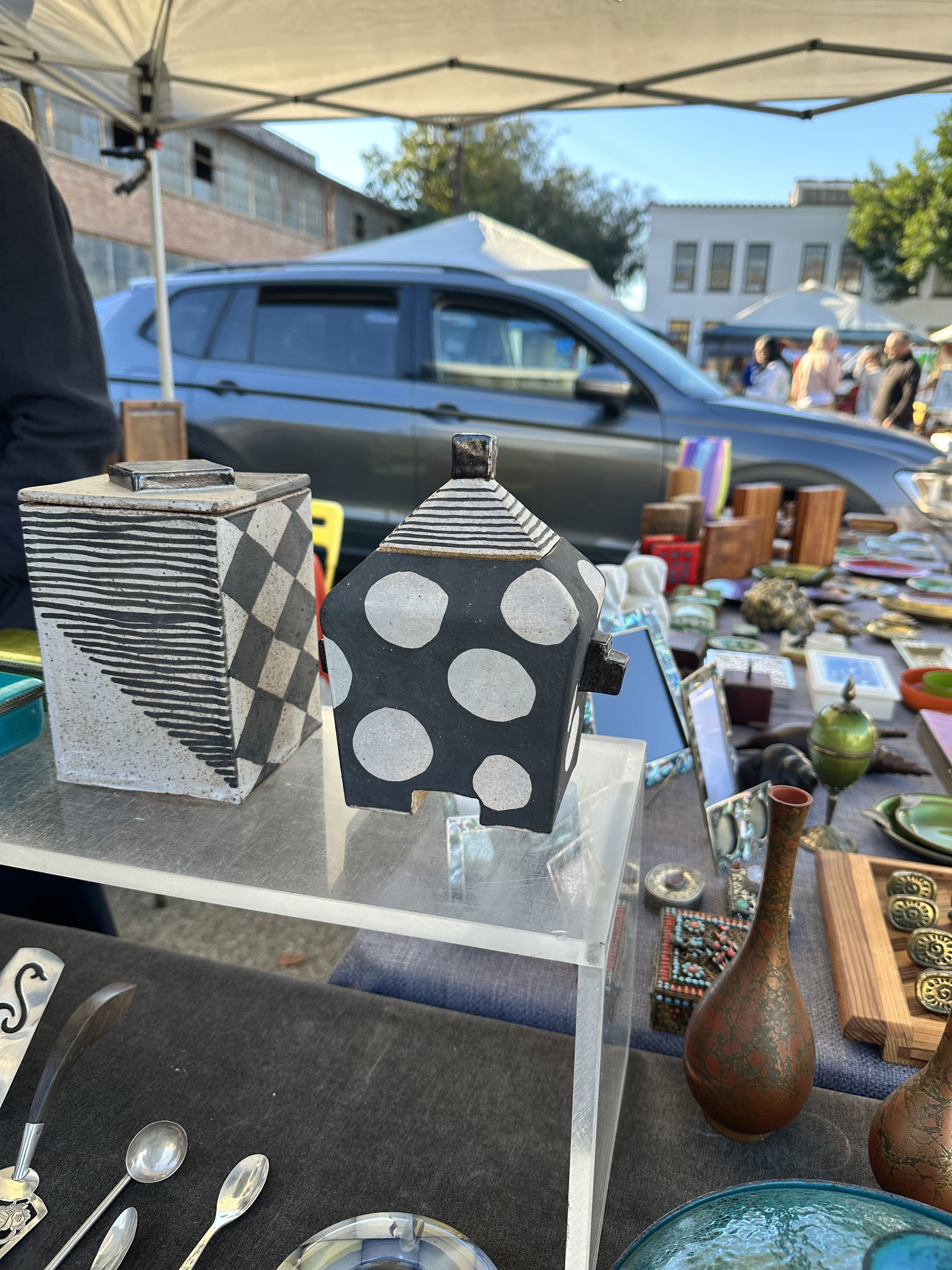
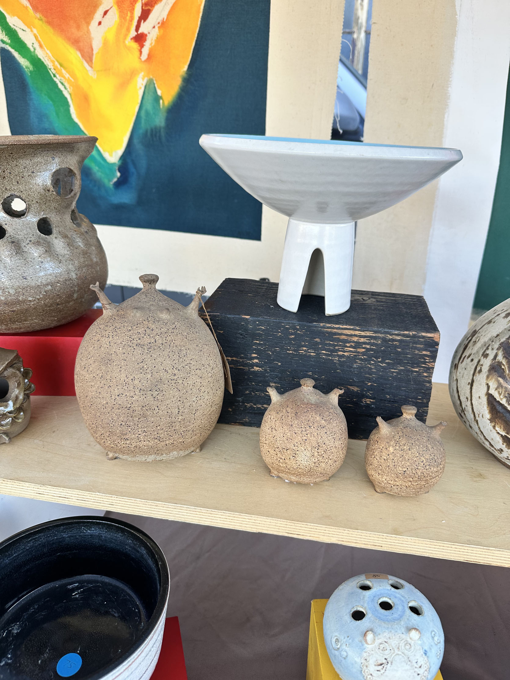
Boy, do I also know how to find special but expensive pottery. I love that black and white ceramic box a lot. But at $400, I was going to skip. Then those little ceramic sculptures made me smile. The hands are adorable, right? They really weren’t right for me or my home, but at $900, I was sure.
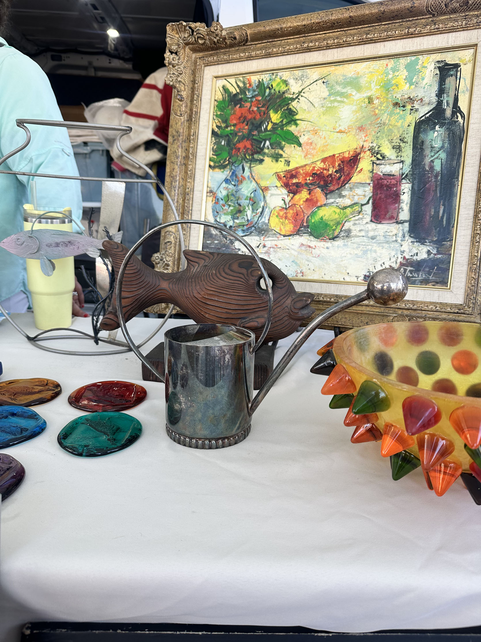
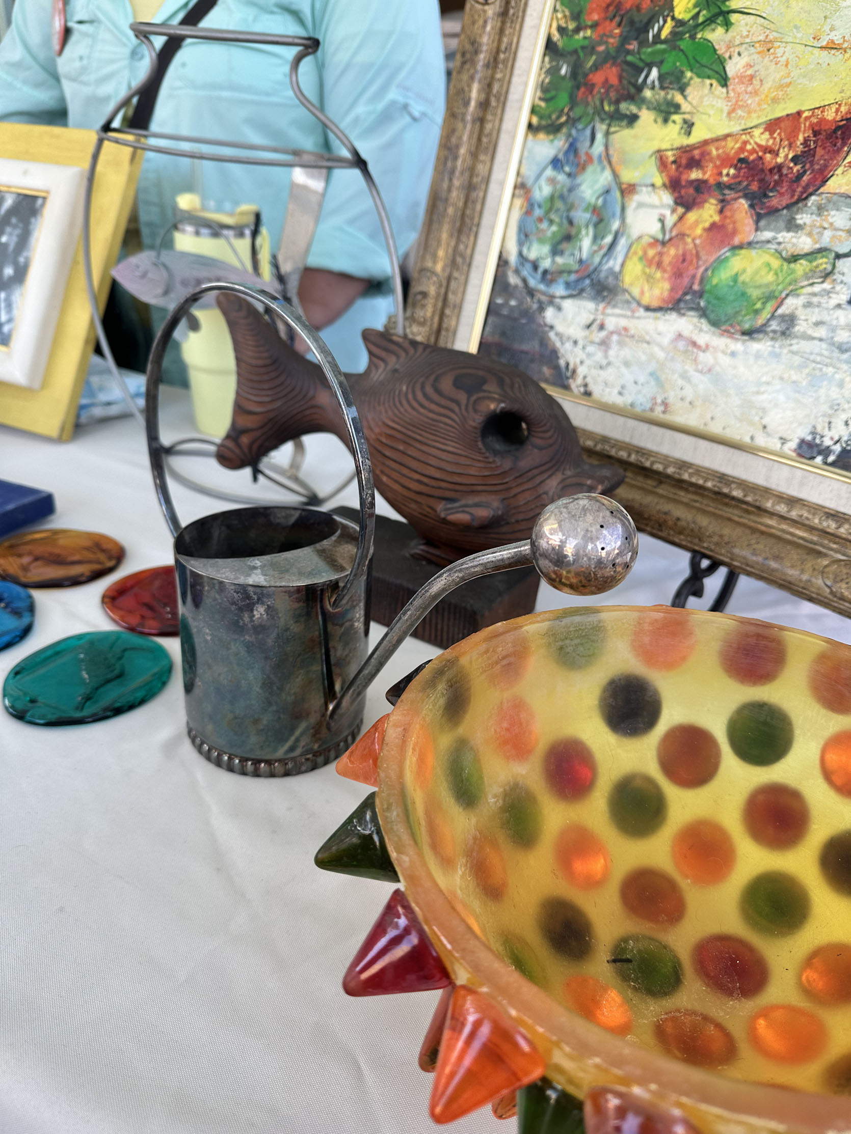
Now, before I knew the price, this was the first piece I thought about buying. The patina was great, the handle was cool, but that ball nozzle was everything. I mean, it’s so cute but kinda chic, right? Well, once I found out it was $400, it was out of budget, and my sad heart walked away.

This is a brass “Nike” paperweight, and I loved it. I immediately thought, “Oh, maybe I can get it for my boyfriend! I think he’d like it.” A dangerous new purchasing excuse I need to keep a close eye on, ha. And had it been $20, I might have grabbed it with less consideration. But it was $60. Then I really thought about it and realized that while he would have appreciated me thinking of him, he would likely not have loved it like I did. So I passed…it was close one.
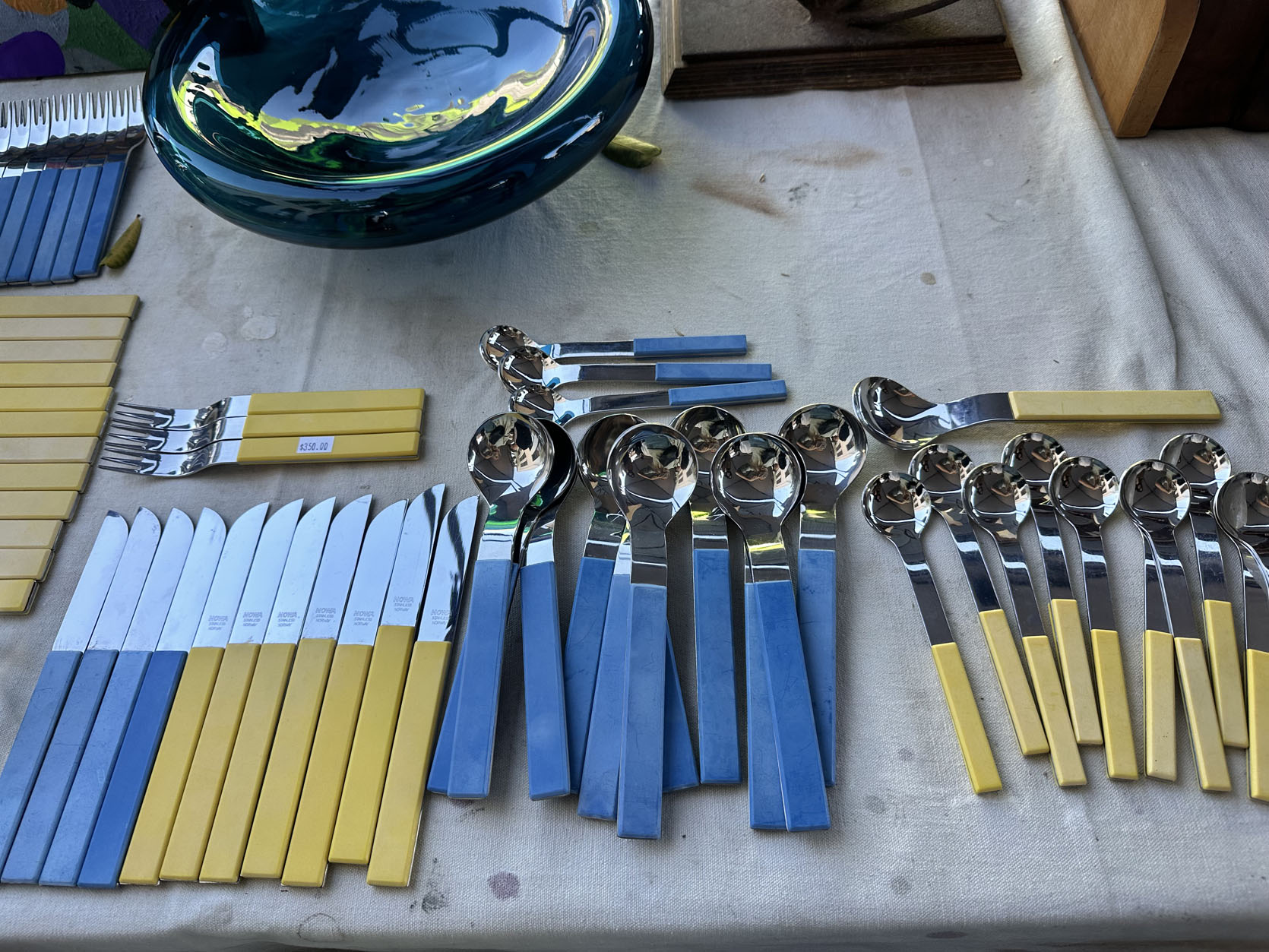
I didn’t need them, but I hope someone did! SUCH a fun flatware set for $350.
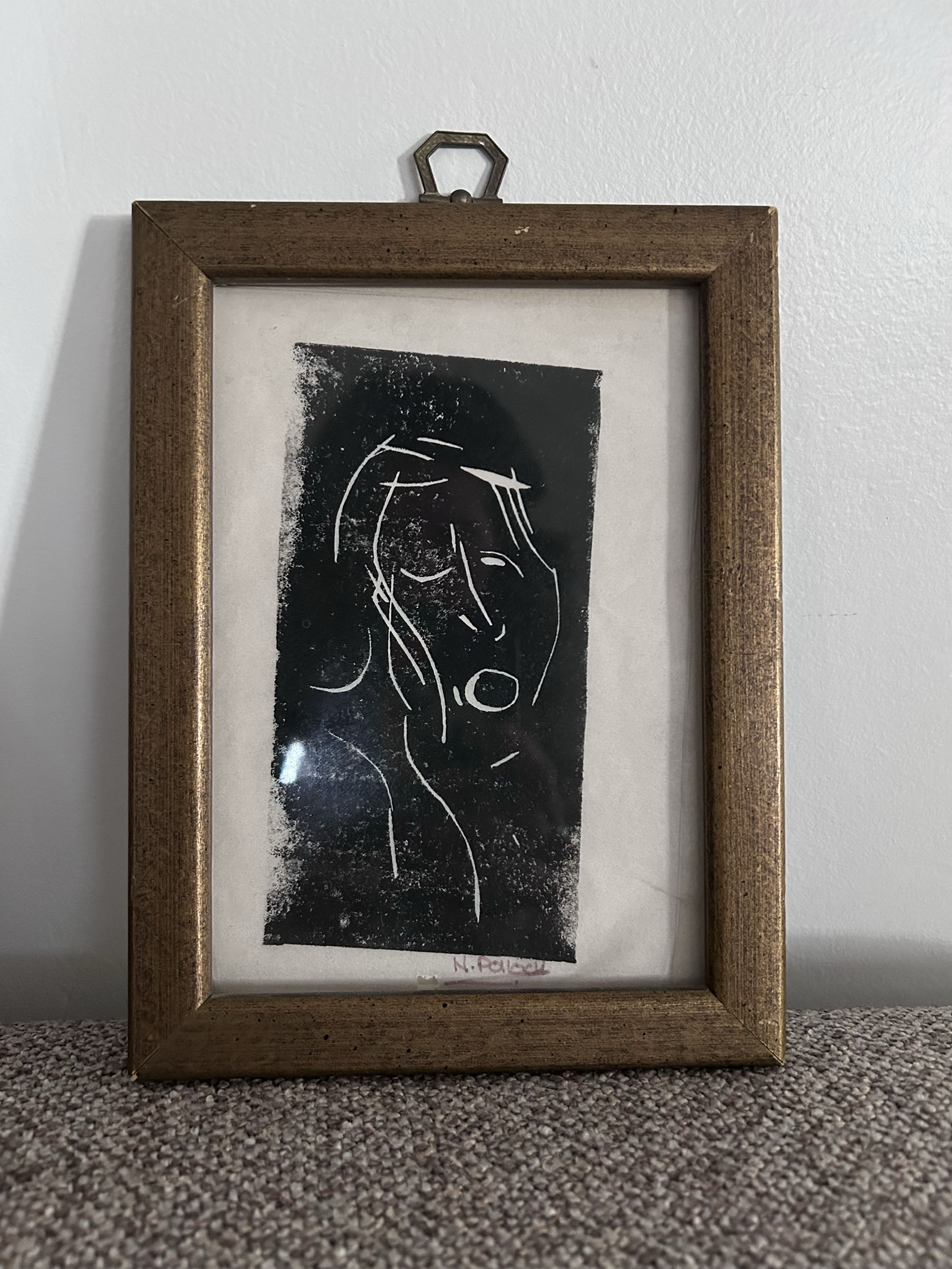
This was the first purchase of the day from Seoda. Franchesca bought a block print by N. Pollock for $45. It was the exact size she was looking for, and it was already framed in one she really liked!
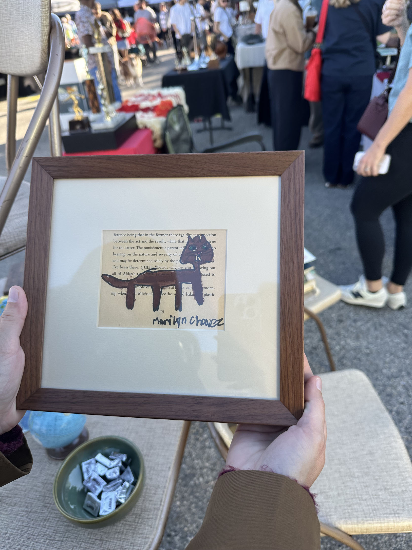
Her second and final purchase was this sweet cat piece from an art show that celebrates autistic artists. This was near and dear to the vendor. She shared that her son is autistic and is an artist as well. This made it all the more meaningful. She paid $68 for it.
Onto me:)
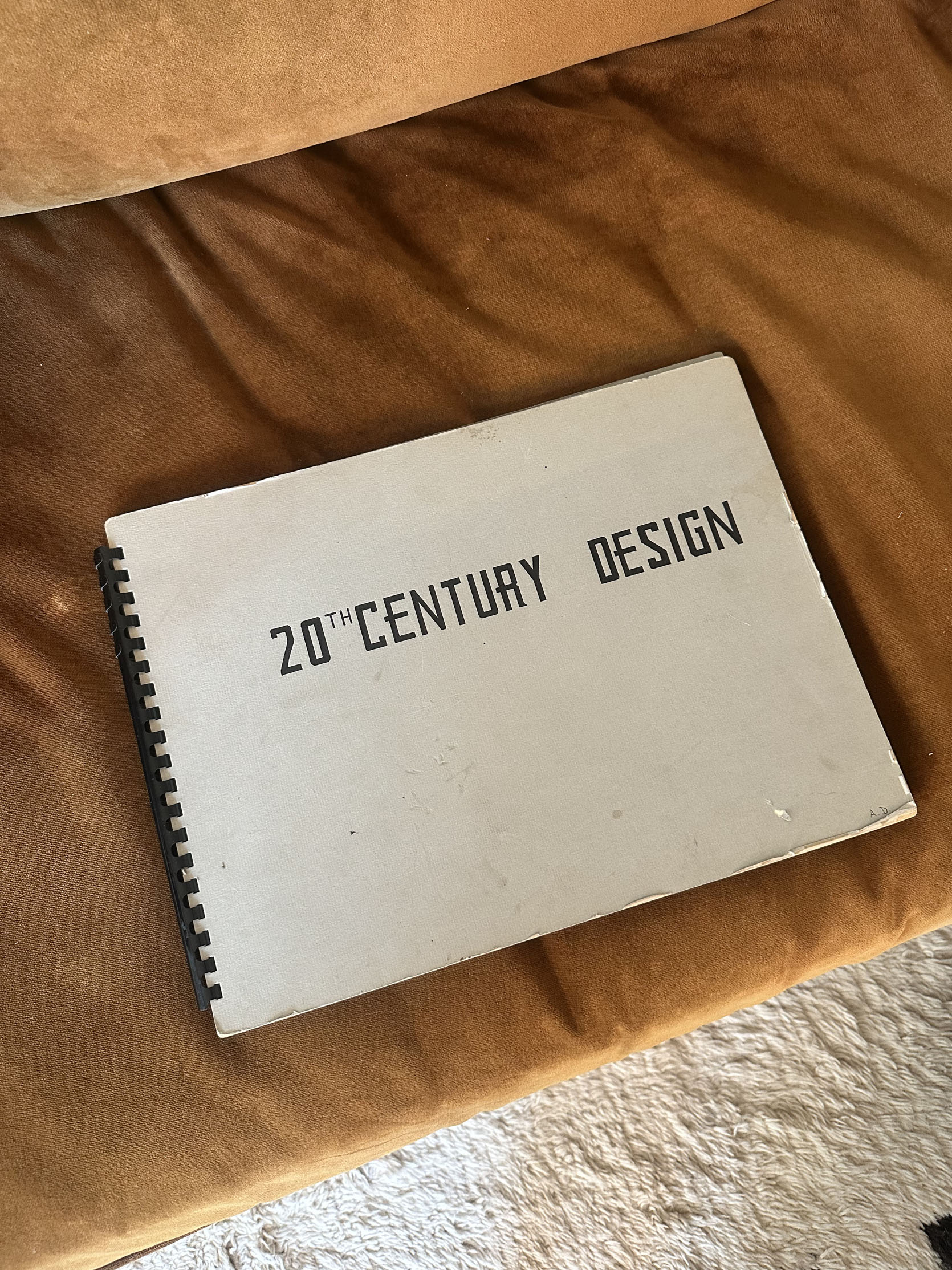
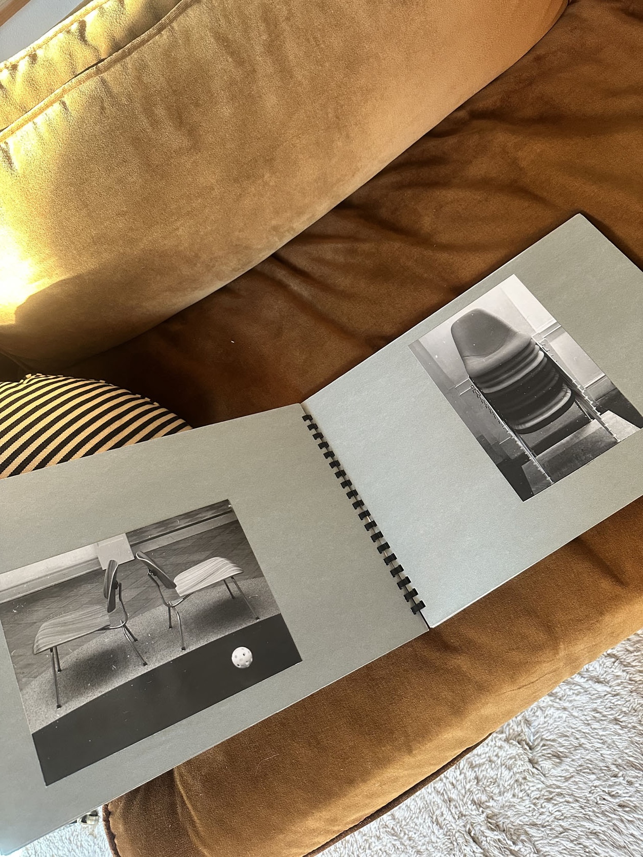
I also only made two purchases (which was two more than were on my list). But this book jumped out at me. I loved the cover, the patina, and the photos inside. When he said it was $20, I said, “done!” Did I totally need it? No. But will I need more design books in my future larger home? Yes.
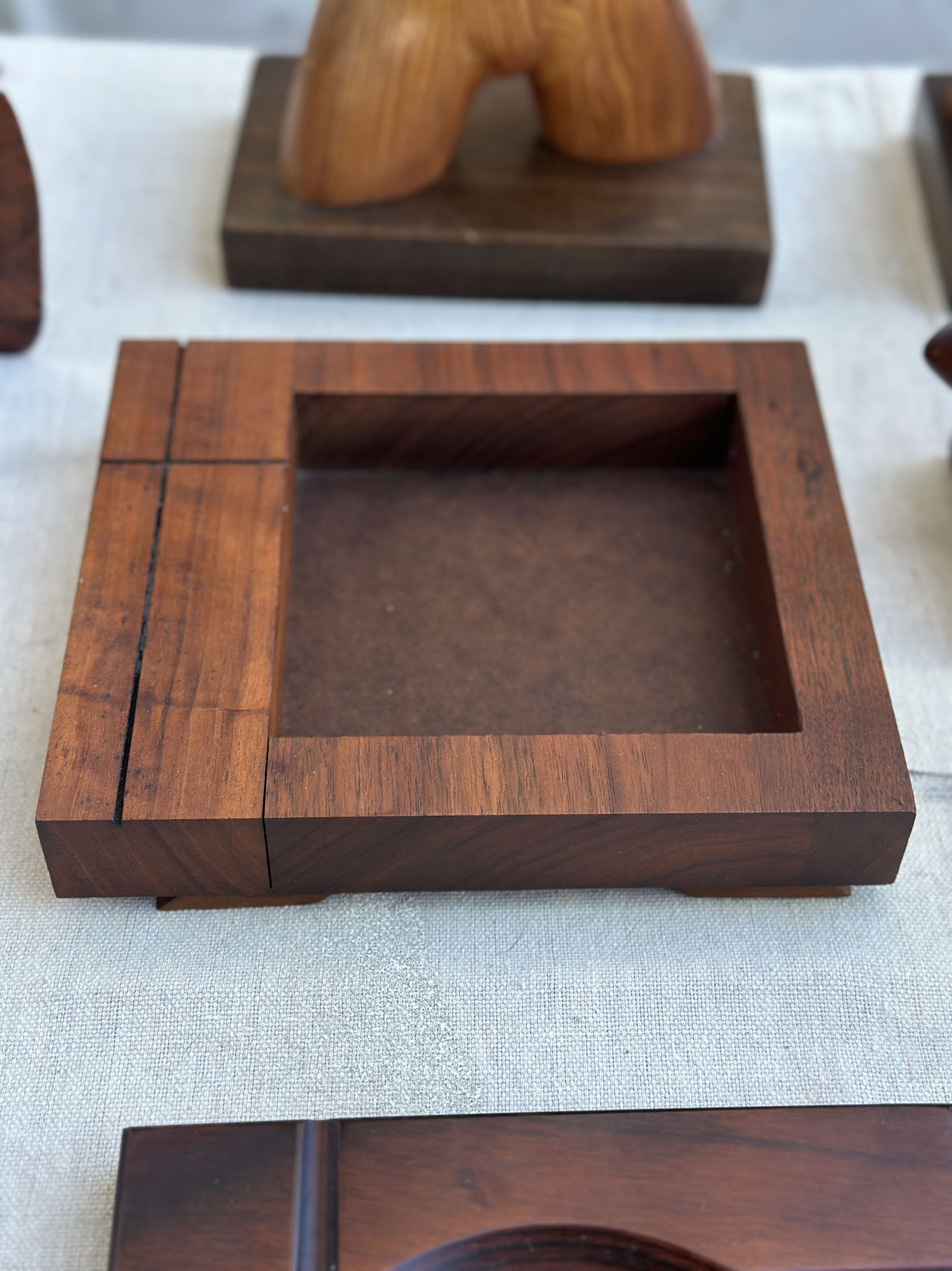
This tray put a spell on me, I swear. I picked it up and fell in love. I love the asymmetrical placement of the opening, the carved lines, and the little feet you can’t really see from this angle. I did put it down, went around the market one more time, and then decided I needed it. I’m sure I could have haggled, but I didn’t and spent $125. It’s now on a nightstand, and I’m very happy.
Has anyone been to any good markets lately? Any favorites? Let us know! Happy thrifting, everyone.
Love you, mean it.
]]>ALL RISE. Design Court is back for round 2, and it is now in session. I’ll be overseeing today’s proceedings as your dedicated prosecutor, defense attorney, judge, and jury. (To be clear: design court does not follow standard courtroom procedures, nor does it stand up to any real legal scrutiny. But I am a Libra, so you can trust that I’ll be both very judgmental and very fair.) Today’s defendant: doorless walk-in showers. The charge? FRAUD. You may be seated. Let us proceed.

I’m an average American who, like most folks, lives in a home with a standard shower. I grew up with a builder-grade tub/shower combo, rented basic apartments with budget-friendly showers, and now have dedicated shower stalls in my LA apartment and my Delaware home. (I’m not going to lie: both of these showers are pretty tiny, and they don’t necessarily provide the most enjoyable experience. The former is a 3’x3’ 1930s tiled number that feels akin to bathing in a coffin; the latter is a standard plug-and-play cheap shower insert with room for your body and…not much else.)
All this to say: I have not grown up in the lap of shower luxury. I am not accustomed to grand showers. AND THAT IS HOW I KNOW THAT THE DOORLESS WALK-IN SHOWER IS AN ABSOLUTE MONSTROSITY. Over the past year, I’ve had four run-ins with these bathing atrocities: one in a high-end Philadelphia hotel, one in a rural Irish bed and breakfast, one in a basic Delaware hotel, and one in – dare I say it – my employer’s home (!!!!!!), and each shower left me reeling. WHY IS WATER EVERYWHERE? WHY IS EVERYTHING WET? I’ve questioned my own sanity: am I dumb? Do fancy shower designers have a special bathing technique that I, a basic normal, am not privy to? But no: it isn’t me, or my soap application style, or the way I rinse my hair. IT IS THE DOORLESS SHOWER’S FAULT, AND IT MUST BE STOPPED. The world has been tricked by beautiful photographs. These showers promise a hotel spa environment at home; in reality, you’re left freezing in a swamp. Today, we will bring these cruel shower frauds to justice. (There will be no defense opening statements, because I am the tyrant of Design Court.)
Allow me a moment to break down my case…
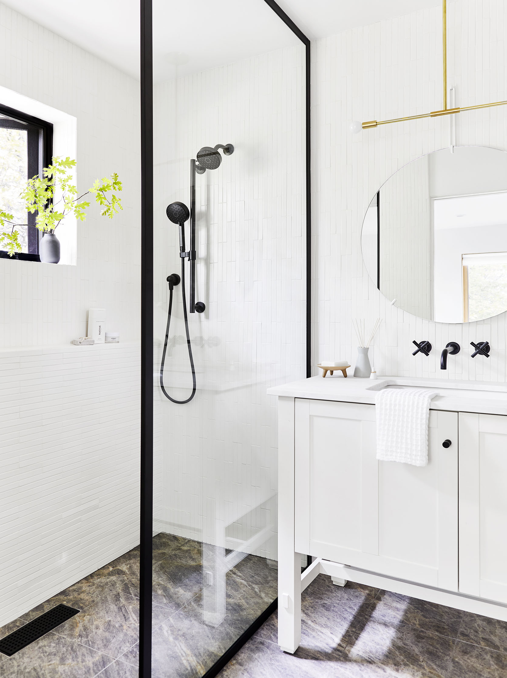
Assault with Cold Draft: Oh, did you want to be warm in your shower? TOO BAD. No door or curtain means that all your steam escapes, leaving you standing in a freezing cube. There’s a reason that the giant shared gym showers of yore didn’t make their way into our homes: because it’s cold and uncomfortable to stand – soaking wet – in a big, barely-insulated space.
Indecent Exposure: To that end, there is NO PRIVACY! (This goes double at the W Hotel in Philadelphia, which boasted the nightmarish combo of a barn door bathroom entrance and a glass wall separating the shower from the bedroom. WHO DESIGNED THAT?!) With a doorless, curtain-less shower, you’re visible from the hallway. The toilet. To any guest who enters, should you forget to lock the door in your own home. There’s no privacy. Is it worth it? NO!
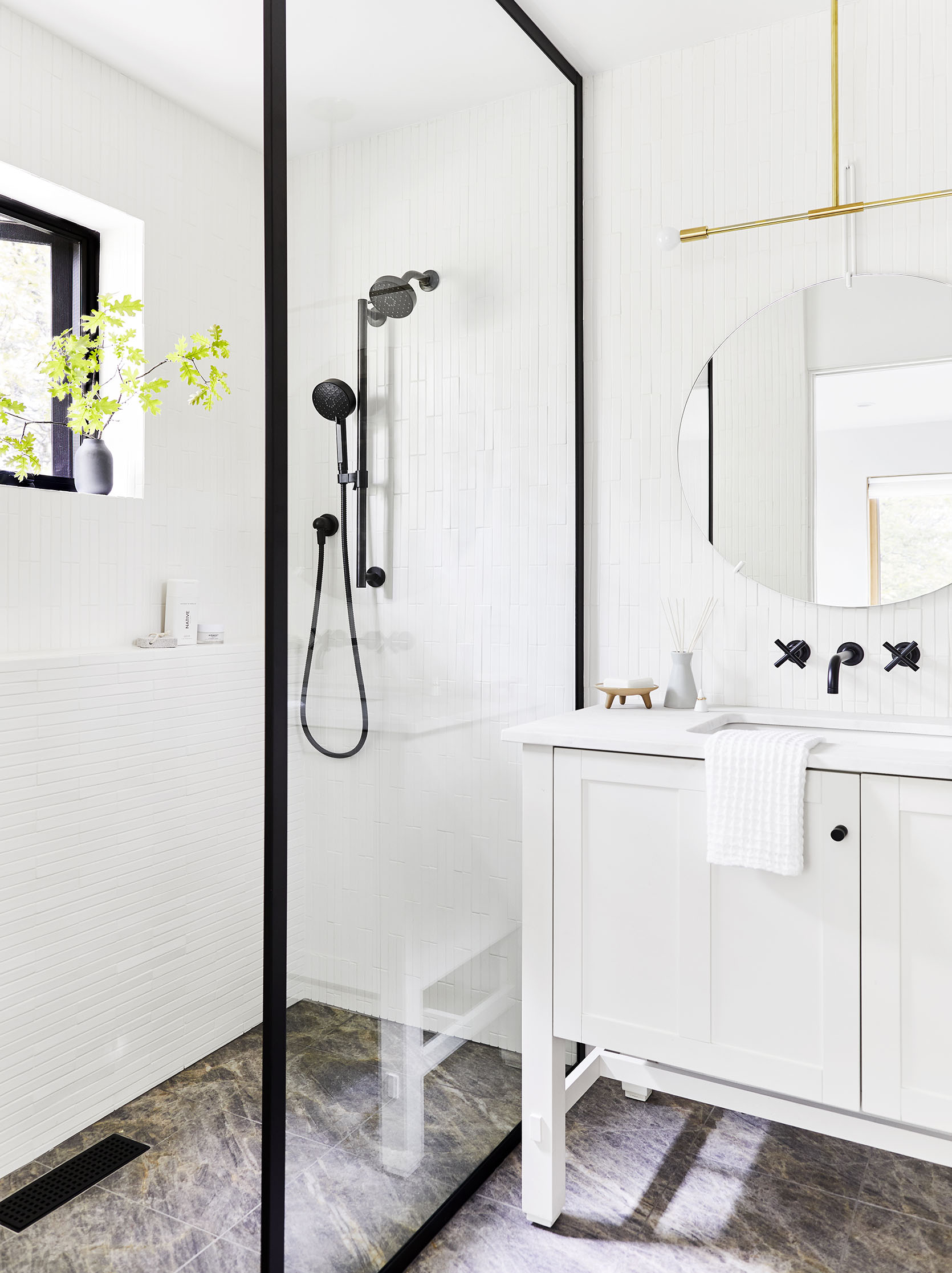
Cruel and Unusual Valve Placement: This is where I’ll give kudos to Em’s walk-in shower – she placed controls both on the exterior wall and the wall opposite the shower head, which did make for a far more enjoyable experience. But to everyone else, I say: SHAME! You better be bare naked and ready to get hit with a blast of icy water when you turn this puppy on, lest you find yourself standing in your clothes and totally soaked. (Learned that lesson in Ireland.) Who enjoys this?????
Reckless Endangerment: I know that the plans had a beautiful sloped floor, and the perfect linear drain, and that everything was plumbed to draw water away from the rest of the bathroom. BUT IT’S ALL A SHAM. Your bath mat is drenched. Did you accidentally leave your underwear on the floor? Too bad, they’re soaked! Did you think that your laundry bag would be safe in a far corner of the bathroom? YOU FOOL – IT’S ALL SOPPING WET NOW, just in time for you to shove it back into your suitcase before a day of travel. Oh, did someone want to sprint into the bathroom after your shower wearing only socks? Lucky them – they can enjoy wading through puddles in their now-damp socks. (Is this getting too specific?) And it’s SO MUCH WATER, you guys. In Ireland, Den and I burned through our towels trying to keep the floor dry, and our Airbnb had a special heated room that could expedite the drying process because this happened to EVERYONE. Give me a door, a curtain, a ledge, anything, PLEASE!!!!
Embezzlement of Budget: The true horror: you are paying more for the trouble! The additional waterproofing, the floor slope, the linear drains – they’re more expensive than any standard tub or shower. I don’t love my little $1,000 shower insert by any means (and believe me, I have big dreams of remodeling once I finish settling my mom’s affairs and have a moment to breathe!), but even that little ugly white fiberglass number provides a less stressful bathing experience. (Like, imagine this novel concept: the water stays where it belongs and doesn’t leave me with a cleanup project afterwards!)
OKAY, OKAY. I’m being a bully. And I will concede that there is at least one legitimate use case for these nuisances.
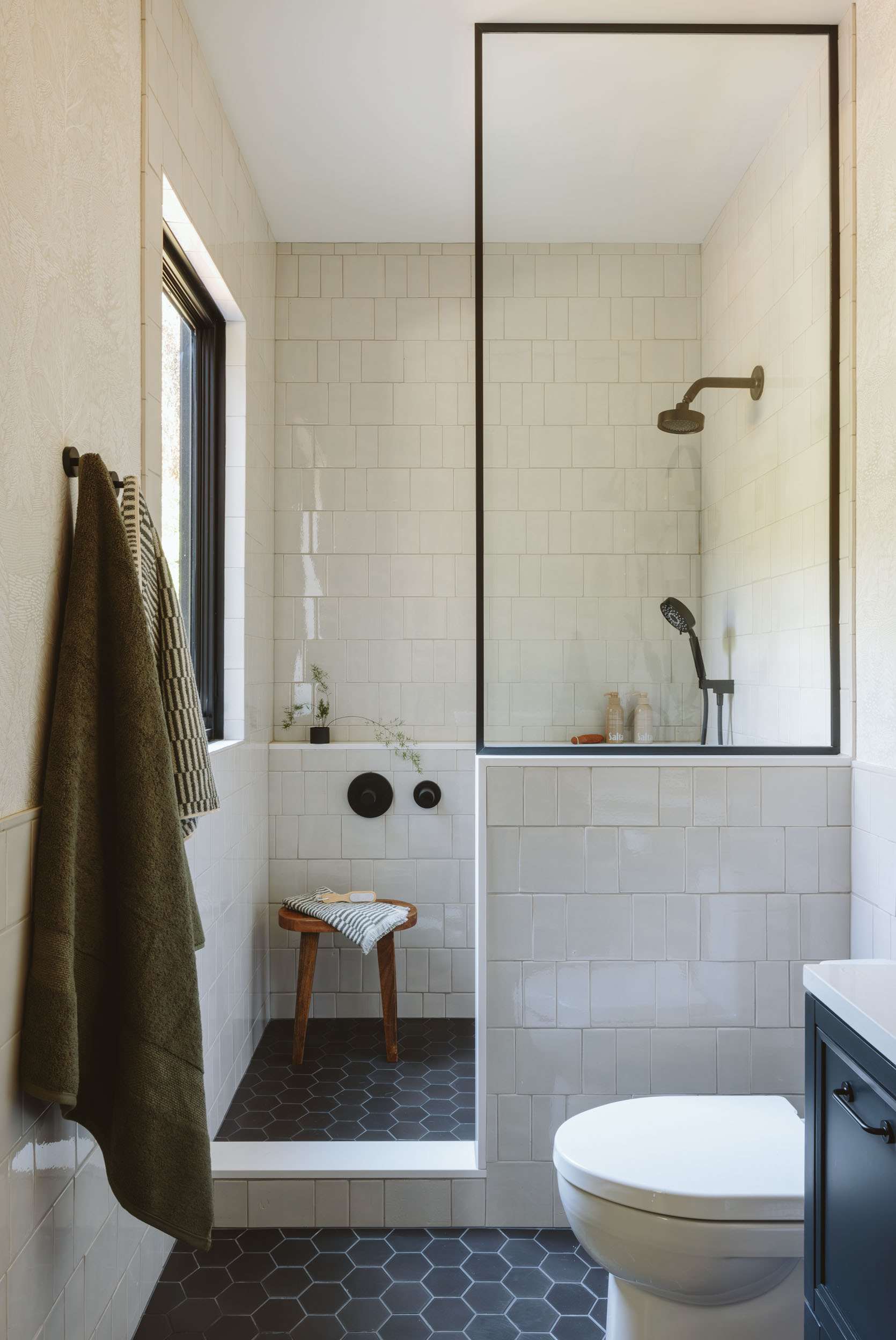
Aging in Place: Last year, my mom and I became regulars in the handicapped suite at a local hotel. We didn’t have a first-floor shower in our home, so I’d pack Brenda and all of her essentials up in the car, drive her across town, set up our shower stool, and then I’d give her a nice little scrub down. (Her cancer caused something called Paget’s Disease, which meant that any movement could – and often did – break a bone. Loudly, and terrifyingly, and frequently. It was really horrible!!!! I am still trying to process it!!!)
ANYWAY. This was the only way my mom could bathe, and for that reason – and that reason alone! – I will give some doorless showers a pass. That being said, she was still freezing her little tushy off any time the water wasn’t hitting her core! There was no steam to keep the room warm, and it took a lot to get her body temperature back up. It’s hard to give a really good shower to another person without getting yourself wet in the process (I found that wearing a sports bra and workout shorts to be the best outfit, FYI), and at that point, we might as well just be getting soaked in a regular shower. Easy access does not eliminate one’s need for a door! (This isn’t even defense, at this point. This post has just turned into a tirade. C’est la vie! Can you believe this is a job?!)
No Squeegee, No Problem: I mean…I suppose there’s little to no glass to spot? No tracks to scrub? No hinges or seals to fail? I guess that’s all a plus, in the same way that, like, having no windows in your house would also reduce your cleaning load. (Read: it wouldn’t, because now you have a whole new mess to handle.) But to each their own?
Character Witness: I will concede: they are beautiful. Nothing blocks light or airflow; they really do help a bathroom feel like a spa. And they can even be done well! I will even admit that I did enjoy Em’s – I cranked the temperature up to 140 degrees from a wall unit outside the shower (obsessed with that level of control, TBH), opened the window for a nice warm breeze, and the installation was precise enough as to not totally soak everything in the room. (Hey, W Hotel Philadelphia, you should have some Lake Arrowhead contractors out to help fix your showers!!!) But I am not a world-renowned designer – I am a mere mortal – and I do not trust us regular folk’s ability to successfully execute (or operate, TBH) these showers without causing a big ol’ mess in real life.
I mean…this one feels open and shut, folks. THROW THE BOOK AT THE DOORLESS WALK-IN SHOWER. Do you want a perennially wet bathroom? What are we even doing here? Is it worth being cold every day in the pursuit of a beautiful room? How far would you go for design? In this case, I argue: we’ve gone too far. PULL IT BACK. This ain’t it. You deserve better. And I do, too!!!

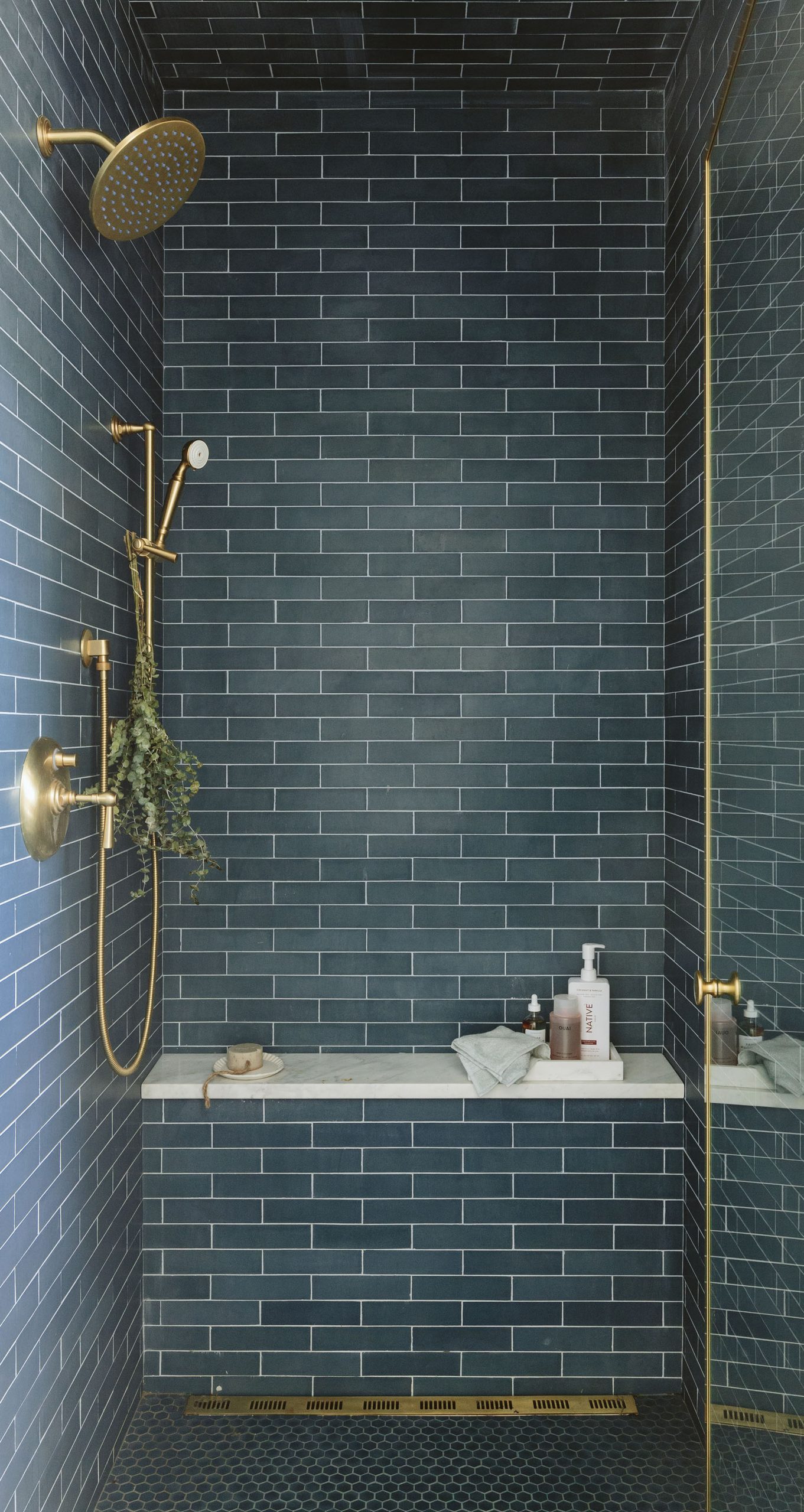
The doorless walk-in shower promises…well, I’m not even sure what it promises. It’s pretty, I guess? But there are lots of beautiful ways to build a shower that don’t involve being a little uncomfortable all the time. SHE’S GUILTY OF FRAUD. This is blatantly false advertising – it’s a beautiful image on Pinterest that turns into a frustrating chore in real life. We can no longer stand idly by as innocent homeowners across the world are FOOLED by this visual trickery!!! The sentence? LIFE IN PRISON. Maybe some time behind bars will teach this doorless shower that a little enclosed space can – sometimes – be just what the doctor ordered.
You know what the funniest part of this is? This thought experience has inspired in me a newfound appreciation for my dinky, dingy, tiny little showers. They’re not much to look at – I might even argue that the LA shower is, uh, a little gross after a century of use – but they do their job! They keep me warm and clean, and they’re a-okay in my book. May we all find such peace with our own bathing situations. BUT FOR THE LOVE OF GOD, KEEP IT ENCLOSED!!!
Now, what say you? Please share your hot takes. Anyone want to file an appeal?!
Opening Image Credits: Photo by Sara Ligorria-Tramp | From: Mountain House Reveal: The Upstairs Guest Bath That Used To Be A Closet
]]>You asked, and we calculated. Today we are breaking down my sister’s budget kitchen remodel total cost, which we did in partnership with Lowe’s. I’ve written a few posts about the process (and obviously make sure you see the reveal here), so I might repeat some things for those just landing. Today I’ll break down what we spent from when we started the project. What is hard to calculate is our time and what it would be “worth” if we charged for it (for these makeovers we get paid from the partner to create the content, not from my sister). Here goes!
My sister and brother-in-law were already deep into their remodel before we began this project and partnership. So a lot of the work was already completed, making this budget breakdown kinda impossible to really add up accurately if you were starting from scratch. They had already finished the framing, rough electrical and plumbing, window openings, and drywall. Starting at this point was pretty awesome for us because they had laid it out really well and had already “placed” everything, so our job was to shop at Lowe’s for everything you actually see and design within these parameters. We didn’t reconfigure anything or even move an outlet (intentionally). Lowe’s covered materials and the flooring, cabinet, and countertop installation by Lowe’s vendors. We covered any outside labor. It was the most streamlined kitchen I’ve ever done because of their services. Let’s get into the numbers.
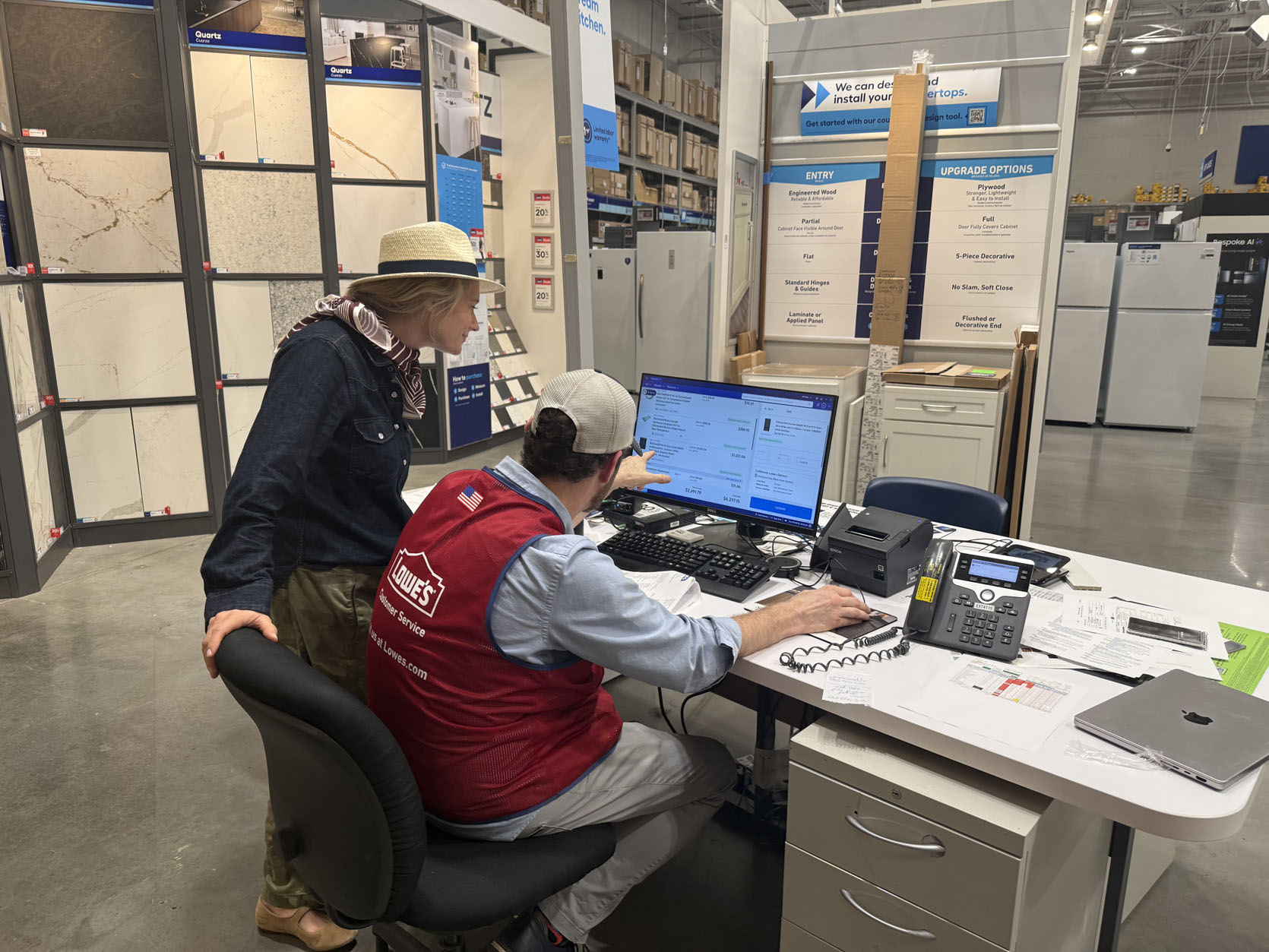
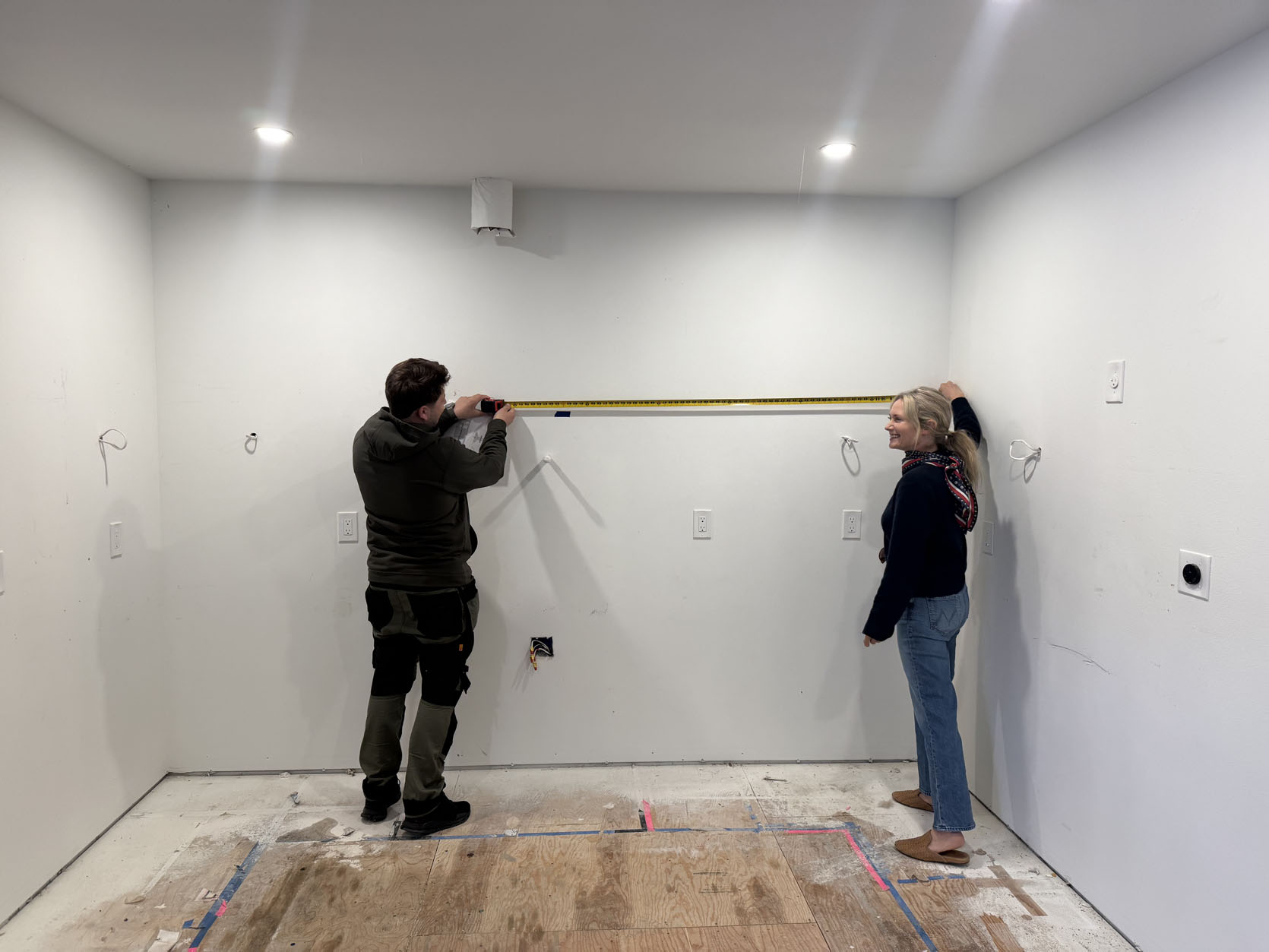
We met with Chris at Lowe’s to design and lay out the kitchen cabinets. To kick off the project and confirm the order is correct, Lowe’s sends someone out to measure your kitchen, ensuring everything will fit just right. This costs $75. This is to cover their time to design it all in case you move on to a different cabinet company.
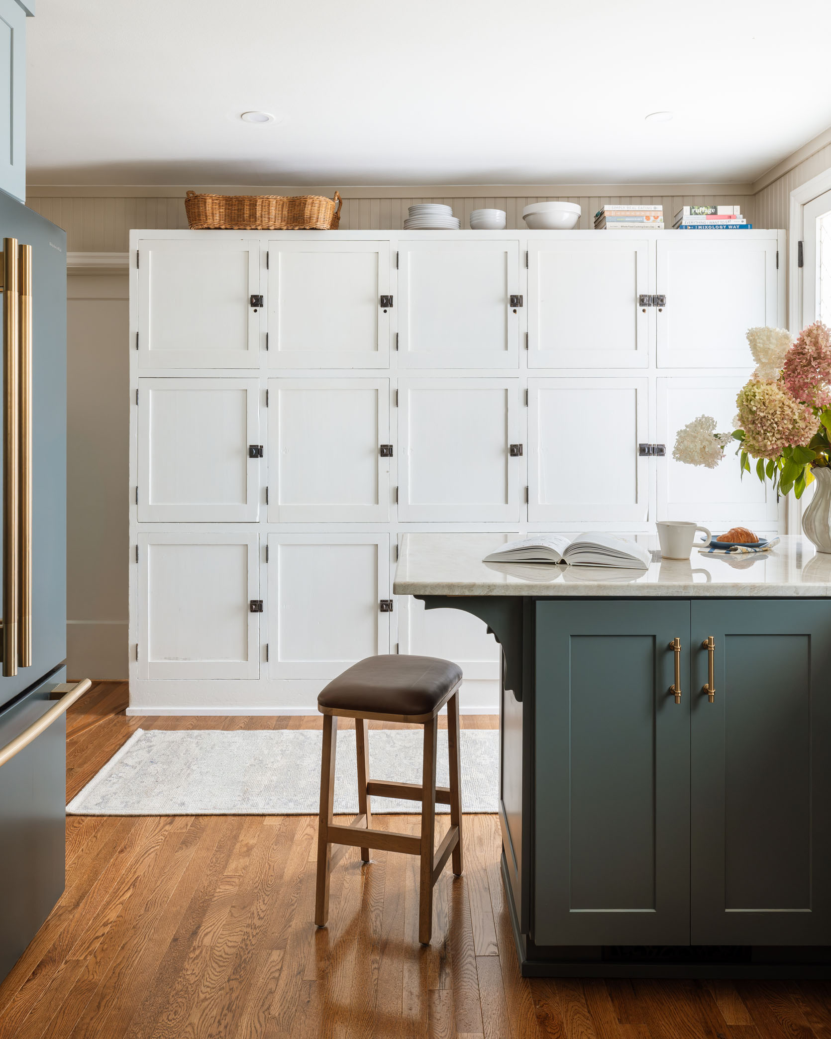

Bruce Hardwood Floors in ‘Fawn Oak’
We chose this wood floor (which we LOVED) for $4.79/sq ft or $105.38/carton. Michelle’s kitchen was 219 sq. ft., so the materials added up to $1,342.81. The flooring was installed in one day by one fantastic installer. The labor costs totaled $900.81. Lowe’s managed the vendor and set up the appointments (it was super streamlined). Now, full disclosure, the install rate will be different everywhere because from what I can tell, they are installed by an outside vendor that Lowe’s works closely with,. So depending on where you live, your Lowe’s would have different contracts with different vendors, so price could vary. As a reminder, we were so impressed with this wood. I was a hardwood snob before and couldn’t believe that something this affordable could look so good and classic.
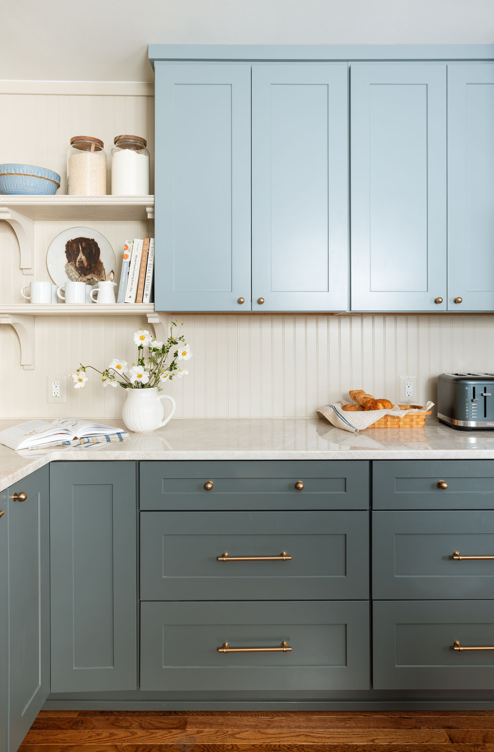
Upper Cabinets: ‘Tropic’ | Lower Cabinets: ‘Emma’
The cabinetry was and will always be the biggest expense (which is why we always encourage trying to paint or refinish what you have if you can). We fully broke down the cabinets in their own post last week, but the quick and dirty is that we chose two different lines (slightly different price points) for uppers and lowers. And we saved money by using a huge vintage pantry and installing shelving instead of uppers for part of the kitchen. If you are shopping at Lowe’s, here’s a cheat sheet on the cost of the cabinetry from least expensive to most expensive:
Diamond Express | Allen & Roth | Shenandoah | Diamond Express Plus | Diamond Intermediate | Kraftmaid-Diamond Advanced | Schuler
Cabinets with 30% discount: $16,294.96
Cabinet Install Labor: $4,037.96


Electric Range | Brass Knobs | Refrigerator | Brass Handles
The appliances were fantastic and so pretty (they drove the whole color palette). They definitely aren’t the cheapest line, so this could be somewhere you could save money, but they are also just so prominent (especially in a smaller kitchen), so having them all be as streamlined as possible will keep it from looking too cheap. Here they are broken down:
Fridge: $2,463.12 + $359.10 for brass handles
Electric Range: $1,601.11 + $337.46 for brass handles
Rangehood Insert: $209.98
Dishwasher: $1,221.06 + $189.05 for the brass handle

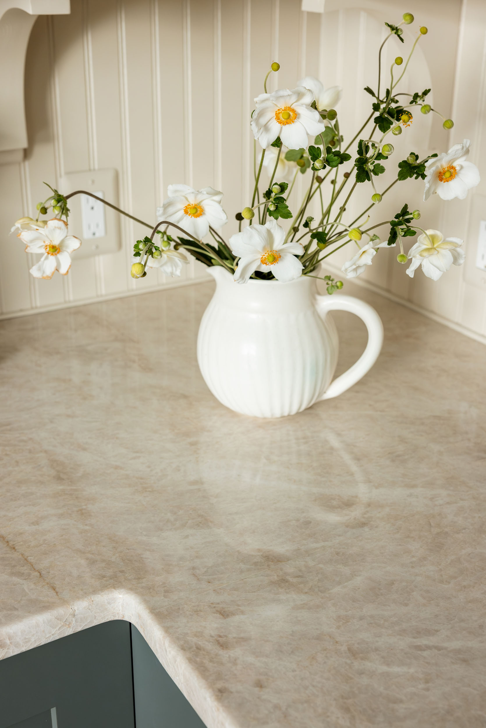
This was one of the places where we splurged. Lowe’s doesn’t break down the cost between materials and installation. In my experience, it’s specific to the stone because if it gets cracked or broken during fabrication, they have to replace it, so I would imagine the install cost increases with real stone that is slightly more expensive with Lowe’s, too. We estimated what it would have cost if we used Organic white Caesarstone (which is one of my favorites for engineered stone), and with the current promotion it would be around $6k. So that is a substantial savings of almost $5k from what ours cost. Lowe’s most popular option (if you are curious) is Golden Sky(D Grade), which is a faux veined engineered stone; the price with the current promotion would be around $9,662.70.


Hot Water Faucet | Faucet | Sink | Pot Filler
This is one place you could have absolutely saved. Michelle had already plumbed for two things that are a nice-to-have, but not a need-to-have: the pot filler and hot water faucet (they also plumbed and planned for a pebble ice machine, which we capped and nixed). So as you can see below, that could have saved a lot. Garen already had the disposal, so that’s not included here.
Farmhouse Sink: $275.08 (This is a GREAT place to save. It looks as expensive as fancy ones!)
Sink Faucet: $258.99 (we chose this faucet because we had to choose one that had a full suite that we liked, but it’s great on its own)
Hot Water Faucet and Tank: $549 + $389. Uh oh. Ok so annoyingly, our brass faucet didn’t come with a hot water tank, so we had to buy another one separately just for the tank. We didn’t know this up front, obviously. It did come with a silver faucet, so if your main faucet was nickel, this is a much more affordable choice.
Pot Filler: $789
So nixing the hot water and pot filler would have saved us over $1,700!
I can’t do cheap hardware. In fact, I would prefer painted wood knobs over cheap metal ones. We touched on this in the cabinet deep dive last week, where you saw all the options we were considering. We spent $326.46 on knobs and pulls for all the cabinets. Knobs were about $8 each, and our long and short pulls were $19 and $14, respectively. These were on the more expensive side, for sure, but absolutely worth the extra couple hundred dollars, I promise.
This was a fantastic place to save money. Sure, there are cheaper fixtures out there, but this one looked higher-end than that price and yet wasn’t splurgy at all. Michelle and Garen had already installed recessed lighting before we started the kitchen design, so if this number seems low, it’s because it is. This $167.99 covers the one pendant light above the kitchen sink. The rest were recessed lights already installed.
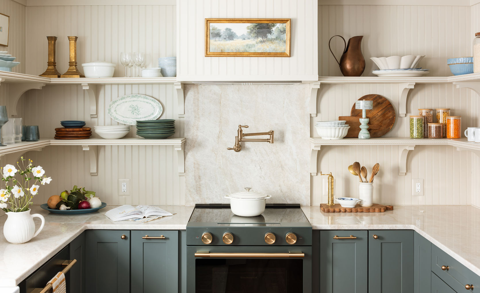
My brother hired a finish carpenter to do all the beadboard panels, hood box, shelving, and brackets.
10 beadboard panels: $267.60.
18 wooden brackets we needed for the shelving and to support the peninsula overhang: $327.96.
Wood and decorative trim it took to build out the shelves: $453.60.
The finish carpenter charged $2,600 to install all the panels, build the hood cover and shelving, and secure it all to the wall.
We hired a team of painters to come in and spray the room and paint my sister’s large vintage cabinet. Painters did the job for $1,500, and we estimated that we spent about $350 on paint and supplies. Now this is a place where we could have saved by DIY. The reason this was even this low is because we specifically didn’t change finishes or paint colors, which requires so much more time/labor. So the walls, brackets, shelves, and trim were all the same paint color and finish, while the window, door, and vintage cabinet were white to add some variation. But if we had chosen to do the brackets and shelves in a different color than the walls, it would have taken twice the time, and thus cost twice as much (we used the Forte line from Sherwin-Williams in satin finish – this is a self-priming, self-leveling paint that is super durable).

Of course we styled it out, but a lot of those things were things that I had in my inventory or were vintage (some she kept, many she didn’t). So this cost is for the remodel cost, not the styling and decor.
Garen is handy when he’s not busy running his window company, so he installed the appliances, and he and Ken did some of the finished plumbing. So yes, he’s a window expert (he owns a company where they keep the vintage frames and double-pane the windows on site, which is so cool), so he installed the new big window.
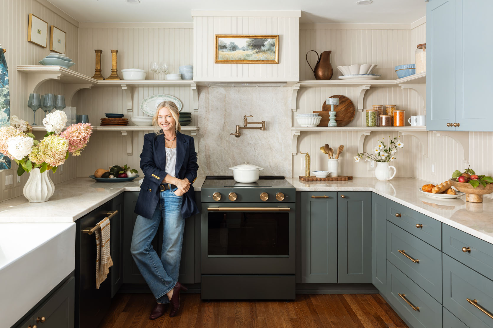
Now trying to calculate my time, Gretchen’s time, and my brother’s time is kinda hard. As you know, designers and contractors are expensive to hire, as they should be. I think I spent probably 50+ design hours on this (not including the photo shoots, content creation, or negotiation of the contract, which most designers don’t need to do). Gretchen probably did more, let’s say 60, since she did all of our Spoak renders and did more of the ordering and project management. I’m not sure of the going rate for designers, so let’s say for me its 200$/hour (I have no idea if that’s accurate) and $100 for an associate designer/project manager. So maybe I would have been $10k and Gretchen $6,000 (adding another $16k to the projected cost). And then my brother, a contractor with Afore Construction, spent around 10-15 hours on the job, but didn’t charge us (I tried to pay him, but he’s a real caretaker of a brother and was like, “nah, it’s for my sisters,” which is very sweet).
I would imagine all the construction prior to arriving would be 20k+ (they were doing the whole house so hard to parcel out just for the kitchen).
So yeah…. Kitchen remodels are expensive, and they seem to be going up, not down. Here are the ways you can save:
I hope this is so helpful. I’ve done 10+ kitchens now, so I have more experience than a lot of people, but I’m sure other more experienced designers (kitchen-specific designers) can weigh in and give even more ways to save. My #1 tip if you just want a “better” kitchen but not necessarily a “designer” is to paint your original dated cabinets. Here are a few kitchen-specific posts that can help!
Reveals:
Design Tips:
*Photos by Kaitlin Green
]]>We don’t know if you’ve heard, but the holidays are coming up (ha!), and it’s the main time of year we want our homes looking their best, right? We know that so many of you have a hard time with bookshelf styling, and since it’s an easy (and potentially free) way to make your home look more pulled together, we are reminding you that this post is VERY helpful! Plus, there are new examples and tips to enjoy. So read this post, grab your favorite beverage, turn on some music, and start playing. We promise you’ll be happy you did it:)
Bookshelf styling can be incredibly daunting. It seems like a skill that should come naturally, right? I always say my dream would be to have a grand room with floor-to-ceiling bookshelves, but the truth is, staring at those shelves would be like staring up at a huge mountain I have to climb. Thankfully, EHD has taught me that there is an expert styling formula for almost anything. Lo and behold, we have discovered some no-fail shelf styling formulas that EHD has been using for years and years. If you feel lost, stuck, or just plain exhausted with making decisions, the following four formulas are foolproof and will make your shelves look like they were styled by an actual pro (that’s you!).

First, to help guide your quest, a couple of ground rules we swear by:
1. Maintain a consistent color palette.
2. Mix up the shapes, sizes, and scales.
3. Don’t go all “big box store”! Mix in vintage and personal pieces.
4. Include a little greenery.
Now that you know the basic rules, let’s dig into the formulas so you can style with some confidence.

Our first tip for styling bookshelves is to start by stacking books horizontally. This will immediately add visual interest and will inform how much more space you have to style with objects other than books. When you stack books horizontally, there is often space above, so our favorite trick to take up that unused space is to add an object on top. This could be a lidded bowl, a precious family heirloom, a vintage vessel from your travels, or truly anything you love and want to look at every day. Above, a stack of three books (in ascending size) is coupled with an aged sculptural vessel which adds shape and color to their shelves.

In the above home office, Ginny (EHD alum designer) peppered in books and objects to create an open yet collected look. The horizontal books are topped with round, sculptural objects, which add movement and texture to the shelves. How cool is that wood-lidded bowl??

So while this isn’t really a shelf and is definitely a console, the rule still applies and looks great! Everything is within a similar color palette with a variety of textures, but when you break it down, it’s simply some stacked books with a cool object on top. Also, make sure that you don’t put a tiny object on a really wide stack of books. Notice how the size of the objects chosen is complementary to the top book’s size. Scale is important too:)

Adding art to your shelves is one of our favorite styling tips that can add color, shape, height, and personality. We love the relaxed look of leaning art (as shown above), which also draws your eye to the back of the shelves, making them seem deeper and more open. Now the trick to styling around leaning art is to layer, layer, layer. Depending on the scale of the art, you can layer 1-3 pieces in front, which will create a collected look and will impress all your friends. Just make sure your objects vary in height, shape, and scale so it is easier for your eye to understand.


If you have several art pieces you want to display, you can absolutely layer art in front of art. Just make sure the frames are different sizes and layer the smaller one in front. Mal added a handful of really great personal pieces to the living room makeover she did for her parents.
While we love layering art in kitchens too, like A 1000x Better did in this incredible kitchen. Adds so much texture and color. So if you see a little piece of art you love at a flea market or thrift store, grab it! They are usually more affordable and will bring a shelf to life.

I am someone who loves my things. I know I am not alone, and it’s something we design enthusiasts have to come to terms with. I love my vintage coupe glasses, my collection of antique candlestick holders, and what would I do without my many lidded bowls and vessels?? Luckily for us, shelves are the perfect display case for objects if done right. Remember the second rule from the beginning? It will come in handy here. Basically, you can absolutely group together several objects as long as they vary in height, size, and shape. If you have a collection of similar objects you want to showcase, just make sure they are not identical to avoid your shelves looking too uniform.
For example, in Emily’s Glendale home, she styled her built-ins with many of her favorite objects and some collections, too. The three teal vessels on the right are similar but not identical, so they add personality without being too matchy-matchy.
Caitlin’s living room is another great example of “going for it” in the objects on shelves department. They are fun and varied, but nothing feels too overcrowded. Notice how, with her wooden mushroom collection and her colorful candlesticks, they are all different heights and slightly different shapes. Perfect collections that are interesting but not too overwhelming to take in visually.

Jess spent a lot of time finding unique sculptural pieces she loved, and it resulted in a very cool and collected shelf display! She considered height, shape, material, color, and pattern and made sure it all felt balanced. Your eye is happy to jump around but not in a way where it’s overwhelmed.


The River House Game Room is just so stunning, and once again, Emily Henderson reminded all of us she is the bookshelf styling expert. As opposed to her Glendale home at the beginning of this section, this styling has more visual breathing room. The objects chosen are also large enough not to get lost (helpful when the shelves are so high up) and in cool shapes to draw your attention and make it more interesting. Also notice how tight the color palette is. It’s so even and easy on the eyes.

As much as I love my things, I might love my books even more. If you saw my living room reveal, you know I have a bookshelf entirely dedicated to books. This reminds me: you can always style your bookshelves with just your books, full stop. However, if you have a lot of books AND want to sprinkle in objects and found things, that is, of course, an option too. To accomplish this look, again start by stacking your books both horizontally and vertically. Once you have done that, you can see where your objects make the most sense. With the grouping of vertical books, we suggest flanking them with objects or bookends to create space between the individual vignettes within the shelves. The more sculptural the object, the better it is to add intrigue and movement to your shelves.

Emily styled her best friend’s awesome dining room built-in with so many personal items, which were mostly photos and books:) But notice how she chose different shelves to use the same marble striped bookend with books stacked vertically. She also never used the same amount of books to make sure they styled didn’t look too symmetrical or boring.

The VHD and Emily Bowser nailed this too in the living room above. I love the alternating stacked book moments on each shelf and the fun, unconventional “bookends” they used. It really makes the space feel so unique to this home.
And there you have it! These four formulas have never failed us and make styling shelves so easy and fun.
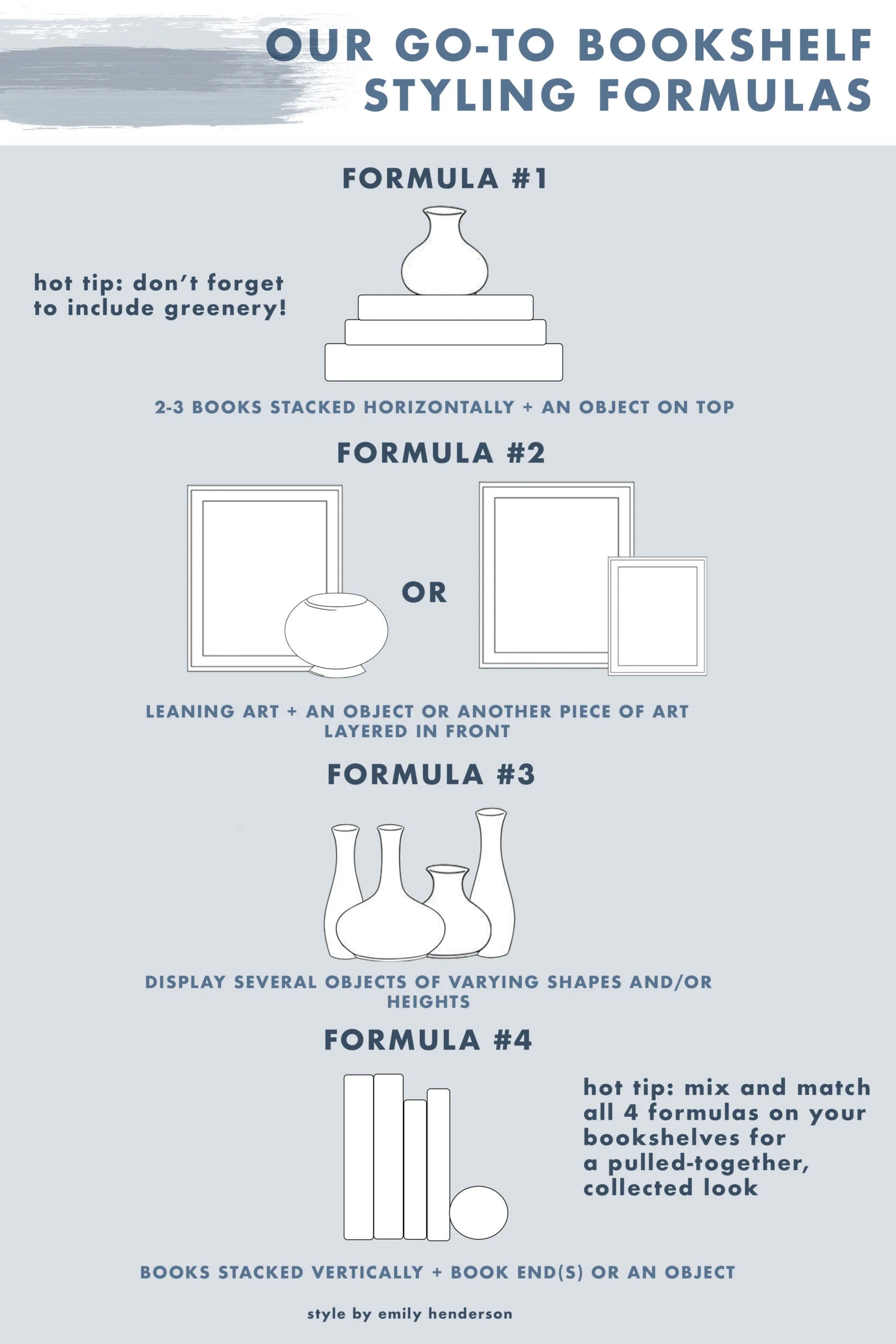
Do you have any other styling questions for us? Be sure to drop them down below. xx
Opener Image Credit: Design by Velinda Hellen Design | Lead Designer: Julie Rose | Styling by Emily Edith Bowser | Photo by Sara Ligorria-Tramp | From: A Kitchen Makeover That Focused On Small Changes For A BIG Impact (Julie And Velinda Did It Again!)
]]>This is an oddly important/big post for me (and potentially quite vulnerable for the person it’s basically about). You may be asking yourself, “Jess, why is teaching us how to frame posters so that they look cool ‘big’ for you?” Fair question. This post is about how my kind and sweet boyfriend sent me pictures of his apartment so that I could more or less publicly critique his art installation. In the now 10 years I’ve worked here, I’ve never talked about a boyfriend. But he’s very special, and this was clearly the natural next step. It’s the classic: become official, then say I love you, then be talked about on a design blog. Normal relationship stuff! To be fair, he offered as I was worrying about being stumped on something I wanted to write about. It went something like, “Well, what about helping me make my walls look better?” I stopped, smiled, and then double-checked he was sure. He confirmed, and started sending my photos.
If any of you know my style, festival posters and vinyl albums are not what I tend to put on my walls But it is what a lot of people do. It’s a visual reminder of good times and interests, which I can, of course, understand. I sent one of his photos to Arlyn, and her response was, “If Charles lived alone, this is exactly what his place would look like.” While I don’t want to gender types of art or framing styles, in my experience, this does tend to be a classic male aesthetic. For my economically-minded boyfriend (along with so many guys this age), they head to Amazon, grab very affordable standard “full bleed” frames for things like posters and albums, and call it a day. There isn’t anything inherently wrong with that. But when you are an adult (say heading into your 40s), there are simple ways to elevate a beloved festival poster to look how you really want and, dare I say, yes, look cooler.


Let me also say he has a very cool apartment (with central AC!). You never know what you might walk into when entering a man’s home for the first time, but a downtown loft with huge windows and an awesome brick wall feels very much out of a movie:) It wasn’t the reason for the next date, but it didn’t hurt his chances. But guys, stop. This post is about ART. I couldn’t help but notice said art on that first visit too. To me, it was “classic single guy in his late 30s”. Did I think it could be kicked up a notch? Sure. But I’d never suggest someone change something in their home. I do not go into people’s homes judging or imagining how they should be different. But in this case, this was a person I was newly dating and, if things went well, would maybe, down the road, potentially build a life with someday. I was going to be checking out the decor, people! Ok, enough dating storytime. Let’s talk design.
This is how the art currently looks. His original plan was to add another row of four albums on the larger wall to have a bigger grid configuration. Turns out the first row was a real pain to put up, so he decided to deal with it later…that was months ago. A story as old as time. The two framed posters above this desk, to me, are a little too far apart. I believe he centered them with the whole wall. Logically, I see how that made sense. But visually it’s not quite right. If the frames were larger, this could have been fine. But in their current size, the scale is off with the width of the wall, and it also looks a bit off with the desk.
So, as he was sending me photos, he decided to do one more pass with the help of AI…just to see. He has these three large posters framed, leaning against the back of his sectional, so he popped them in, and this was the result. Of course, he immediately didn’t like it (too high and not in line with the albums). It was then my turn…
See how much better it looks with a picture mat and in a larger frame?? It looks intentional and elevated (but still fun). Since all of his frames were black, I wanted to show him an option with a darker walnut. Another way to add a layer of style is to mix frame colors and even materials. It’s all about the overall visual balance, which I’ll get into more later.
I also prefer a thinner frame in general because it feels more modern and tends to look more expensive. Speaking of which, the unfortunate reality of doing this kind of poster framing is that it will likely require a bigger financial investment. A standard full-bleed poster frame is 24″ x36″ and runs in the $35 range on Amazon, but upgrading to a ready-made frame with a mat border (like 28″ x 40″) is anywhere from $45 to $100. It doesn’t have to be a lot more money, but it’s not less. Of course, it’s even more if you want a custom frame, but if it’s in the budget, they do look incredible. We’ve used Framebridge, and I’ve used Frame-It-Easy for online orders. Frame-It-Easy doesn’t have many thin frame options, so just note that. If you are in Portland, Em’s handyman, Dave, is an expert framer and has helped her with some pieces. If you are in LA, I’ve used Quick Frames in the Los Feliz/Atwater area. They guarantee they have the best prices, and they are so easy to work with.
But if you simply prefer a full bleed, here’s an example I like:
The frames are in a pretty wood that’s thin and complements the credenza’s tone. The scale of the art with the width of the credenza also looks great. Oh, and the edges of the posters’ borders have some negative space. It almost gives the illusion of a mat frame.
Here are some great larger (mat-friendly) frames I found:
Engineered Wood Matted Poster Frame to 24×36 – $49 | Thin Aluminum Poster Frames – $77 | Petrol Wood Frame – $129
These are all ready-made and in three different price points. They also each have other color options. The first two only come in neutrals, but The Poster Club one comes in a bunch of really fun but cool colors. Don’t be afraid of a pop of color.
Solid Teak Wood 27 x 40 Frame – $98 | Oak Wood Photo Frame Matted to 24×36 – $81 | Brown 27×40 Picture Frame – $45
These also all come in other colors! All pretty wood, and how great are the edges of the teak wood frame? That’s a subtle detail that, especially in a gallery wall, gives it some edge.
Ok, he liked the dark walnut for the design area pieces, which then helped choose the frames for the bigger wall. And as you can see, I moved the albums, but they’ll be back shortly. The grid of four on the large wall was in the same sightline as the diptych on the desk wall. It was too linear and one note. It didn’t really create any real interest, and your eyes didn’t have anywhere to bounce around to. But by making the diptych’s scale bigger and the larger wall a gallery (that fills the whole wall), your eye is happier with this better balance.
Let’s also note that not all of the posters have a mat border on the large wall. When you are creating a gallery wall specifically or hanging a lot of art in the same room, it’s important to have different styles and sizes of framing, unless you are creating a grid. But for a gallery wall, have some be full bleed (with a quality frame), some with a mat border, some float mounted, maybe one large mat with a little piece of art, etc. Here’s a whole post on how to create an EHD-approved gallery wall and another on how to hang art on different walls in the same room Now, you also want to mix the frames’ colors themselves. See how I used dark walnut, light oak, and black? It creates a subtle visual depth with how they are mixed in a balanced way. There’s almost equal space and use between them all.
Ok one more thing, and this is not a rule but, I think, a good guideline for poster and album art is to STAY AWAY FROM LARGE POSTER AND ALBUM WALL GRIDS. It may seem like the most logical configuration, but in many, if not all, of the examples I shifted through, they fell visually flat to me. They can take up a lot of wall space, which sounds good, but lack that movement and that interest we want from our wall art.
Here’s one of the better examples I found. While I would have personally opted for thinner frames, I appreciate the variety in sizes and frame styles, as well as the gallery being floor-to-ceiling.
Back to my boyfriend’s gallery wall:) This, of course, isn’t the final art he wants or I think is perfect, but putting it together was more to show to him (and maybe the men or other poster lovers in your lives) that they can still have art that speaks to them and makes them happy, but how it’s framed and arranged does make a pretty big difference.
See, I told you his albums were safe. The frames he put them in are totally fine. But what I think could make them look even cooler would be to put up single-album floating shelves. The brick column is a perfect place. I love how the walnut is a little softer to the eye, and functionally, he could easily swap out which ones he felt like displaying on any given day. What’s more fun than showing off your latest vinyl purchase and having easy access to play it?? There is also a 3-D element to these shelves that adds more visual variety to the room. Now, these shelves are $24 a piece, whereas frames like the ones he has can easily be $10 or under. A new option can cost more, but if you love it, I think it’s worth the larger investment.
There are, of course, so many different shelf options. Here are some others I found that I really liked:
Vinyl Record Ledge – $34
This is the one I used in the render. It comes in three different lengths and two different wood tones. I love how simple it is.
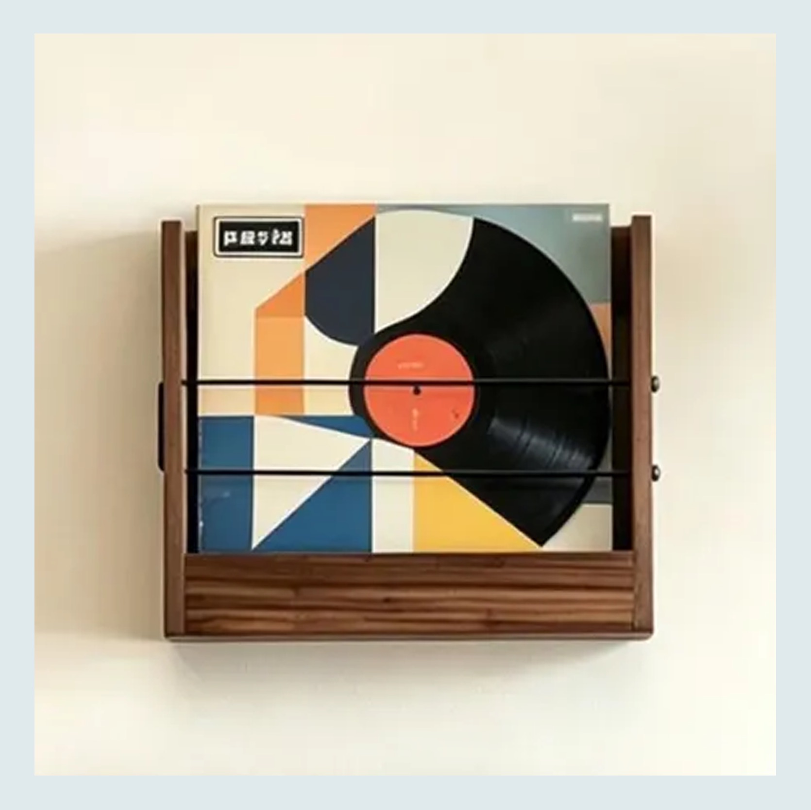
Handmade Walnut Floating Vinyl Record Shelf – $48 | Mid Century Modern Album Holder – $238
These were two others I thought were great too. The wood hooks (?) are very cool, but I wouldn’t display too many of them on one wall. I think this design is best at a handful max. The second album holder is so pretty but definitely not inexpensive. It comes in a lot of sizes, so if it’s in your budget, I think it’s a great choice.
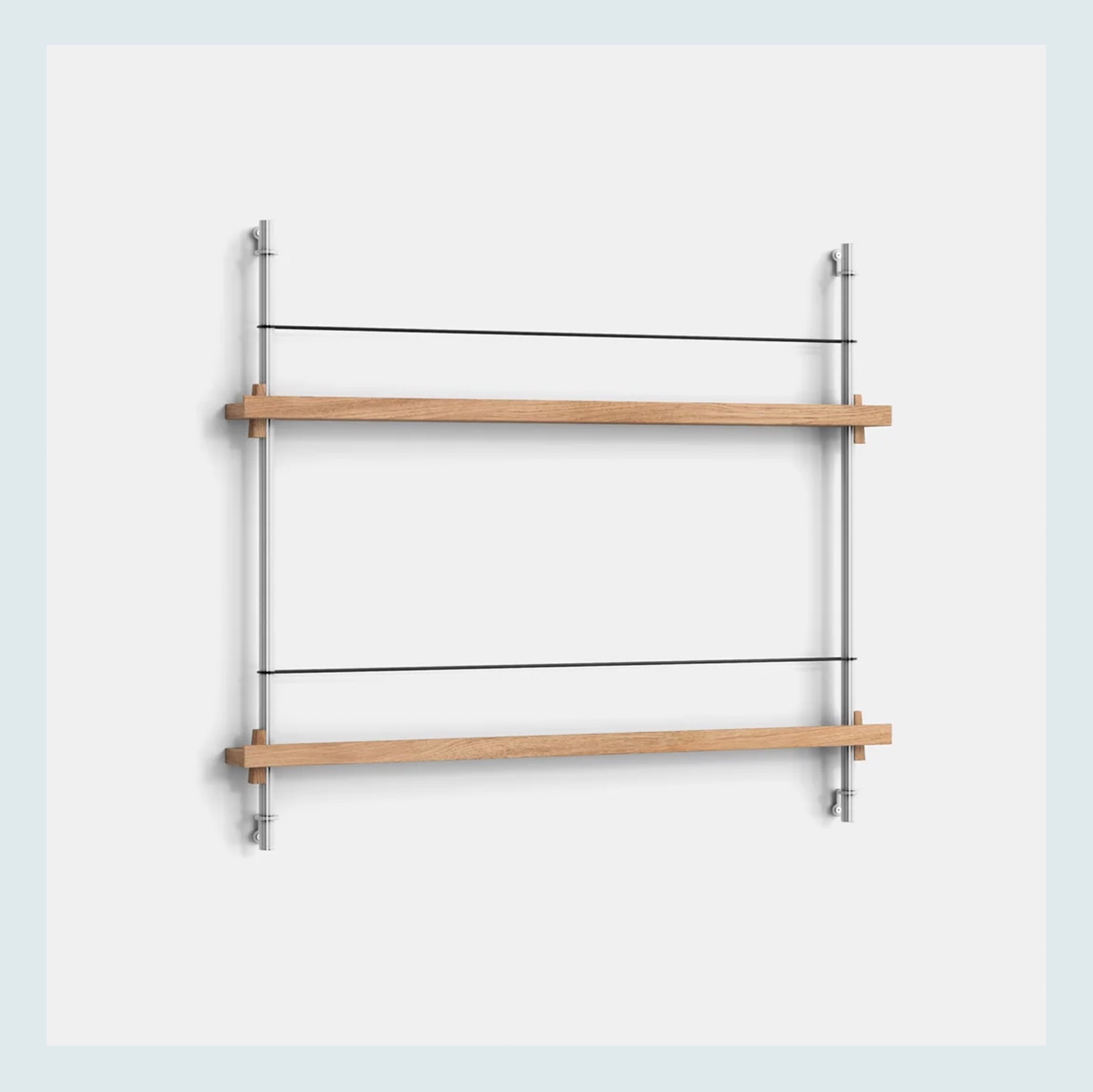
Magazine Shelving – $383
I saw this on Instagram and loved the idea! Technically, it’s a magazine holder, but in the example above, it can easily be used as an album display shelf. It comes in other colors and larger configurations too. Very cool, very chic, very Scandinavian. I actually was gifted my long wall mirror from my last apartment from this company, and it’s still so wonderful and beautiful. So I trust their quality.
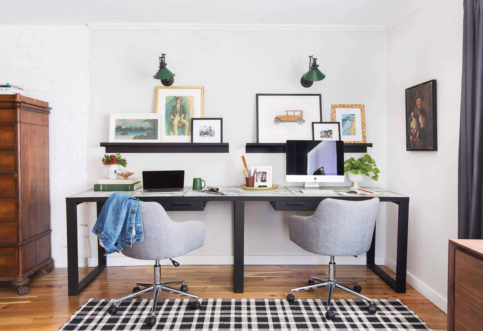
Another idea I really love, especially for rentals, is a long art ledge. I think the longer, the better/makes sense is best. In most cases, things look better when a little bigger. Again, scale is SO important. Think rugs, coffee tables, a piece of cake:) Like the single vinyl floating shelves on the brick wall, it gives so much flexibility. You can change up your art or the styling as often as you want.

I chose to show an art ledge over his desk with the two pieces. If this were a real shoot/life and not a render, I would have layered in more, but I like the visual variety it has in relation to the gallery wall. There would need to be a lot more playing around if the ledge were put on the larger wall, given the bigger and taller canvas (the sofa sitting low adds “more” height). Regardless, always remember it’s a great-looking display option.
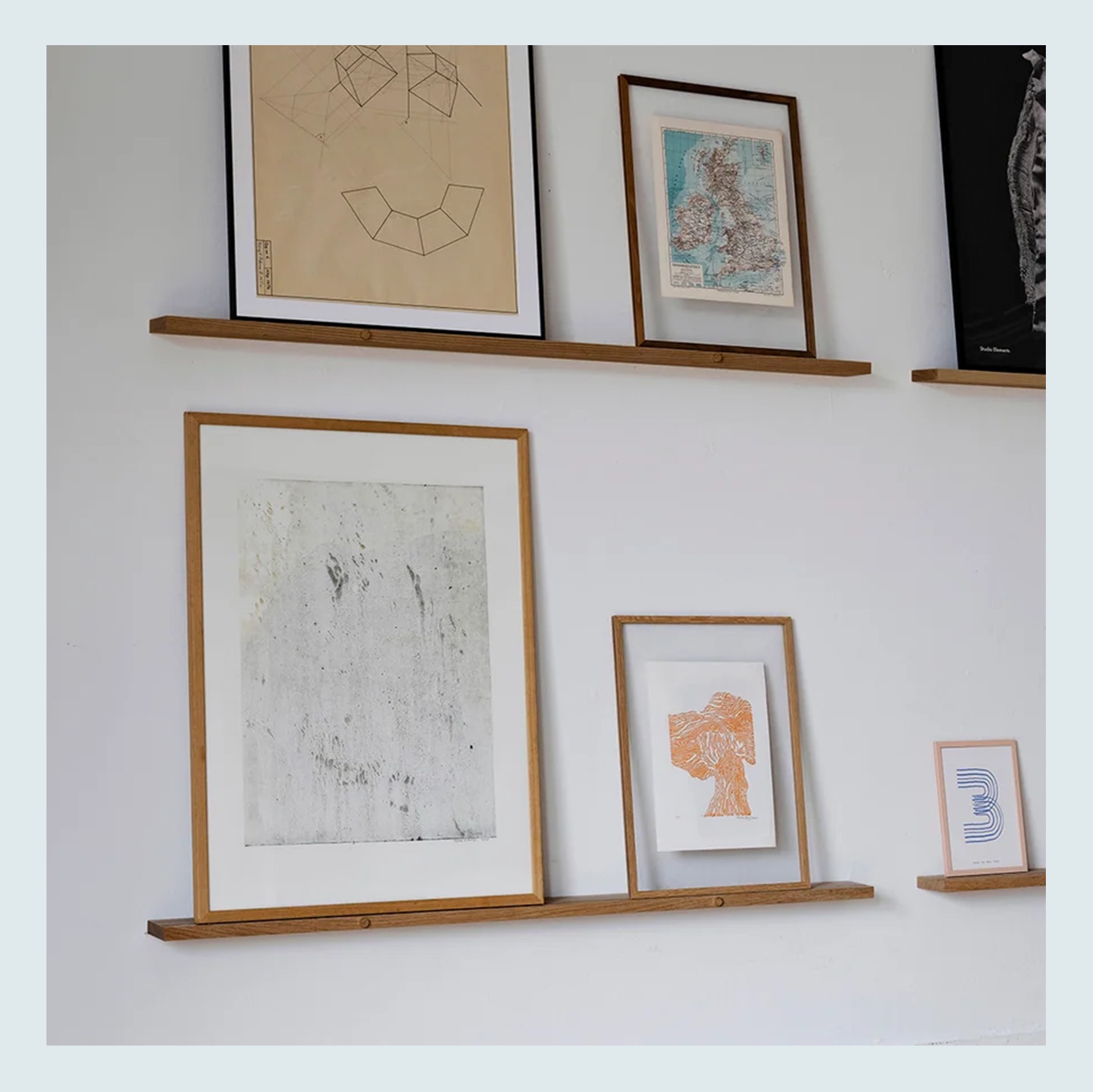
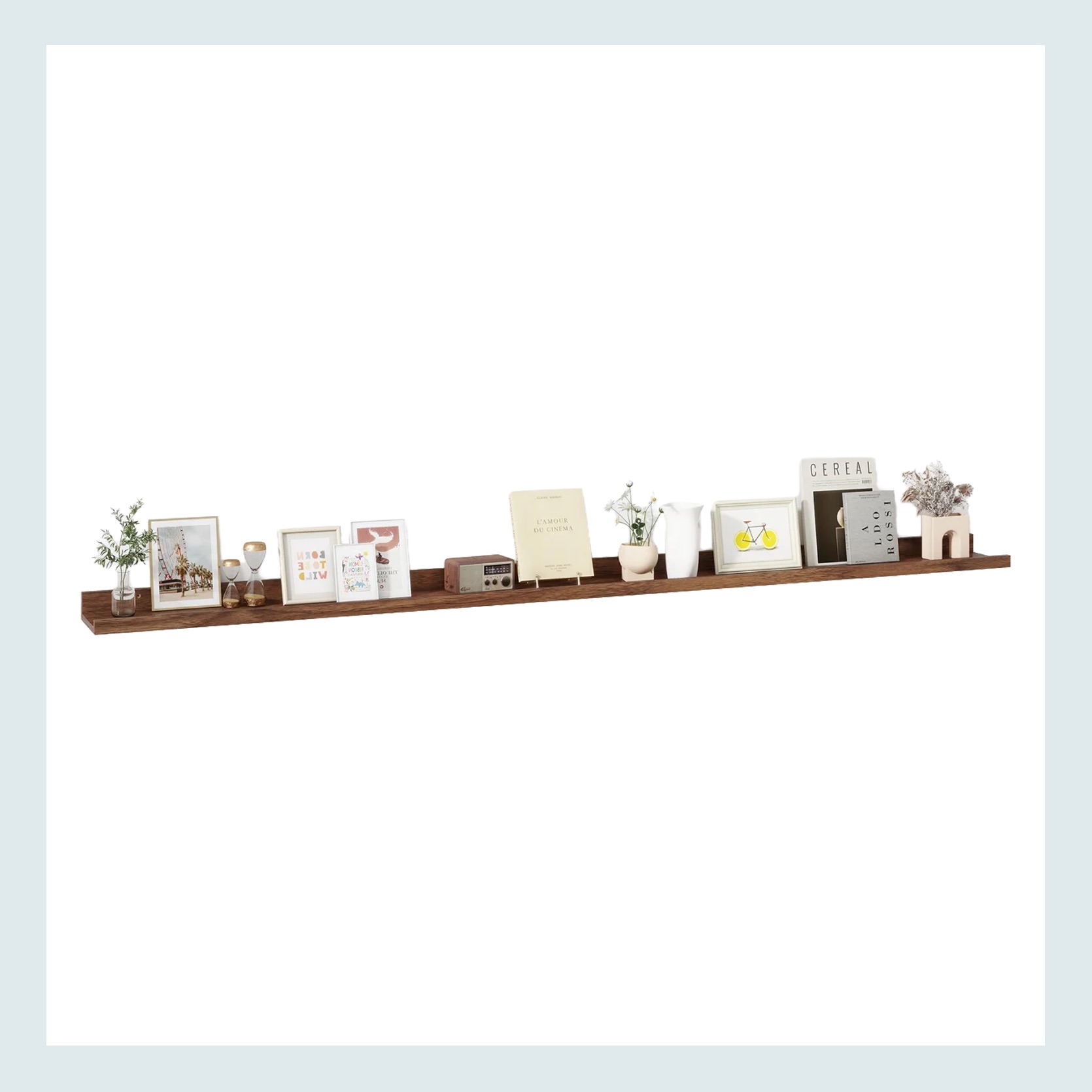
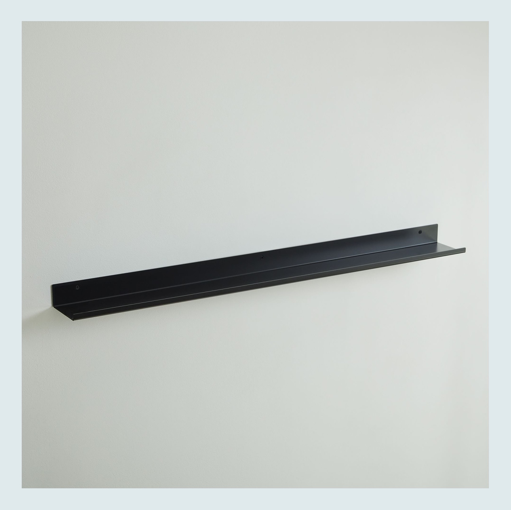
45″ Gallery Shelf – $162 | 72″ Wall-Mounted Floating Shelves (Set of 3) – $86 | Floating Lines Metal Ledge – from $49
Three great product options with multiple lengths for each, in three different price points. I do love the wooden circle dowel detail in the first one, which, naturally, is the most expensive. Cool cool cool. I am also a huge fan of the thin black metal one too. I think that profile is so chic but really understated in the best way.
Here’s a wooden art ledge very similar to the dark wood one above that shows a great display of multiple layered albums. Why I feel this one really works is that while they are floating, they are visually anchored by the TV and the wall/window. They aren’t just in the center of a big empty white wall all by themselves. I now think that was the issue I kept seeing with the posters and albums that were in grids. They were too large, with too much empty space around them (like in my boyfriend’s place…). This example is cozy but still has some breathing room so that corner setup isn’t cramped.



Vans Warped Tour 1998 Poster – $19 | The Beatles Help! Original Music Poster, 1965 – $128 | Trips Festival 1966 Handbill (6.5″x9.5″) – $100
Aside from flea markets, thrift stores, garage sales, and good old-fashioned hand-me-downs, the internet is your best bet to find cool posters. I doubt I have to convince any of you readers, that a vintage poster is almost always the way to go. The patina is priceless and visually adds so much soul to a room. We suggest Etsy, eBay, and Chairish as go-to places to check out. If y’all know of any great vendors, let us all know in the comments! But if your person is like my boyfriend and has a lot of their own beloved poster art, maybe just one vintage option could get added to the mix if it looks right:)


Cowboy Bebop Anime Poster – From $28 | Back to the Future Trilogy Movie Poster DeLorean – 3 Parts – $64
This one is less about finding something vintage and more about something that they love that’s presented in a cool way. One of his favorite shows is an anime called Cowboy Bebop. I haven’t watched it yet, but the original illustrations are maybe not what he would want to put on his walls. But when I asked if he liked this version on the left, he was into it. Again, I don’t know if this is something that he will end up getting, but it’s a good-looking, cool option of something he really loves. The Back to the Future triptych that’s on the right is actually one that Arlyn bought for her husband for either his birthday or their anniversary. They both LOVE those movies, and this was something that she knew he’d love and she didn’t mind hanging in their home. Oh, and she framed them in IKEA frames.
It usually doesn’t take a lot to make something look a little (or much) better. I hope that’s how you feel after reading this. Everyone should get to have art that they love in their home, and good framing is pretty transformative. Now, I only had my boyfriend read the first three paragraphs of this post (which he approved and said he really liked, phew), so chances are good you might hear about him again:) Until then, I’m just excited to help him make his place feel and look even better than it already does. Maybe a rug is next??? We’ll see!
Love you, mean it.
Opening Image Credits: Design by Sara Ligorria-Tramp and Macauley Johnson | Photo by Sara Ligorria-Tramp | From: Sara & Mac’s Office/Guest Room Reveal – LOTS Of Function + Even More Color and Style
It’s been a while since I’ve ventured into Secondhand Scores territory, but I’m back, baby! The premise here is easy: I find a piece of furniture that’s easy to overlook on places like Facebook Marketplace, and then convince you that it’s worth a second look. In the past, I’ve explored dry sinks, barrister bookcases, and vintage armoires. Today, I’m tackling the gateleg table. As I slowly furnish our new home in North Carolina, I’m trying my hardest to have at least a 50/50 split (maybe more) of secondhand to new, so I’m constantly cruising FBM. And let me tell you, there is a PLETHORA of drop-leaf and gateleg vintage tables available here. In truth, I saw them all the time when I was living in Los Angeles, as well, but I never looked twice. They seemed fuddy-duddy and old, and not the kind of old I liked.
But then…I changed my mind. Not for no reason, though. I kept stumbling across images of rooms that used vintage and antique gateleg tables in ways that made my thumb come to a screeching halt. They were grand, interesting, curious, and a little hard to understand at first glance. On the big dining varieties, there are so many legs in play. As we’ll learn today, they aren’t all like that, including the one I recently added to my home after I started researching for this post. I’m sharing a sneak peek at it at the end of the post. But first, let’s educate ourselves a bit.
Alright, so…a gateleg table is a type of drop-leaf table where the leaves are held up by legs or brackets that swing out like a garden gate. This furnishing got its start in England in the late 1500s and really hit its stride in the 1600s Jacobean era, when homes were smaller, rooms did double duty, and furniture had to earn its keep. The idea is pretty genius in its simplicity. A narrow center section holds one or two hinged leaves that drop down when not in use, and when you need more surface, a pair of legs swings out on a hinge, just like a gate, to hold the leaves up. Folded, it could slip against a wall or into a corner. Opened, it could seat the whole household for dinner. That flexibility made it a fixture in everything from farmhouse kitchens to taverns and inns, and it’s easy to see why people loved it, since it was basically the original space-saving furniture long before anyone was talking about small-space living.
The earliest versions were made of solid oak and had a sturdy, slightly chunky look, with legs that were often turned on a lathe into bobbin or baluster shapes. By the later 17th century, especially after the Restoration in 1660, the barley twist leg (pictured below this paragraph) became the star of the show. Named for the twisted barley sugar candy it resembles, this spiral-turned leg gave the table a sense of movement and craftsmanship that still feels special today, and it’s probably the detail most people picture when they think of an antique gateleg. Into the 18th century, walnut and then mahogany took over; the shapes got a bit lighter and more refined, and the gateleg eventually shared the stage with cousins like the Pembroke table. The Victorians and later the early 20th-century revival crowd brought the barley twist back in a big way, which is why you’ll see so many of those reproductions at estate sales.
Then came the mid-century Scandinavian designers, who took this centuries-old workhorse and made it feel brand new. Danish and Swedish versions traded oak and turned legs for warm teak and clean, tapered lines, and the leaves often dropped down to a surprisingly slim profile. Some of the cleverest examples even had a little cabinet or drawer tucked into the center section to store folding chairs, so the whole dining setup could disappear when you didn’t need it. It’s the same practical thinking that made the gateleg popular 400 years ago, just with a lighter touch and a lot more polish, which is exactly why it still works so well in apartments and multipurpose rooms today.
They come in varying heights, so they can serve as end tables, dining tables, hall tables, and even desks. And, as it turns out, a small gateleg table is exactly what I needed for my living room. You see, I had my eye on an Emma Chamberlain demilune bookcase end table from West Elm, but I really didn’t want to spend $550 on it. I envisioned a piece that could sit flush to the low and wide side of my sofa but would round out enough to fill some space in my furniture arrangement that I was struggling with. I tried hunting down a secondhand demilune table, but nothing was quite right. I also liked the idea of some flexibility. Could I find something that worked as an end table but also maybe even a low table for my daughter to use for certain activities?
And then I saw this image:
While this table has squared-off edges, it inspired me to pivot my search direction to drop-leaf tables and even gateleg. I kicked myself thinking about all of the pieces I skipped over for months and months because I didn’t see the vision.
As is common with peer-listed product marketplaces, the titles and descriptions of pieces aren’t always super accurate. Your best bet is to examine the images or see the piece in person to check if it operates as a true gateleg table, but some search terms to consider looking up include: Gateleg table, drop-leaf table, Pembroke table, folding wood table, wing table, swing leg table, folding leg table. Don’t forget off spelling variations, such as gaitleg, drop leave, and even something like barely twist instead of barley twist!
I found this website that does a great job of breaking down some of the eras key to this table’s history, how to check for authenticity, what to look for in the pieces, and even what they should cost. I pulled some of the pricing information (thank you, Antique Tables Co. for sharing this) so you have something to work from when you’re shopping for one. For most of the gatelegs you’ll find people selling on Facebook Marketplace, they’re likely Colonial reproductions, which are still made super well and highly versatile, but aren’t really worth all that much. These are the ones you can get a big deal on!
Be sure to check out this link for further details on the above if you’re interested in more nitty-gritty!
A typical part of this Secondhand Scores series is to show some actual listings so you can get a sense of what’s out there, how people title the listings, and what they charge. Here are some by me in the Raleigh, NC, area, but I also poked around some of the cities I know we have a lot of readers in, including Los Angeles, Portland, and Dallas.
Here’s what I have near me:
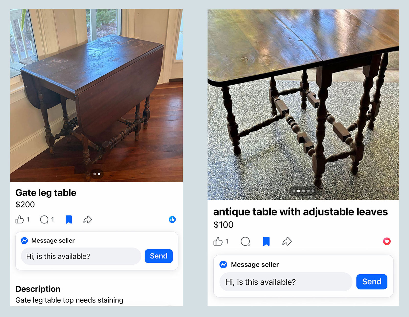
You can see that for around $100-$200, the condition varies. You may have to refinish the top, like the one gate leg table on the left. Also, note the title of the one on the left; no real mention of gateleg, but you can see that the two legs under the table leaves nestle into that little notch in the base (a hallmark of a gateleg table).

$75!!! For a gorgeous MCM gateleg. The top is in need of some love, of course. It would need sanding and restaining, but what a great project for such a low price. I could see that being used as a dining table if you don’t have a ton of space to always have a dining area set up, or a desk in a guest room that does double and triple duty. And the table on the right is right up my alley. This is a butterfly wing table, rather than a gateleg, but the function is the same. You can see it’s listed as a gateleg, though, so important to really study images and descriptions to know what you’re getting.
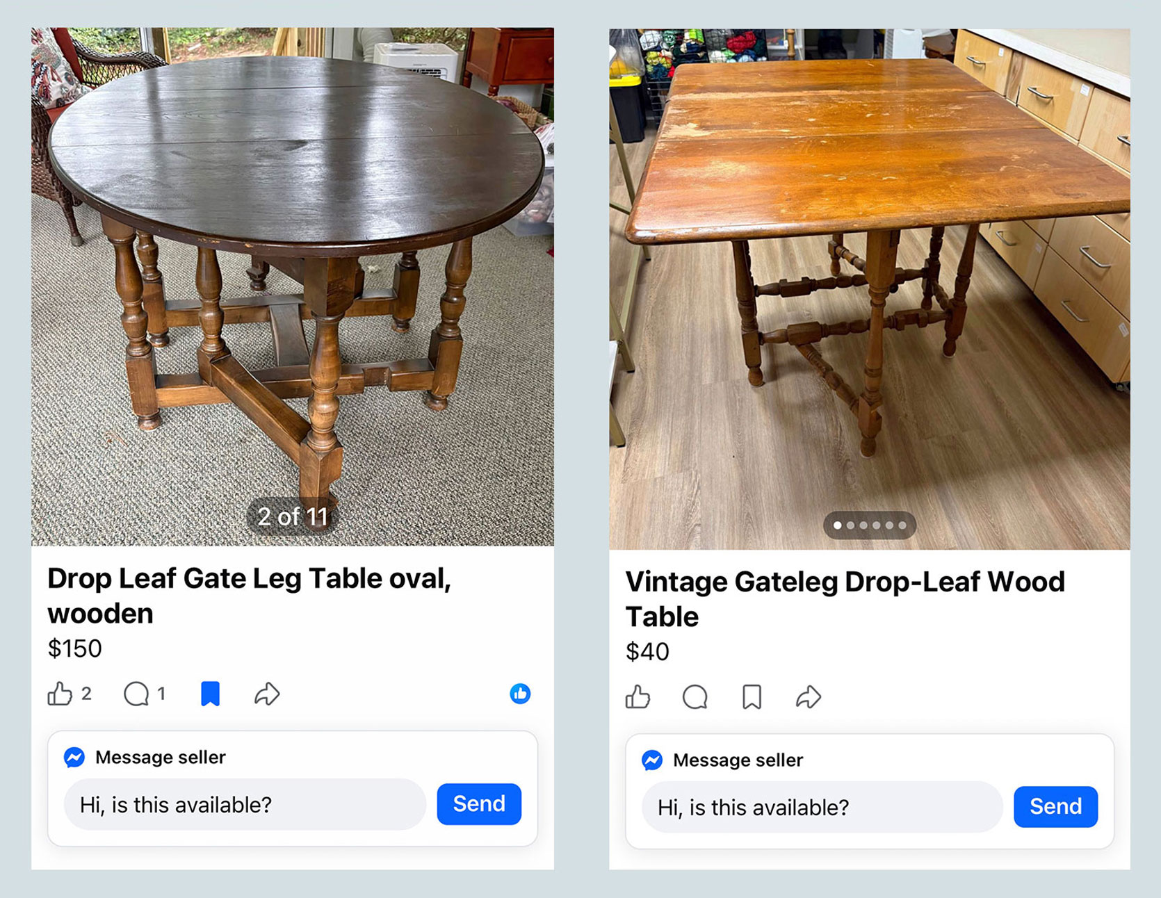
I’d love to see the oval table on the left as an entry table in a large foyer, or even as a center table in a home library (I’ll show you an example of what I mean later on). The $40 table on the right is, again, not in the best finish shape, but a light refinishing and you’ve got yourself a gorgeous console table to use in a hallway, as a bar in your living room, even as a narrow foyer table up against the wall.
Now, let’s look around the country. Here are some of the top results I found in and around Los Angeles, which feature similar pricing but some more variety in wood finish and design. That little scalloped number is CUTE!!!

Next up, Portland. A few more antique versions with barley twist legs in a dark mahogany finish.

And here is Dallas, with smaller occasional table options from $60 to larger dining table sizes for a few hundred.
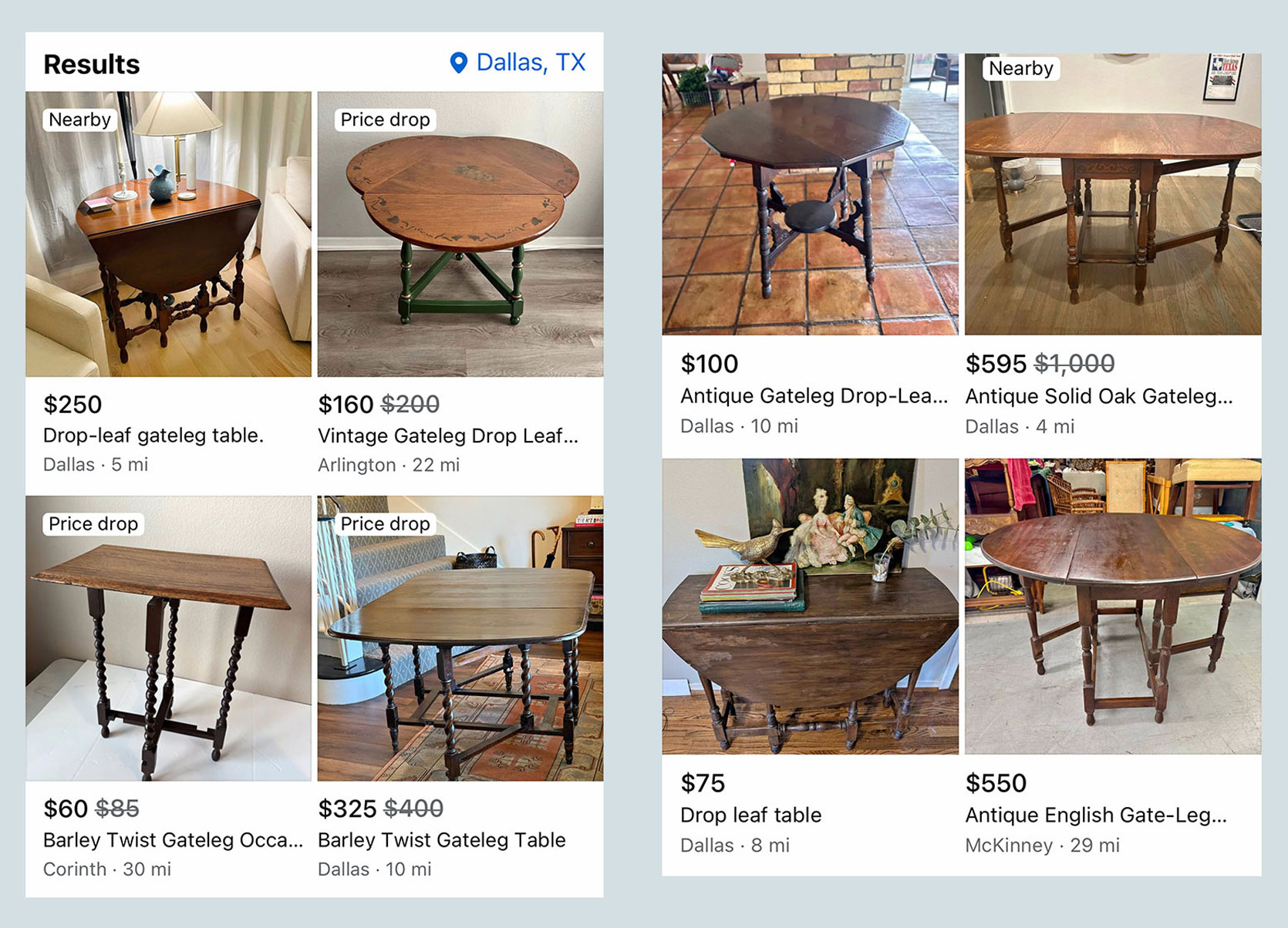
I also poked around Chairish to see what was shakin’ over there in the gateleg table realm. Given that Chairish houses more antique dealers, you can see there are options from the 18th and 19th centuries.
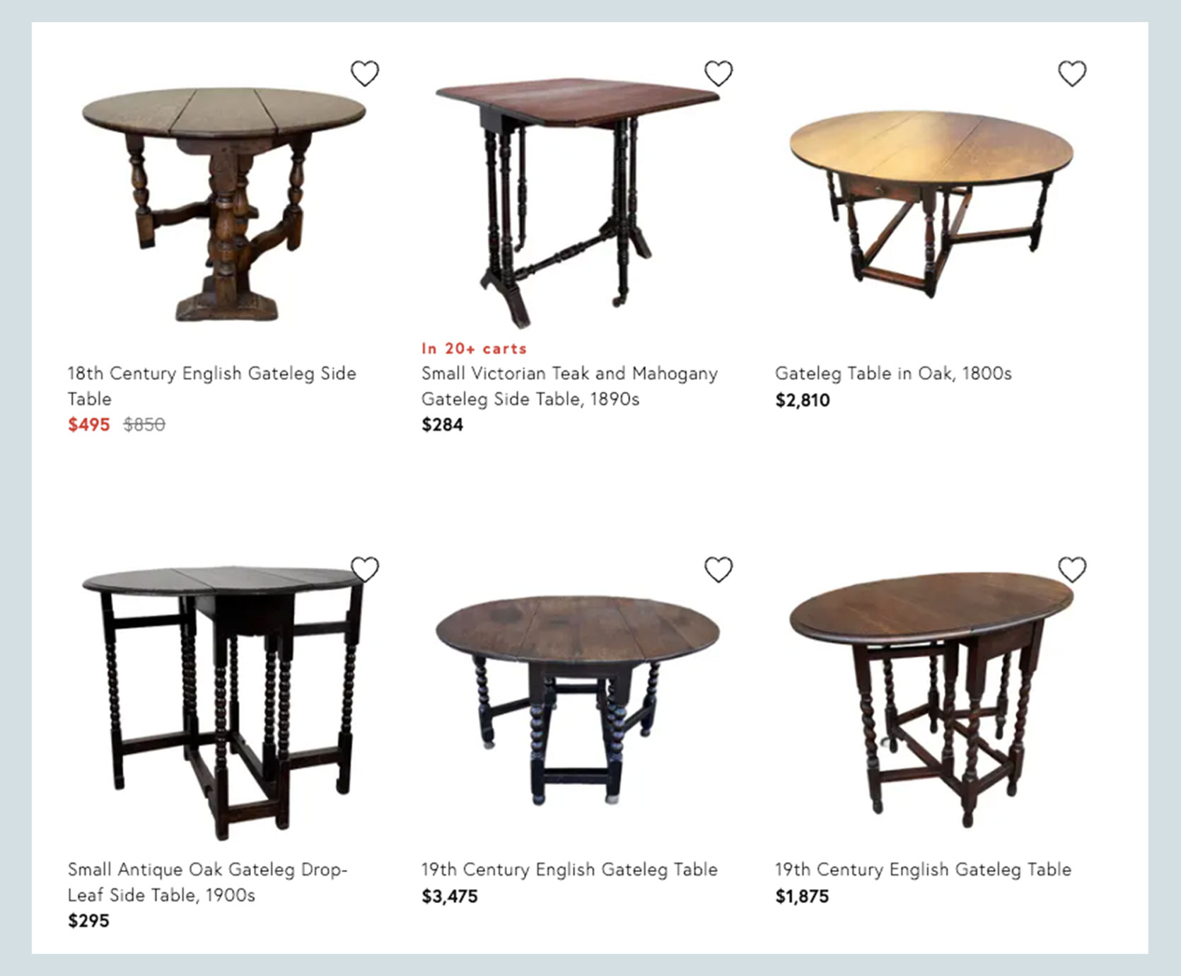
That Edwardian mahogany gateleg table below has my heart and is similar in shape to my original inspiration.
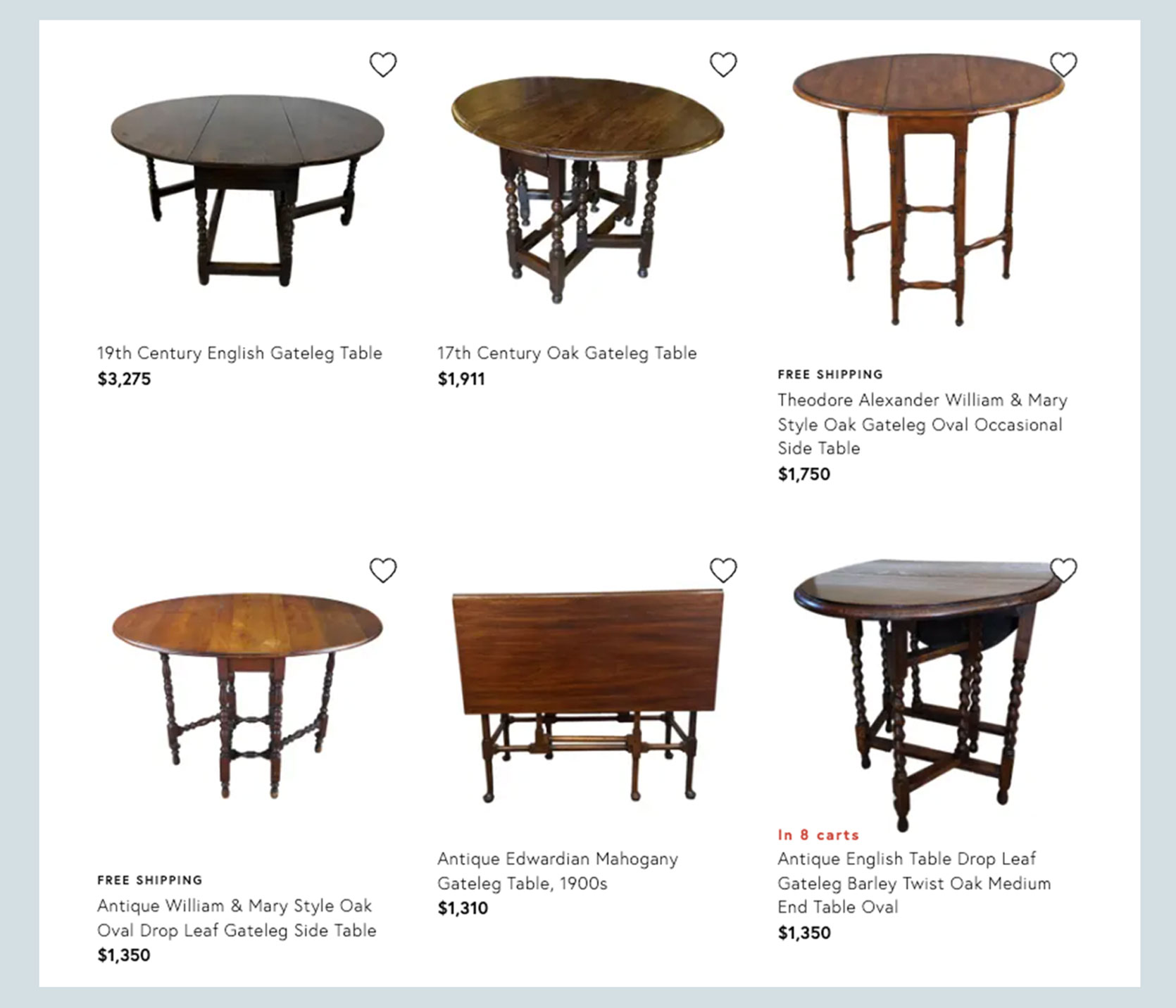
One of my favorite current uses for a round gateleg table is the grandest: As a center table in a foyer. Trust me, I know this one isn’t going to be the most practical for most of us. I have a split-level entry townhome with a foyer no larger than about 5 feet by 7 feet, but I can dream, can’t I? Let’s dream together:
Above is the home of designer Carlos Garcia. This gateleg table has a little drawer, a common feature in larger and better-made designs from as early as the 17th century.
Technically, the above is a snapshot of an entry hall in a hotel (the Inness Hotel in Accord, New York), but wow wow wow! What a cool surface for displaying some of your own curiosities, collections, or florals.
Here’s one that’s more realistic for most of us. If your foyer features a little alcove next to the staircase, it’s a fantastic spot to put a smaller version of a gateleg. If you click through the above, you can see how it’s used, including on slide four where it’s in the caddy corner of two upholstery pieces.
Head of Dwell Wright Interiors, Kaylyn Wright, stands proudly in a beautiful space she designed. I love the addition of the two fringed stools, which extends my mind to using something like this in a study, as a cute little conversation area of a living room with square footage you don’t know what to do with, or as a breakfast nook table.
If you’re lucky enough to live in a home with a parlor or library-like space in your home (I’m very jealous), get yourself a gateleg table to place in the center STAT.
Got a narrow hallway or spot you would love to add a surface to? This is where the gateleg shines! Sure, you could buy a narrow console table, but using something like this instead gives you the flexibility to repurpose it for other uses as they come up at home.
The finish on this one is so lovely. It glows almost gold!
Click through the images in the post above to see how practical a gateleg dining table can be. This is a more modern version (IKEA even sells something similar—my friends own one!), and I love it for an area in your home you want to leave open to multiple purposes. I could even have seen something like this working really well in my last home where I contemplated using my dining room as a playroom. With a table like this, I could have had both!
Here’s a mid-century modern one. I mentioned it earlier, but these Scandinavian ones fold up super slim. They go from console table to compact desk, to a 2-seater table and all the way up to a 4/6-seater table. Name another piece of furniture that can do this!
Technically, all gateleg tables of a certain height are console tables, but I wanted to show the above because some of them are much smaller occasional tables even when opened up. The barley twist legs here are so gorgeous.
I can’t understand the Japanese on the above post, but the images speak volumes. What a stunning teak piece! Something like this would be so useful to someone like myself who likes to bop around my house working on my laptop. I don’t have room for a desk in every room, but sometimes I wish I could be downstairs in my living room without the neck-breaking posture of working on the couch. A table like this would be amazing to open up, work on, then close up and move on.
We’ve reached the end of my plea to consider the amazing, transformative, versatile, and stylish gateleg table. There are SO many of these out there, all in need of good and beautiful homes. Including mine! Just last week, I found one for $50 in exactly the size I was hoping for, for next to my sofa. The condition is a little worn, and I’m pretty sure someone painted it along the way, but it functions exactly as I hoped it would, and it looks great as-is. Maybe one day, I’ll strip it back to see the true wood grain and restain it, but for now, I’m very happy with my purchase that’s 10x cheaper than what I was originally considering! I haven’t styled it or much of my living room, but here’s a quick iPhone photo because I wanted to share it with you ASAP!

Technically, after writing this post, I learned that my table is a butterfly wing table, not a true gateleg, as the support that comes out is more of a wing that swings around to hold up the leaf rather than a leg. But it was listed as a gateleg, so I’m counting it!
Until next time, friends…
Opening Image Credits: Design by Emily Henderson Design | Photo by Tessa Neustadt | From: Emily’s Kitchen and Dining Room Reveal
]]>